Spreadsheet Modelling – Assignment 2
Excel Tasks
- Using appropriate tools to present data. [P4]
- Customise the spreadsheet model to meet a given requirement. [P5]
- Use automated features within the spreadsheet model to meet a given requirement. [P6]
Presentation
Part 1: Data Analysis for Marketing [Part of P4]
Judging by the number of visitors to the UK from each of the listed countries per year, I suggest that it would be most beneficial to target marketing towards the following countries, in the specified languages:
| Country | Visits per year | Language |
|---|---|---|
| France | 3930396 | French |
| Germany | 3161980 | German |
| USA | 2790504 | English, Spanish |
| Irish Republic | 2394513 | English, Irish (Gaelic) |
| Netherlands | 1921942 | Dutch, Frisian |
| Spain | 1704476 | Castilian Spanish, Catalan, Galician, Basque |
| Italy | 1665808 | Italian |
| Poland | 1357008 | Polish |
| Belgium | 1188322 | Dutch (Flemish), French |
| Australia | 1069962 | English |
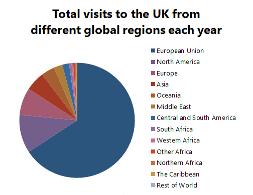 A chart showing the proportion of visitors from each geographical/political region of the world to the UK per year.
This data was found using a Top 10 conditional formatting rule across all of the data for total visits. This allowed me to select the countries that supplied the highest amount of visitors to the UK per year and isolate them. I then sorted the results by the number of visitors, and consolidated the language data I found on infoplease.com.
The chart to the right shows the proportion of visitors from each geographical region of the world. This further shows the significance of visits from Europe and North America, which combined account for more than 75% of the total number of visits to the UK annually.
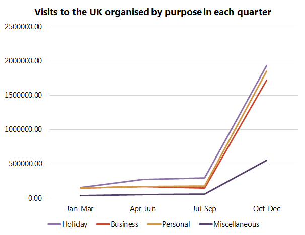
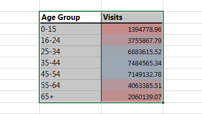
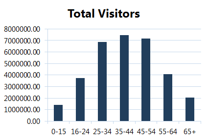 The graph on the left shows the number of visitors to the UK each quarter in each purpose category. The chart on the right shows the number of visitors to the UK each year in each age group.
In order to show the seasonal trend in the amount of visitors to the UK in each purpose category I plotted a graph with four lines, showing the visitor count for each quarter of the year. This graph clearly shows that the UK is visited by the greatest number of people, for all purposes, in the fourth quarter. The suddenness of this increase, when also considering the similarity between the different categories, suggests the could be an error or anomaly in the data set.
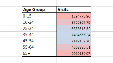
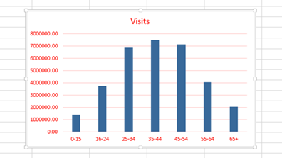
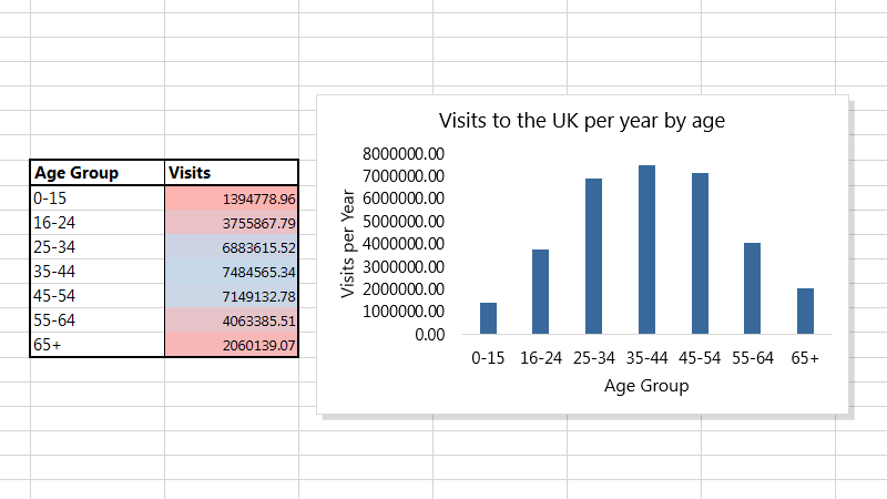
To display graphically the number of visitors to the UK each year that fall into each of the age categories, I decided to generate a bar chart. Using this, we can clearly see the the most popular age group is 35–44, with 25–34 and 45–54 close behind. Using this data we could reach a number of conclusions regarding the direction of marketing efforts. Personally, I think marketing should be targeted towards 25–44 year olds in the countries listed above. People in this age bracket have shown to travel more often to the UK, and I feel that the younger end of the bracket in particular could be persuaded to visit thanks to their more flexible lives.
Part 2: Generation of Charts and Tables [M2]
Excel can be used to create rich visualisations of data, allowing users to create pie charts, line graphs and histograms. In most situations generating a graph or chart is as simple as selecting the area of data you would like to represent visually, and clicking the corresponding button on the ribbon, under the Insert tab. Often a title is not available for the graph, and axes are labelled incorrectly. For this reason, these aspects of the graph or chart must often be edited manually.
This process is shown in the screenshots below.
 Data is organised so that Excel can interpret it effectively, by consolidating information and positioning it simply, and with headers. A range of data is then selected on the worksheet, including the headers for the data columns/rows.
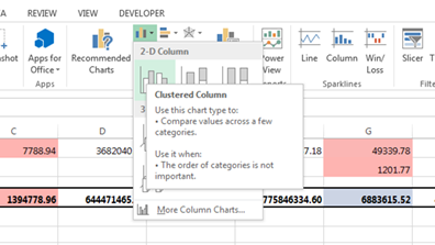
 Different presets can be picked from the bar chart icon in the Charts section of the Insert tab. Excel creates a preview of the graph as it would appear, even as you hover over these icons. The colours are selected based on your current colour scheme.
 The table colours, typography and layout can be changed to a great degree, meaning graphs and charts can be changed to suit the company branding and/or colour scheme.
PivotTables
In some cases, standard cell layouts or Excel tables don't provide enough flexibility when showing data, which is where PivotTables can be used. These allow a range of data to be selected and then used in a table that can be quickly changed. By dragging arrays of data to areas of the table (*Column Headers*, for example), one can build complex tables quickly, and these can be fine tuned by filtering the data shown by various methods or sorting the headers of the table rows.
PivotTables bring their own kind of charts and graphs into Excel, separate from the standard ones. These are built to update as the information in the PivotTable they're mapped to changes. This dynamic design can be useful particularly when the dimensions of a table are changing. A PivotChart was used in the 42.2.xlsm spreadsheet to show data as a pie chart.
Automating Tasks in Excel: A Comparison [M3]
Macros
Macros can be used in Excel to automate processes. In our scenario, a macro written in Visual Basic for Applications (VBA) was used to take data written in the visitor form and place it on a separate, hidden worksheet. This worksheet would only be unlocked by the macro as data was being entered, meaning that users of the form would be unable to tamper with the information others have submitted. There are two different ways to create a VBA script for use as a macro in Excel, detailed below:
The first, and more simple of the two, is the use of the *Record Macro* feature in the application. After clicking the record button, the suer will be presented with a dialogue box asking them to name the macro they're about to create, and optionally give it a keyboard shortcut and longer description. When the dialogue's contents are submitted, the macro begins to record, meaning that Excel makes not of every action the user makes. This includes the selection of cells, changing of cell formatting and the creation of rows, as examples. This means it can be used to record the copying of data from a form to a database spreadsheet absolutely (meaning formulae are copied as actual values, which is important for the date field in the form we created). The actions a user takes while recording are expressed by VBA script that Excel generates.
The second method is more laborious, but can result in more accurate and concise scripts. It involves each line of code being written by hand, likely in the simple IDE (integrated developer environment) packaged with Excel. This is an unpopular way of creating macros, but for more advanced programming within Excel, it can be the only option. Certain programming elements such as variable declaration, loops and conditionals cannot be performed graphically in Excel, and therefore cannot be recorded to a macro.
Most macros, other than the more simple, are created using a combination of these two methods. Because most actions in VBA can be performed in Excel, recording the macro, or at least sections of it, before refining and expanding it in the code editor is usually the best method to go about macro creation. The VBA script can be copied to another application for easier editing, otherwise changes can be made easily from within Excel. Despite the fact that some of the script generated by Excel after recording actions may not be as efficient as possible, this downside is greatly outweighed, however, when considering the ease and speed with which macros can be made.
Forms
Forms in spreadsheets are useful for gathering user input, which can be used to create a much more interactive experience than Excel typically provides. Form controls are used to built detailed interfaces for users, the result of which can be processed by a macro or VBA function.
As commonly used on the web and in native applications on various operating systems, the form controls in Excel include radio buttons and tick-boxes, text input fields and buttons. In the case of radio buttons, for example, they can be grouped in order that any previous selection is removed when selecting another item. Each from control is available in a standard Excel type as well as a more advanced ActiveX version. The former is implemented directly into Excel and is easier to use, although offering more limited functionality. Standard form controls allow you to take input and create a submit button, for instance, but in order to change the visual styling of the box, one must look to ActiveX form controls. These allow far more properties to be changed, altering both their appearance and functionality.
ActiveX controls are often used because of their more comprehensive property list, entries in which can be easily modified. ActiveX controls are somewhat more complex to use, but are required for certain tasks. When developing simple apps in Excel, workflow is important. ActiveX controls appear as objects in the VBA scripting environment, which is useful for quickly viewing or altering the code that is executed when a button is clicked, for example. It is also worth considering, if making a choice between standard and ActiveX controls, that by default, Excel will not trust the macros linked to ActiveX controls. Until permission is given by the user, these macros will not run, which could be an issue in some cases. Even without causing a problem for the developer, the warning that Excel shows may irritate or inconvenience the user, or persuade them to leave macros blocked.