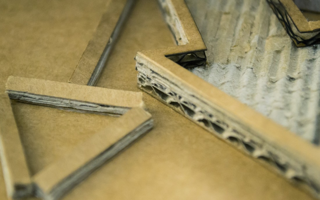
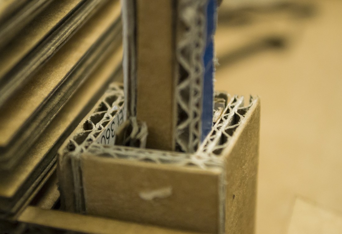
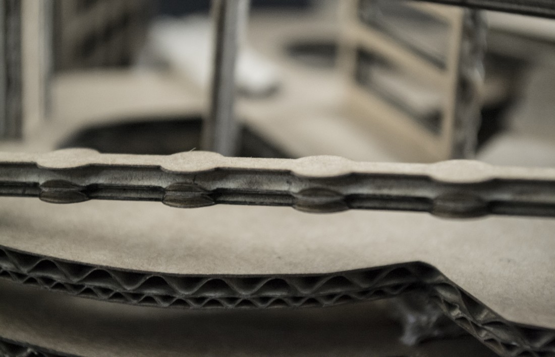
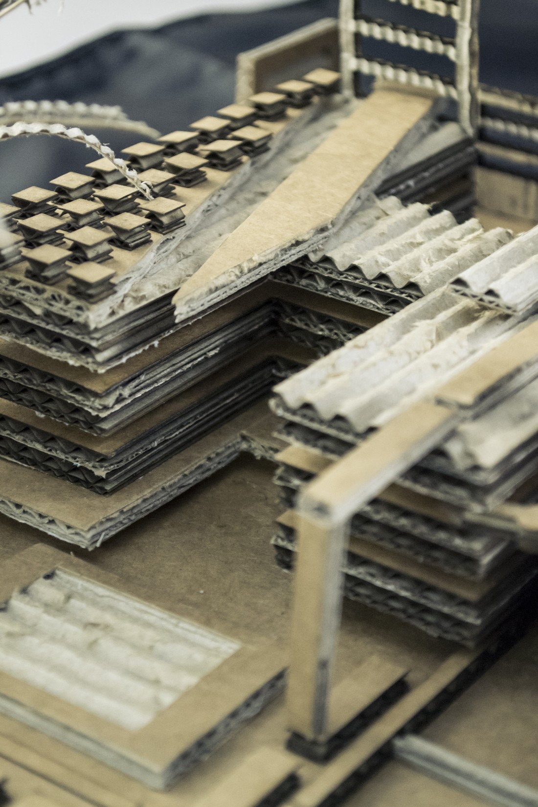
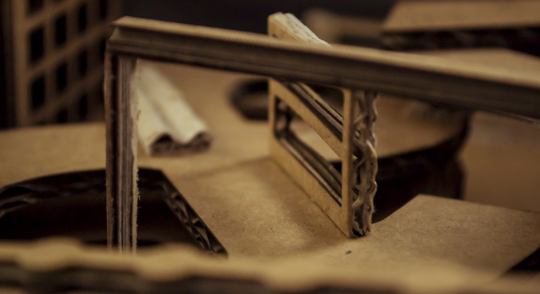
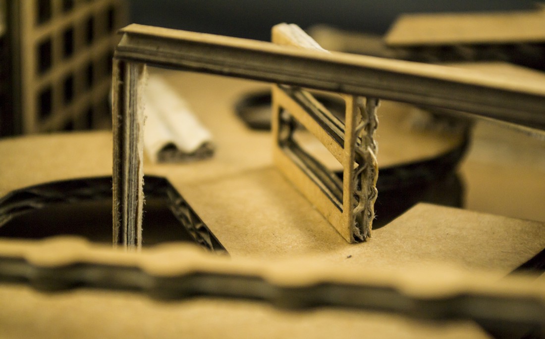
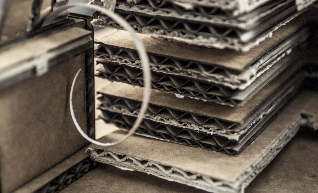
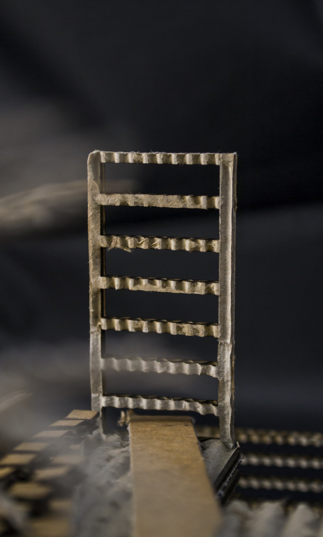
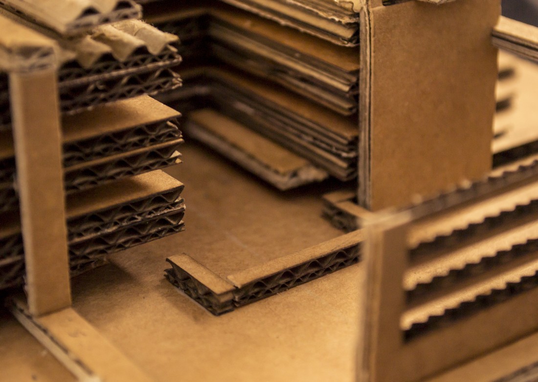
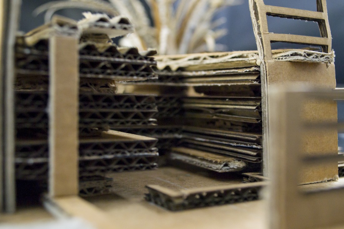
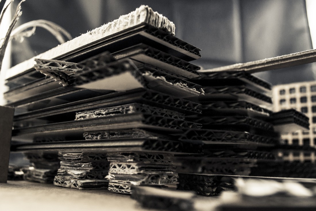
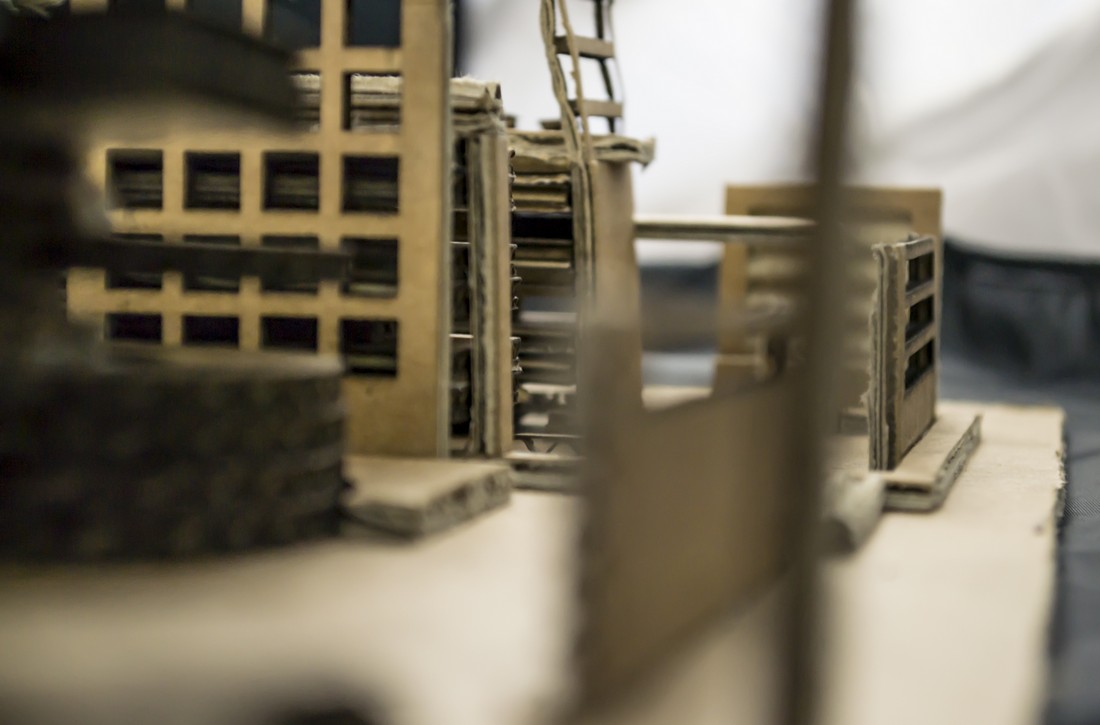
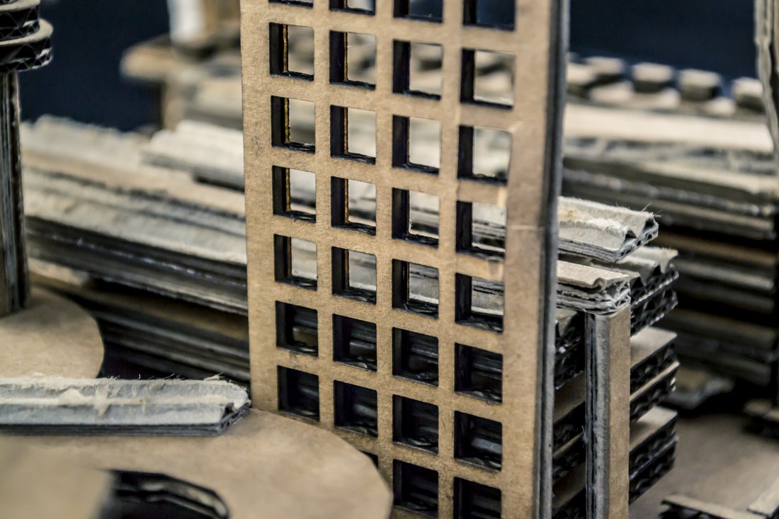
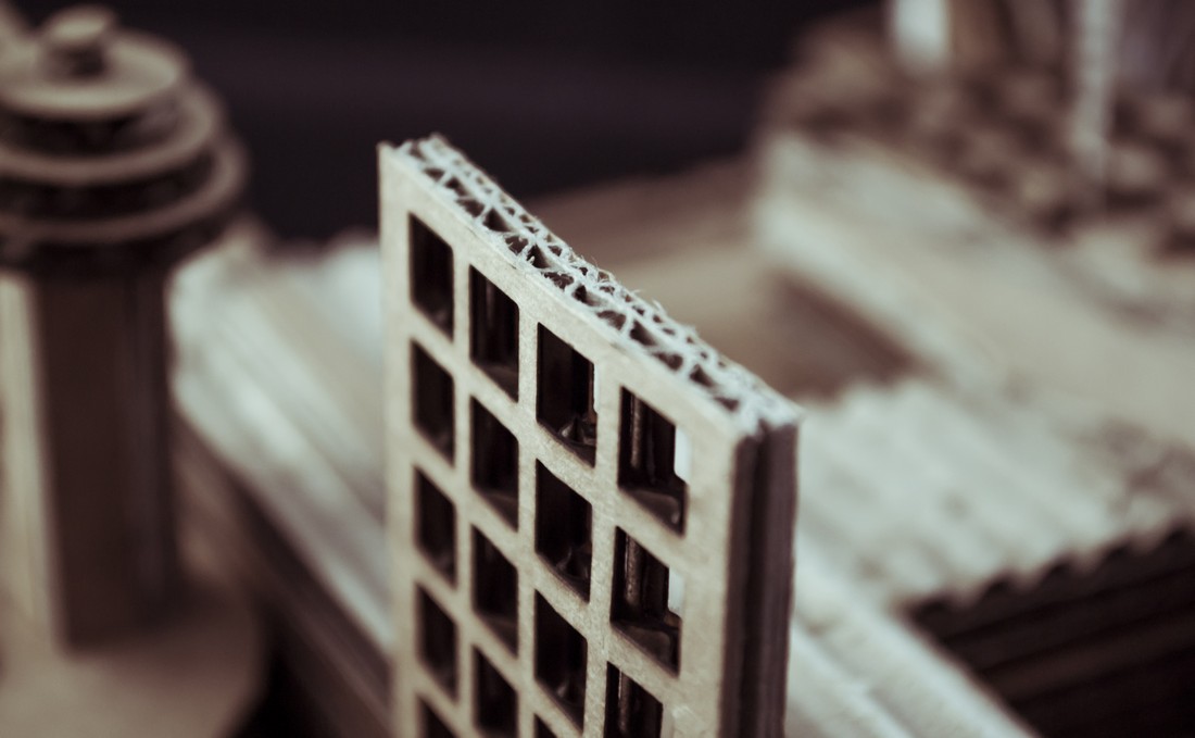
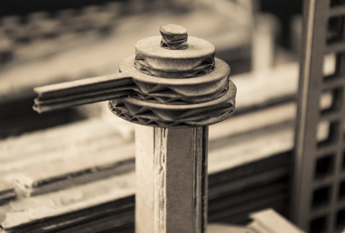
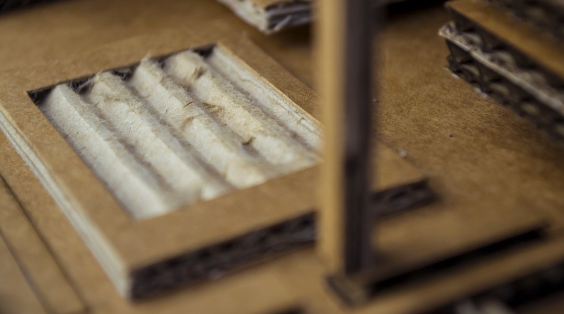
The first unit of the Art GCSE – Here and Now – offered a broad range of opportunities. I took a less digital route than I did in later units, and made a lot of work using cardboard and PVA glue.
Because most of the unit consisted of physical content, photography is all that is shown below.
Photography

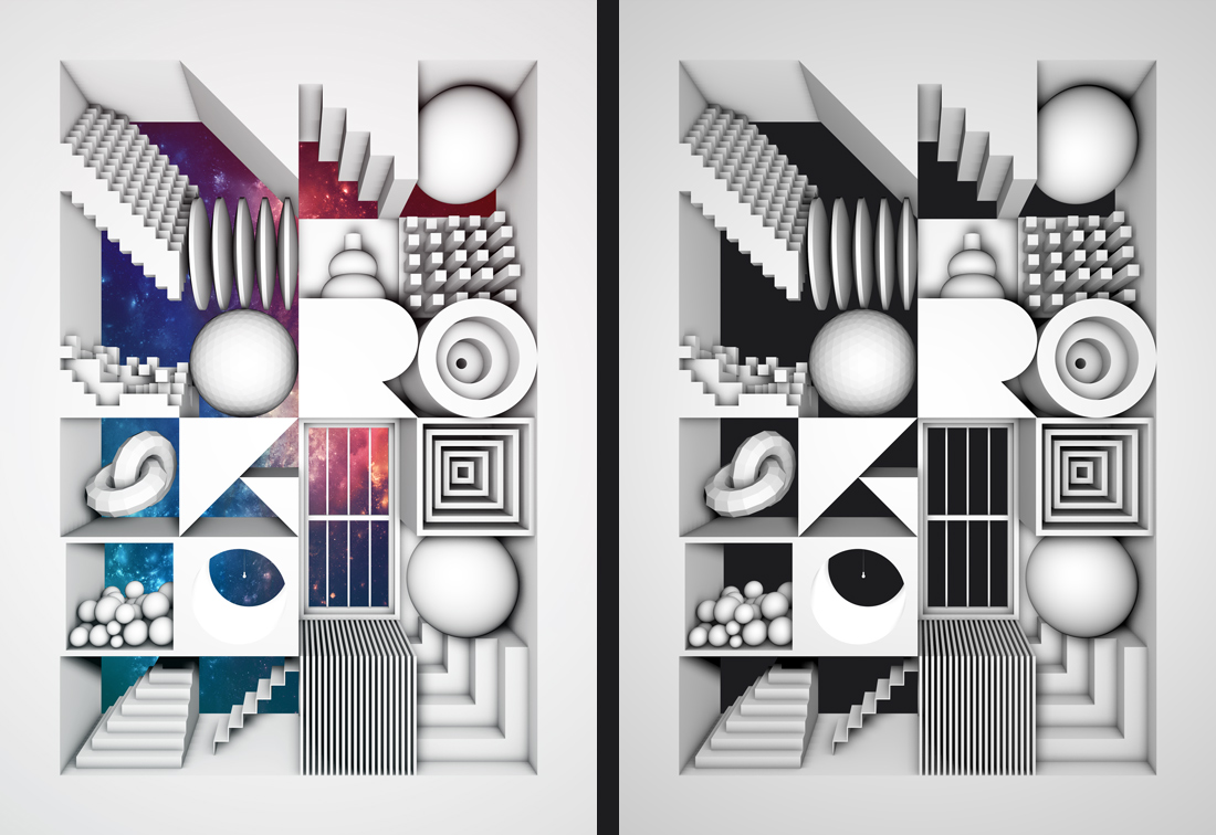
The second unit of our GCSE, name A Magazine Cover allowed us to take one of two paths;we could either investigate typography, journalism and other magazine covers in order to create our own, or we could simply create the image to act as a cover background. This kept the range possibilities wide.
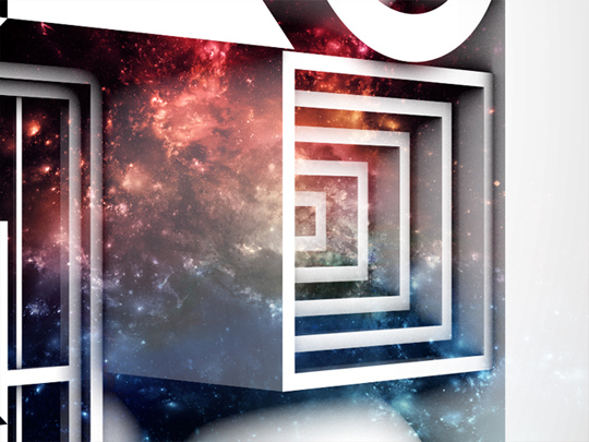
Investigation 1 – Box
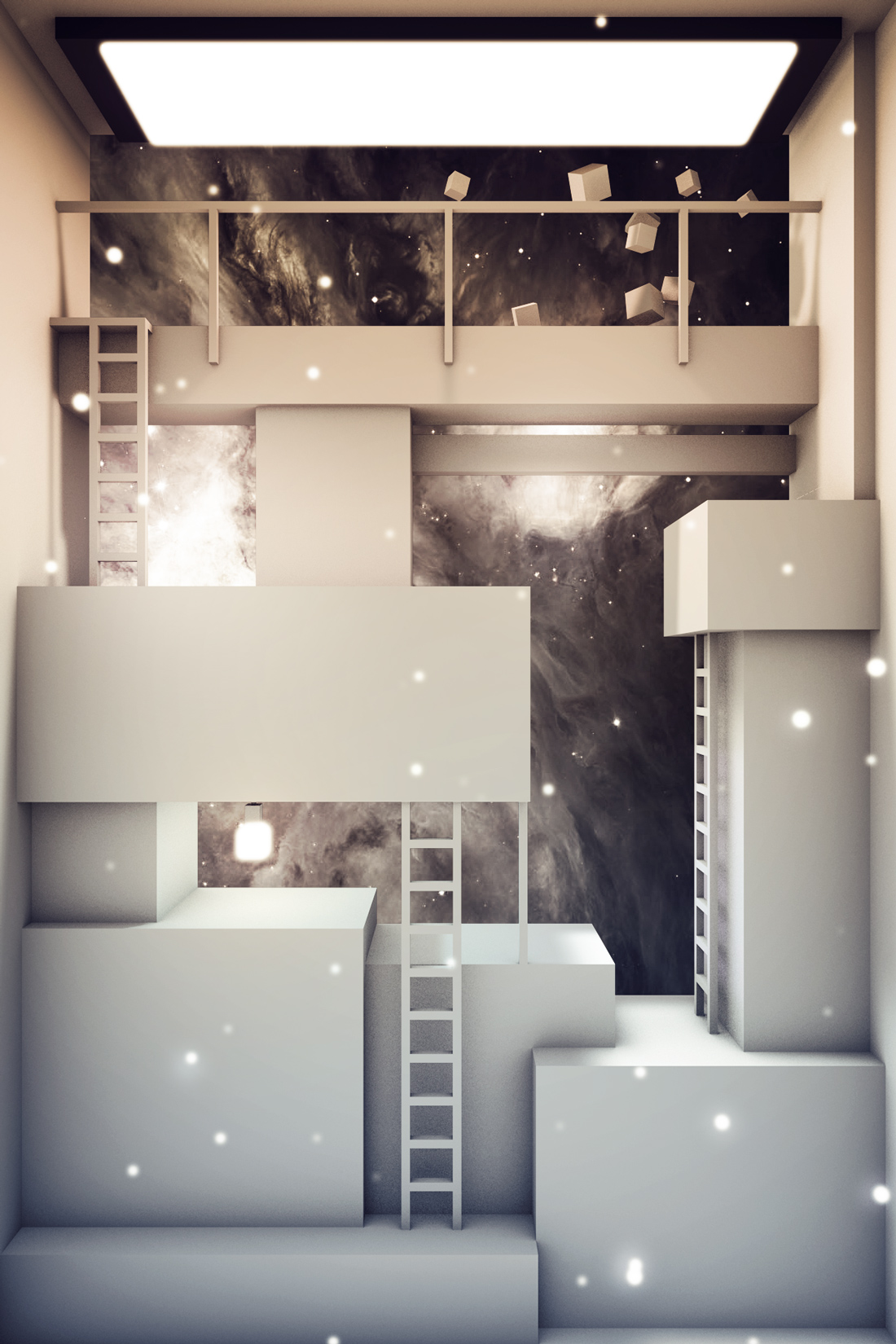
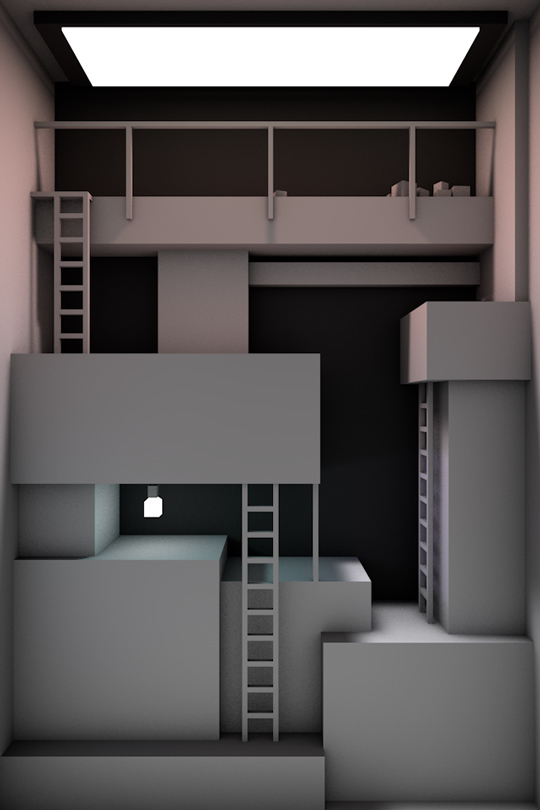
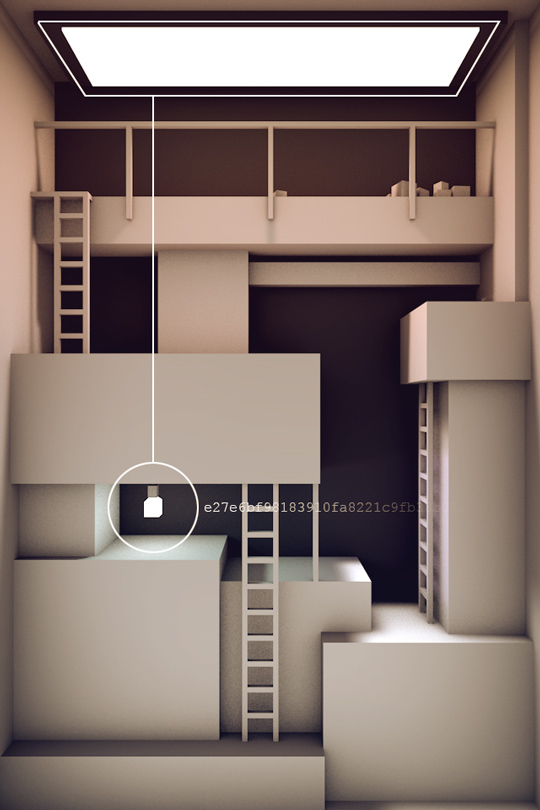
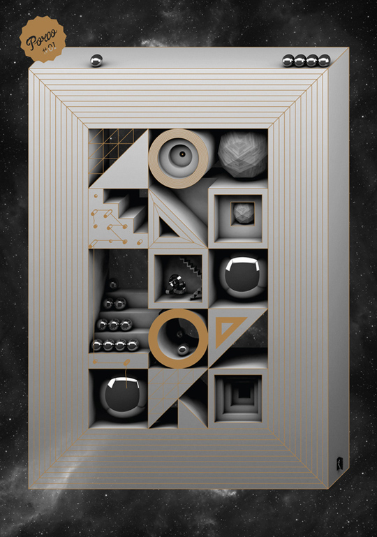
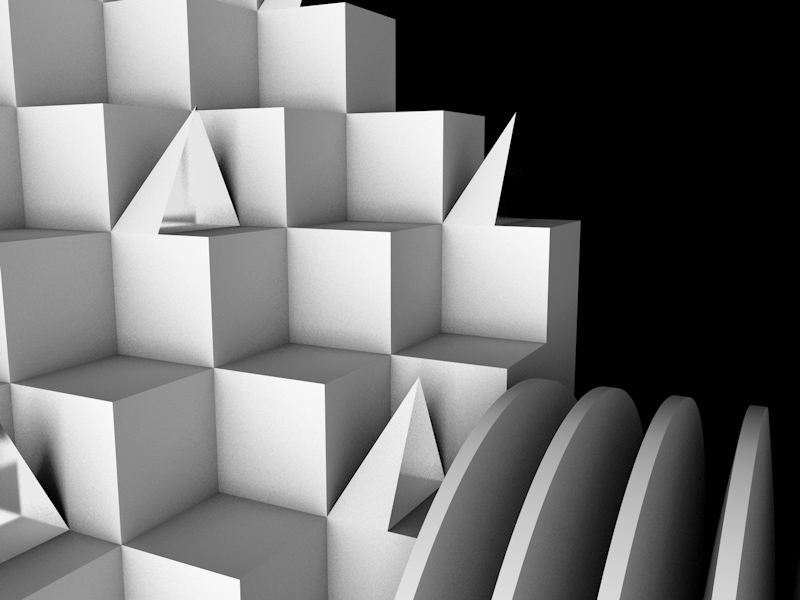
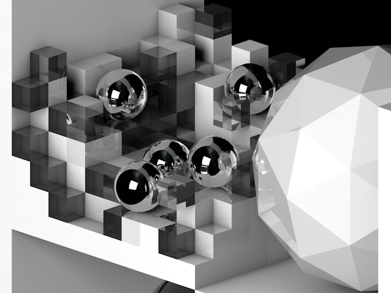
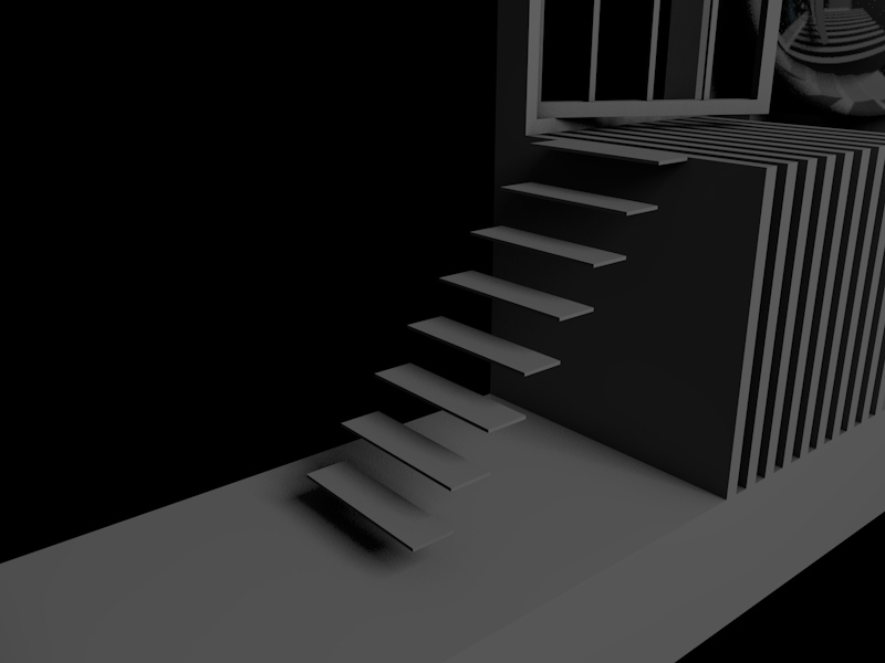
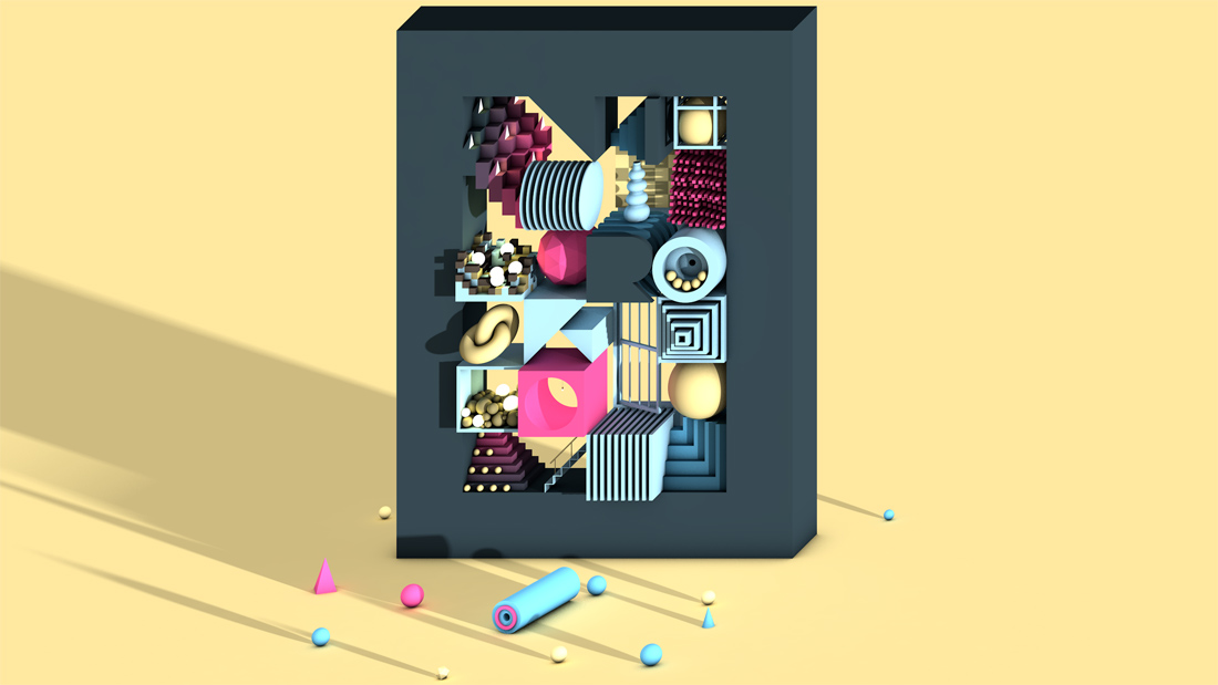
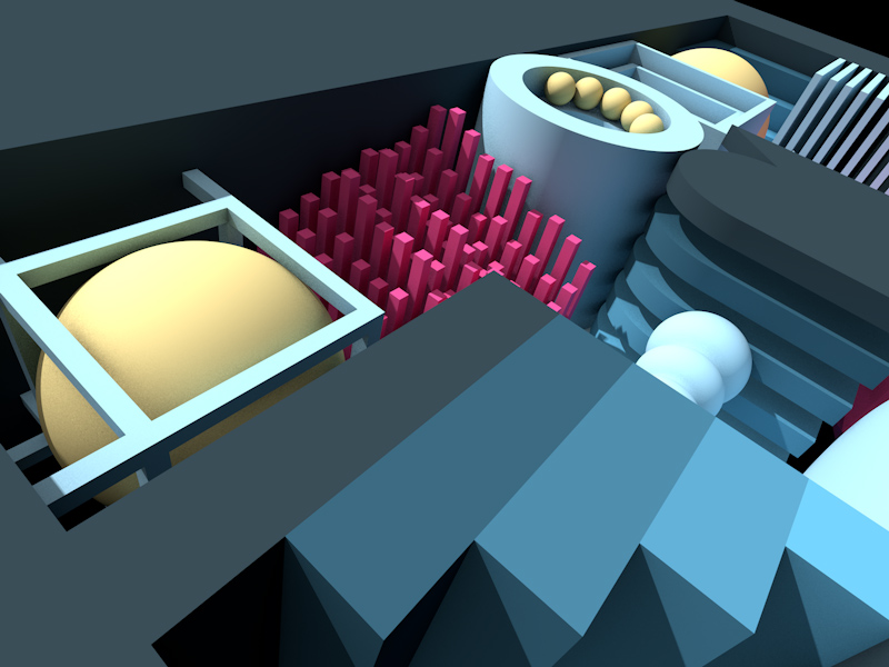
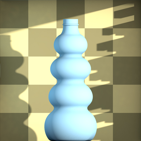
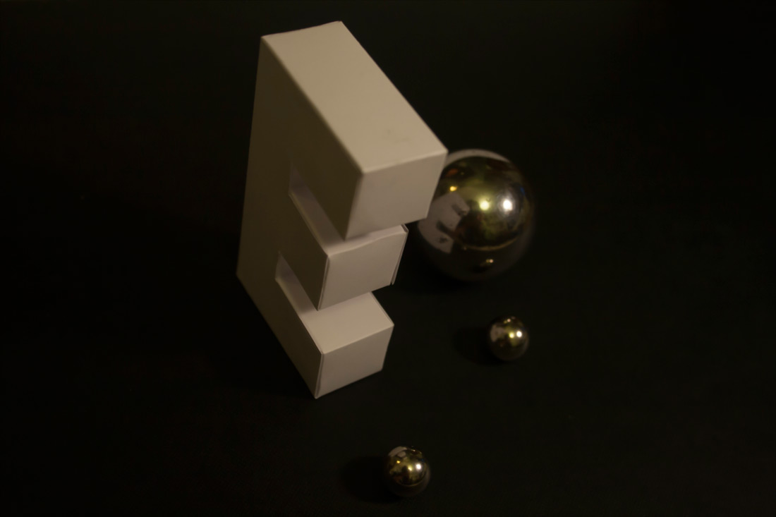
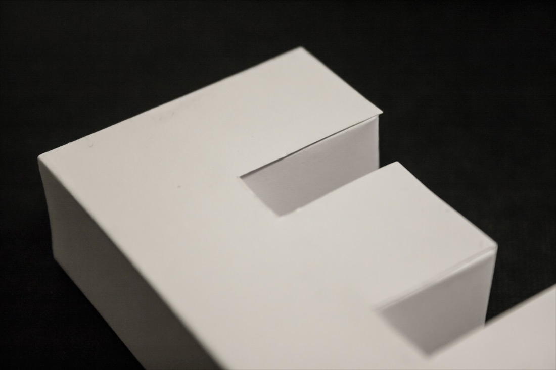
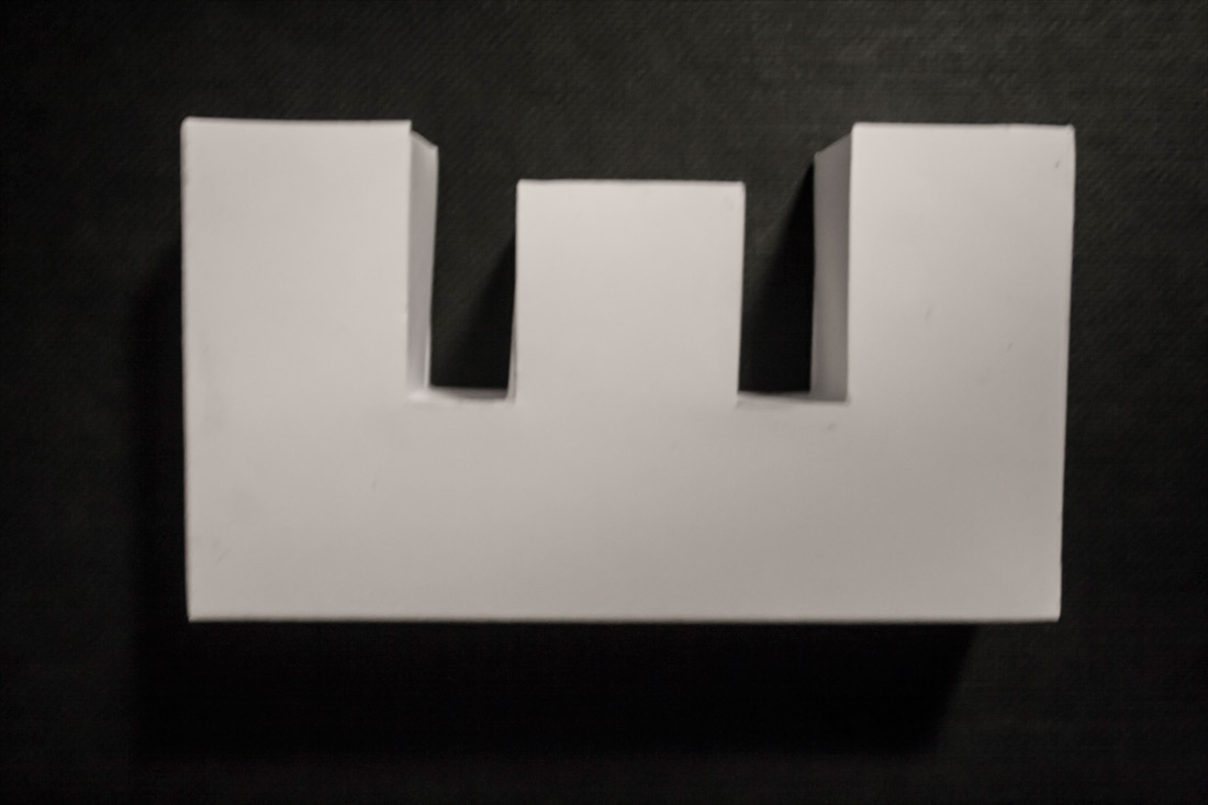
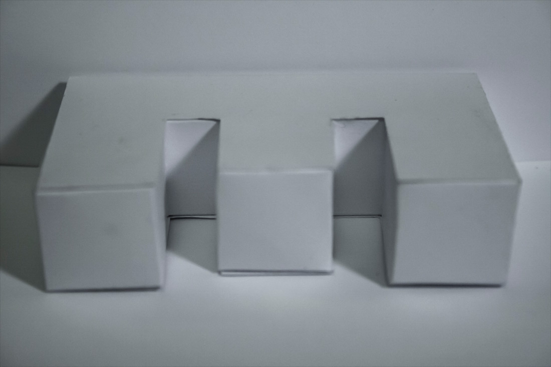
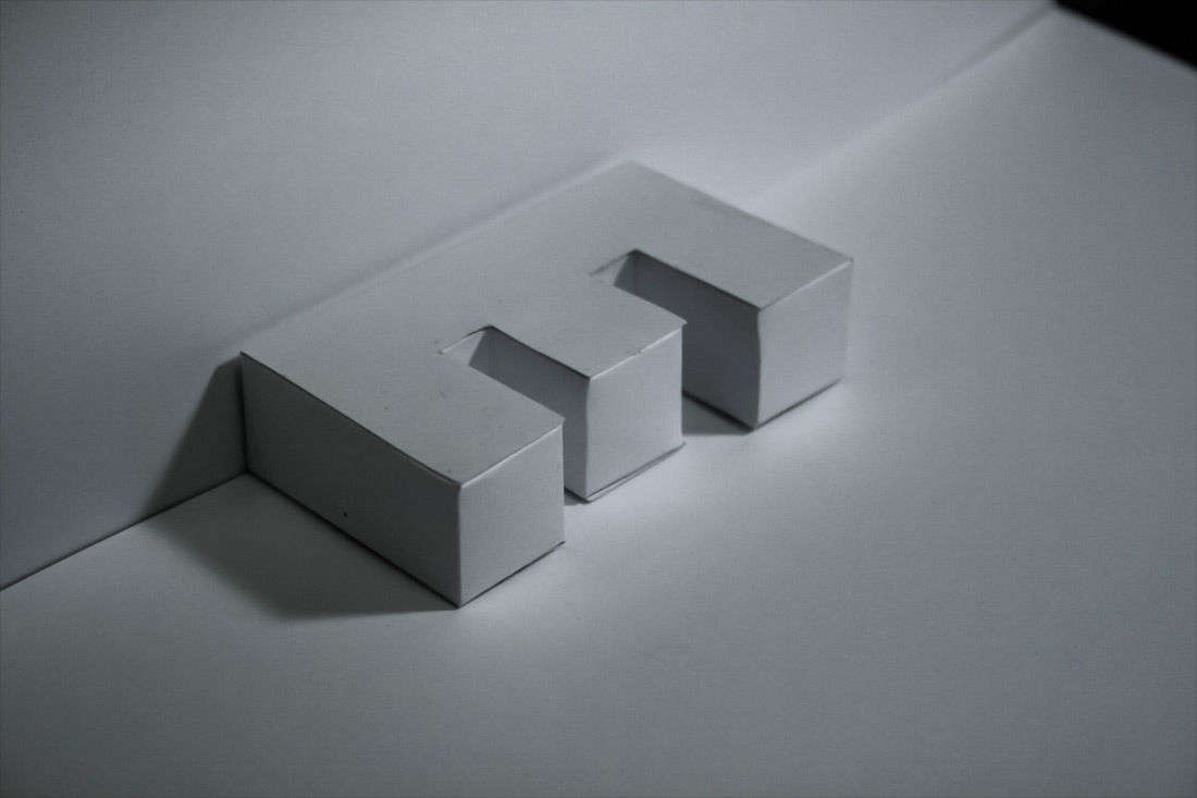
I began my project without having chosen an artist to work in the style of. The first investigation I made involved an upright rectangular box, filled will smaller cuboids, ladders and lights. This is the final image of the investigation.
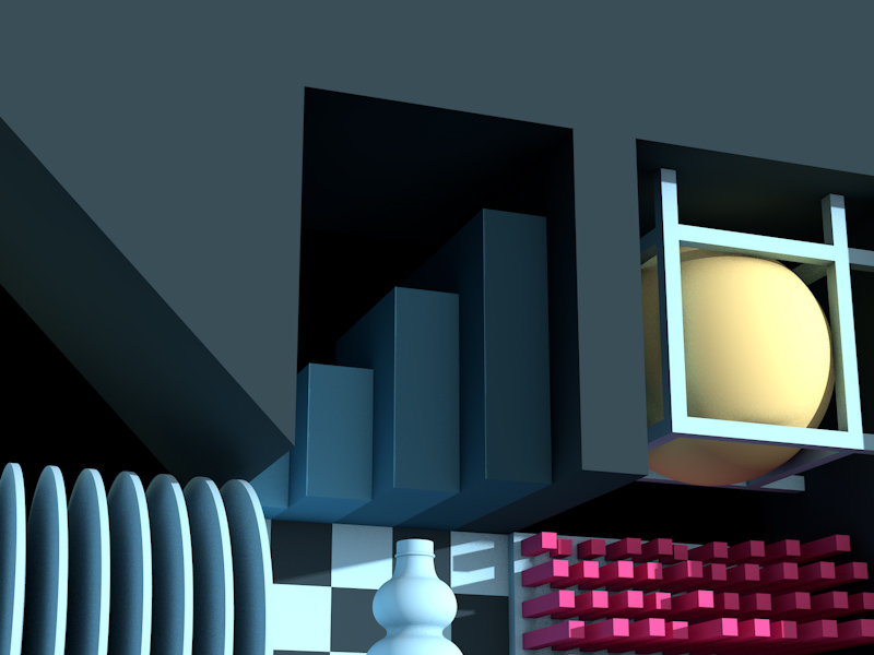
The final render from Cinema 4D of a development version. Notice the dark back wall and the cubes affected by gravity.
The render to the left after being edited in Photoshop.
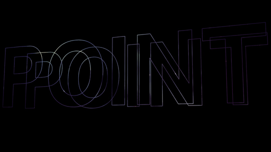
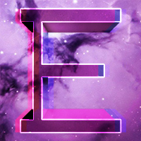
Investigation 2 – Point
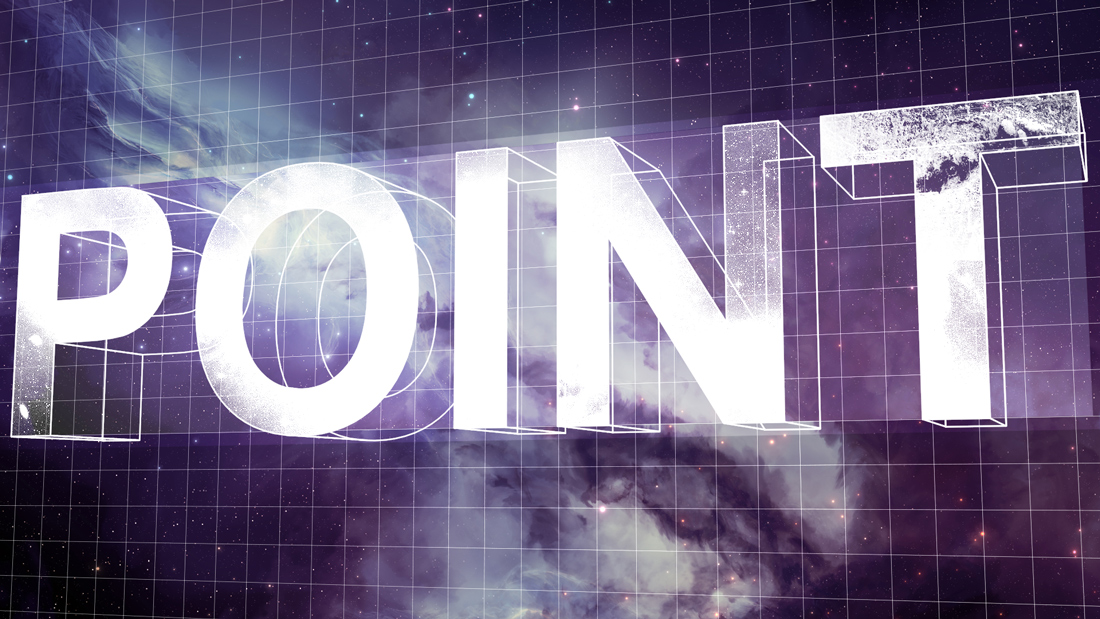
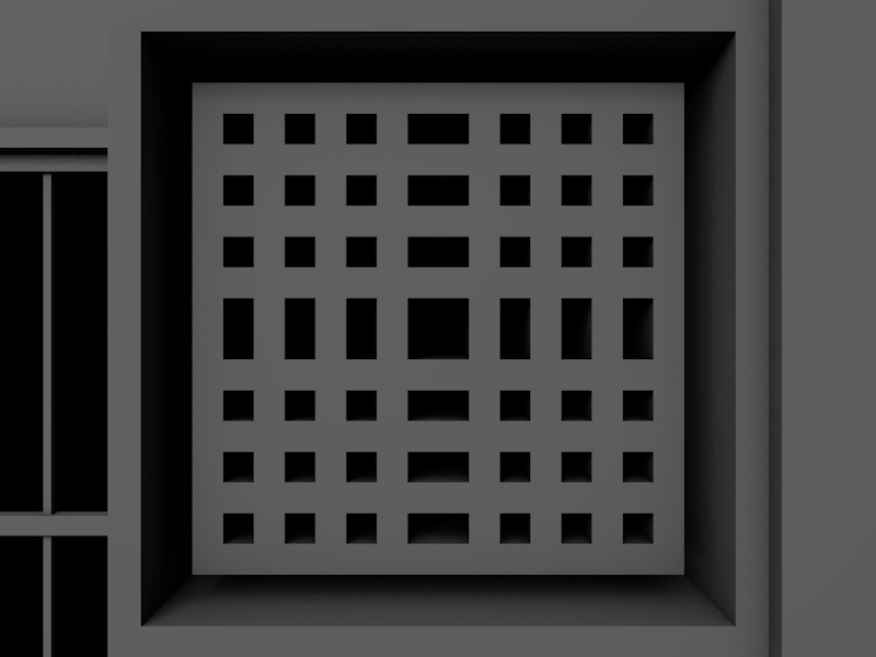
The second investigation in the project was called "point". It began in Cinema 4D, with creating two-dimensional text and viewing it at an angle. I rendered this, along with a rectangle the same width and height as the text. These were then used in the Photoshop-orientated piece above.
A different version of the piece I inadvertently created whilst making the main version. I liked it and saved it before continuing.
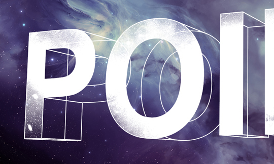
A close-up image of the main version, showing the grainy, worn effect on the front of the letters and the background clearly.
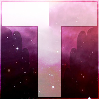
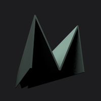
Investigation 3 – Shatter
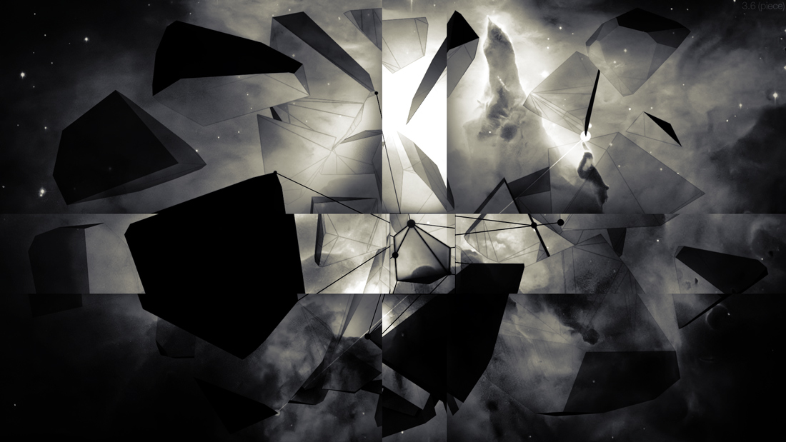
The third investigation I made, "Shatter". I used a Cinema 4D plug-in called Thrausi to shatter a cube, and then exploded the pieces outwards. I overlayed the render on one of the space images I had downloaded and emphasised one of the shapes with lines and dots. I also made two perpendicular strips through the piece
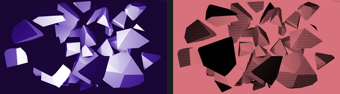
Other versions of the piece that I made, none of which I felt were particularly good.
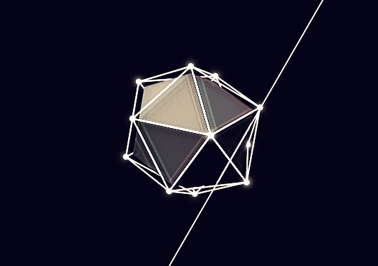
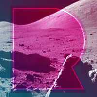
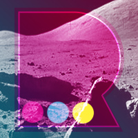
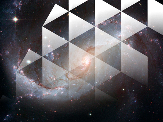
Investigation 4 – Hex

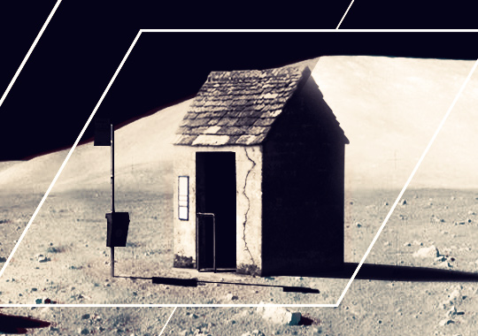
Based on a photograph of the moon, this piece was themed around hexagonal and triangular geometry. The bus shelter originally started as an amusing idea, but when tried worked well and was kept.
One part of the image which shows the 3D anaglyph-like effect I created.
The bus shelter in the scene, taken from a photo I captured near my house.
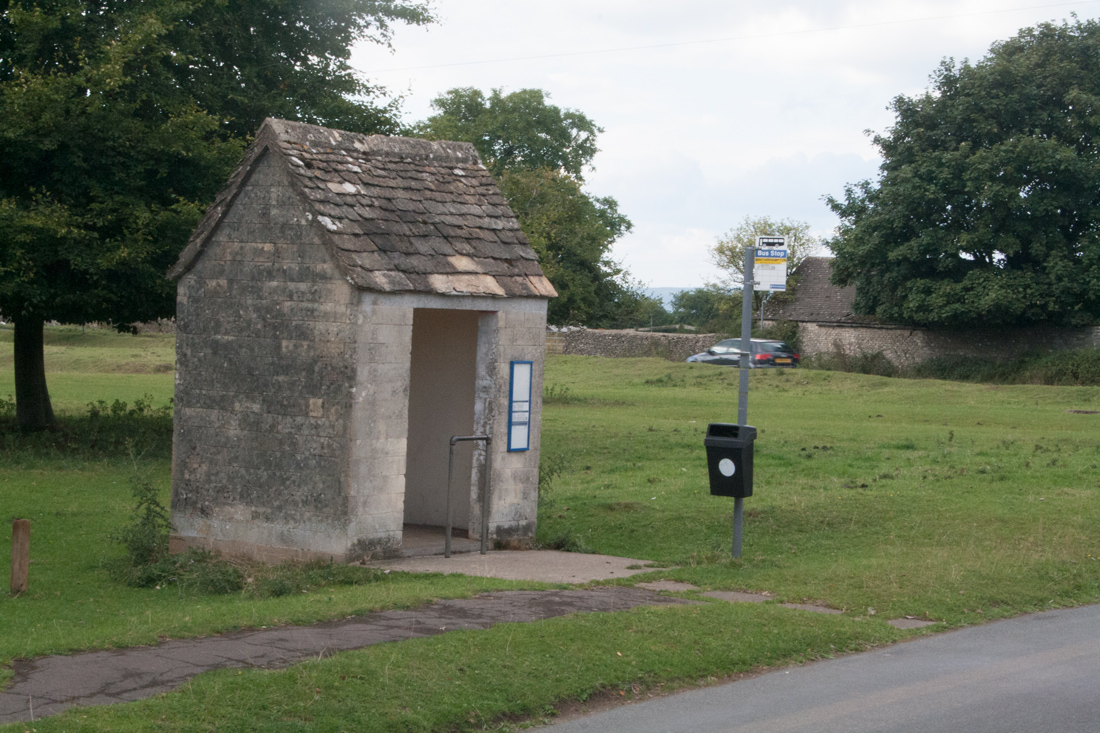
The original, unedited photo of the bus shelter. The journey from this image to the piece above involved colour correction, warping, isolation from the surroundings, manipulation (such as the crack in the wall) and most noticeably mirroring horizontally. I also added the shadows by my own judgement and made further small tweaks to ensure the image fitted seamlessly into the lunar landscape.
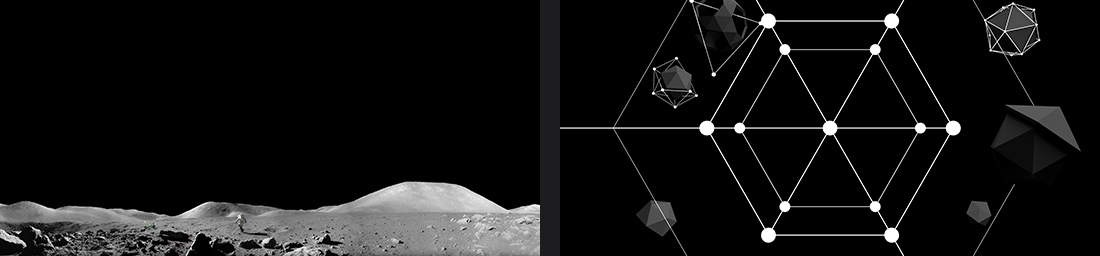
The two primary elements of the piece; the photo of the moon by NASA, and the final render from Cinema 4D. The "Screen" blending mode was used in Photoshop to replace the black of the render with transparency.
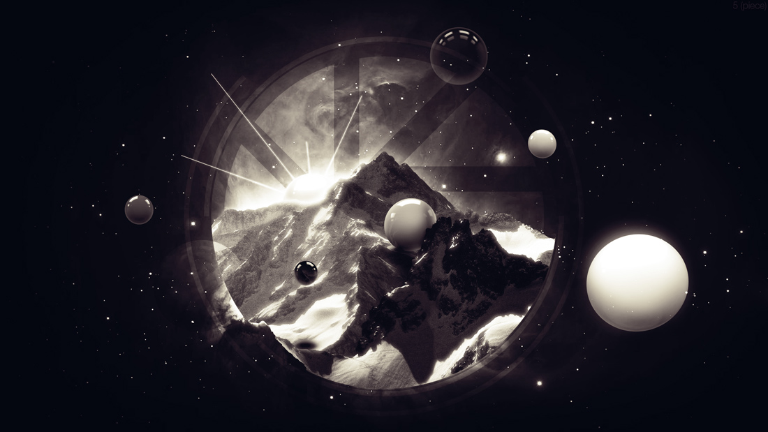
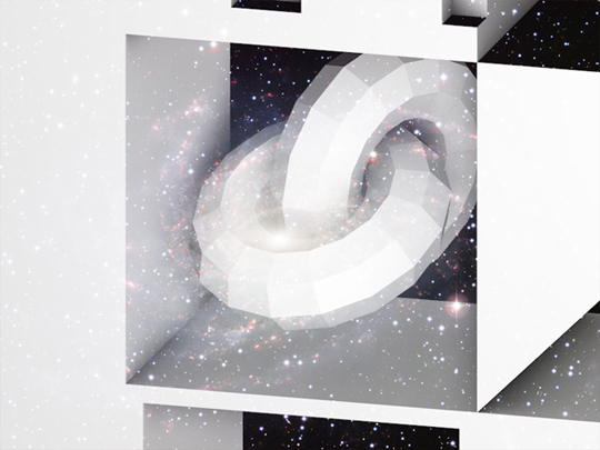
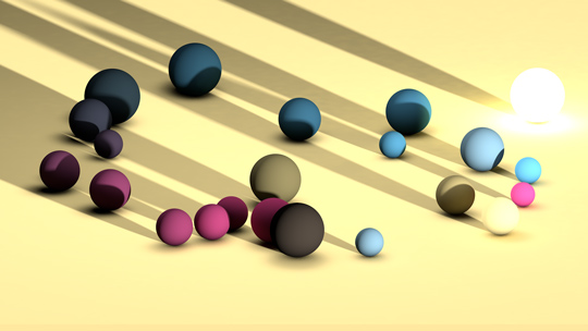
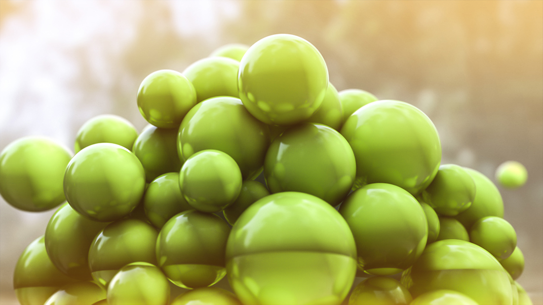
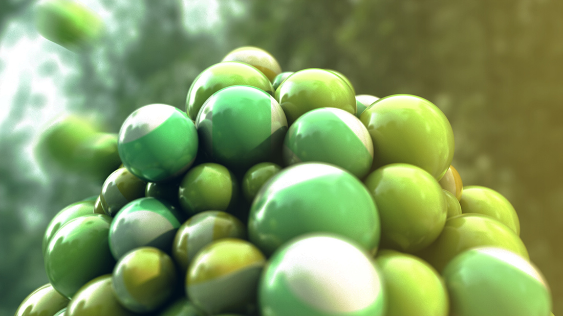
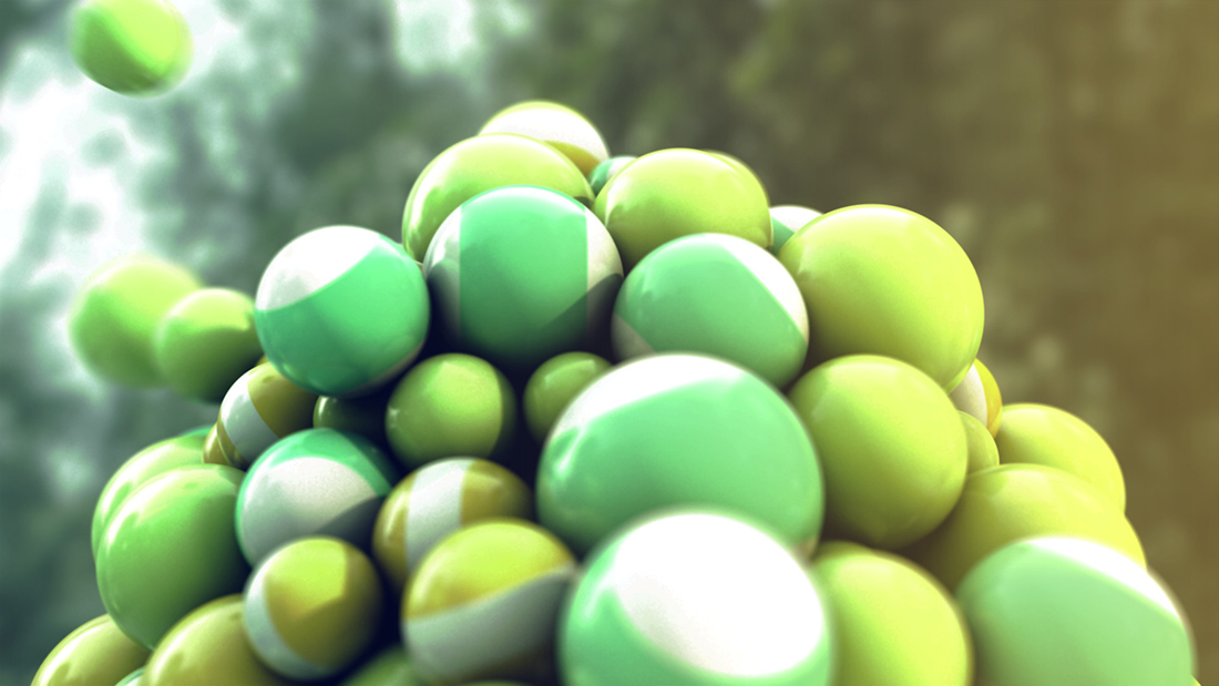
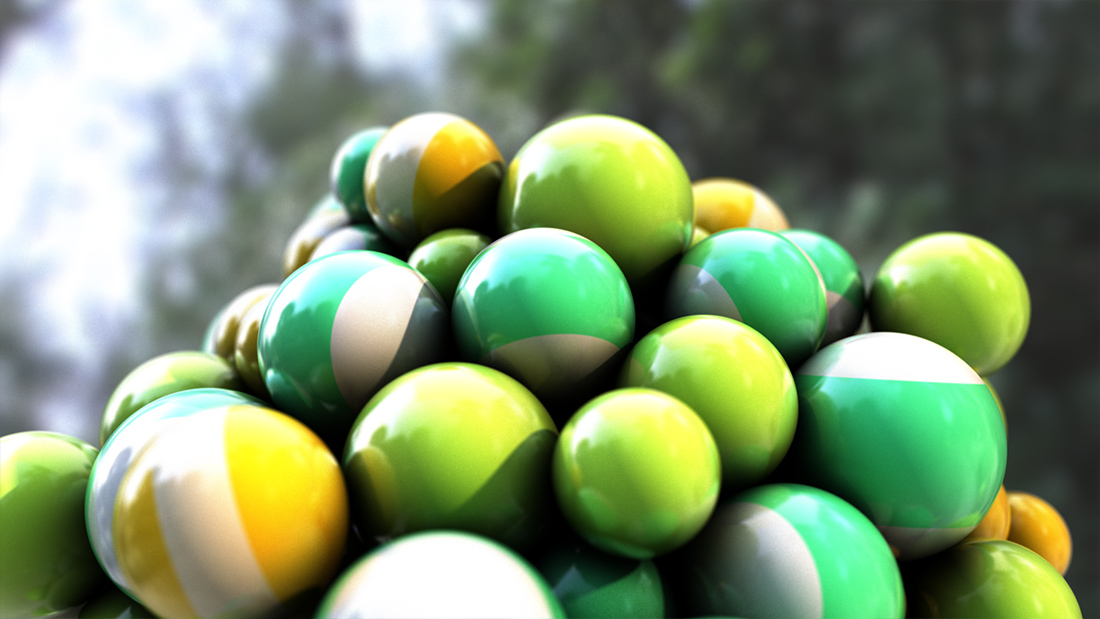
Investigation 5 – Rounder
A combination of the three versions of the final edition, using three different colour correction configurations. More can be seen about the colour correction in the last image in Investigation 5.
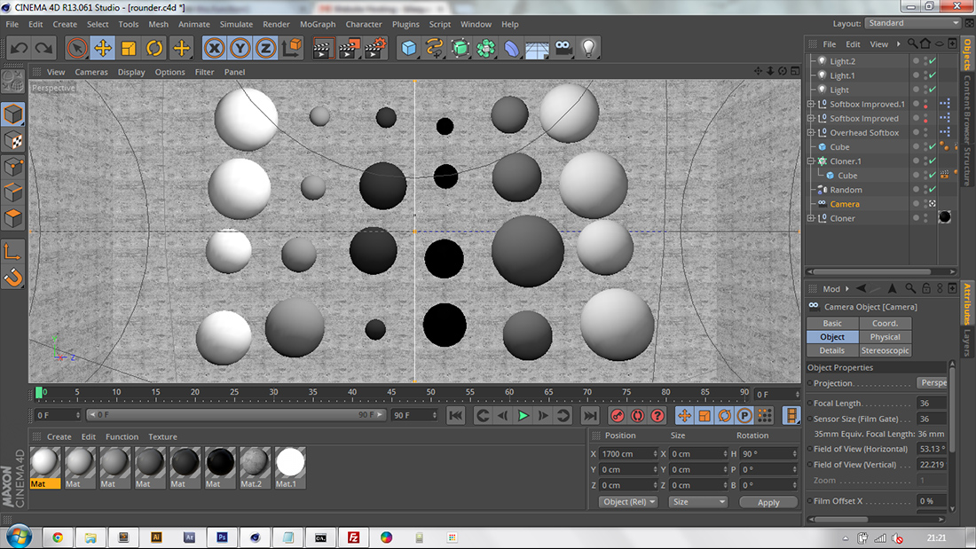
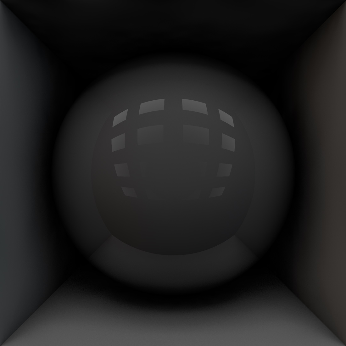
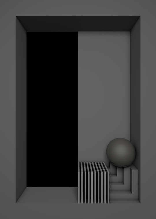
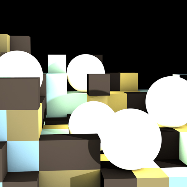
A screenshot of Cinema 4D with the sphere scene open. The background was an attempt to make the spheres appear to be in a concrete walled room, but the idea never made for any pleasing renders and wouldn't have fitted with the space background planned.
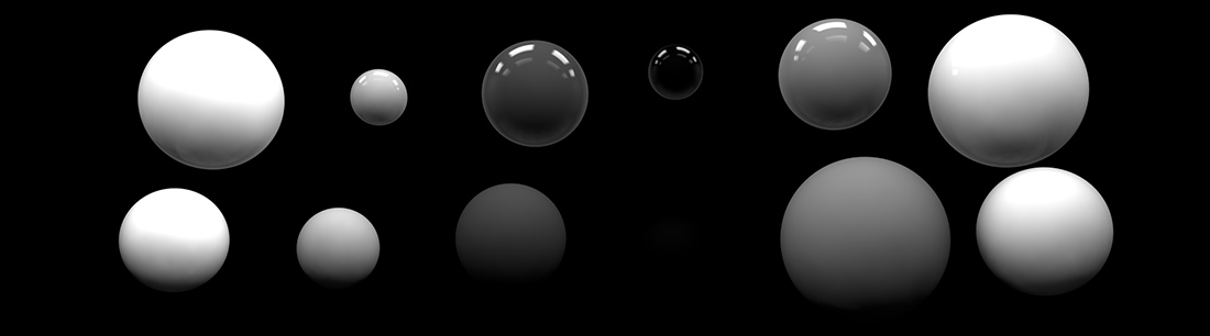
Comparison of two rows from two versions of the spheres image. The above half is from the reflective material render, and the bottom from the matte material render. I found that without reflection the completely black sphere reflected almost no light, and is therefore invisible on a black background.
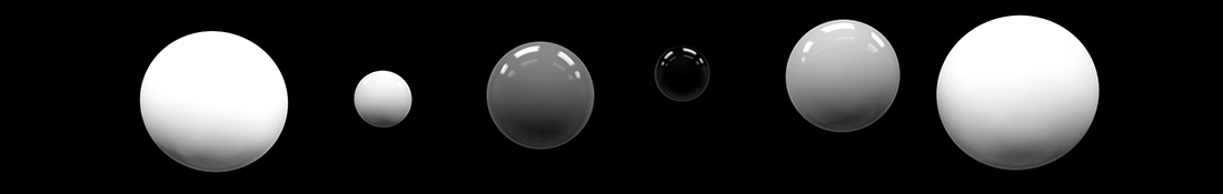
A line of spheres combining the matte and reflective material renders. Although similar at first glance to the reflective spheres, the combined spheres are slightly darker towards the bottom, giving them more of a shaded appearance.
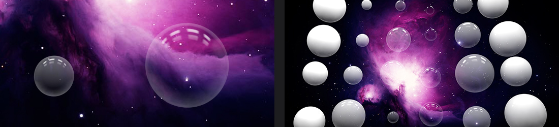
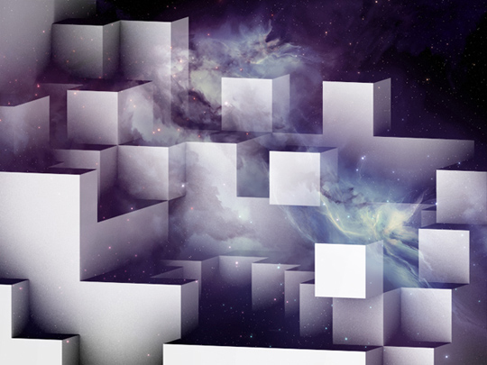
The combined sphere image shown over a barely-edited image of space, and a cropped version. To make the black appear transparent I used the "Screen" blending mode in Photoshop.
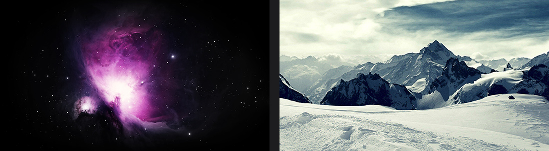
The two main images I used; one of space and the other of a Nordic mountain.
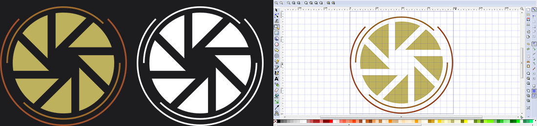
A basic geometrical vector design that I created in Inkscape, inspired by both a camera lens and the fictional Aperture Laboratories logo from the video game Portal. I originally used colour, but found a purely white version was more pleasing.
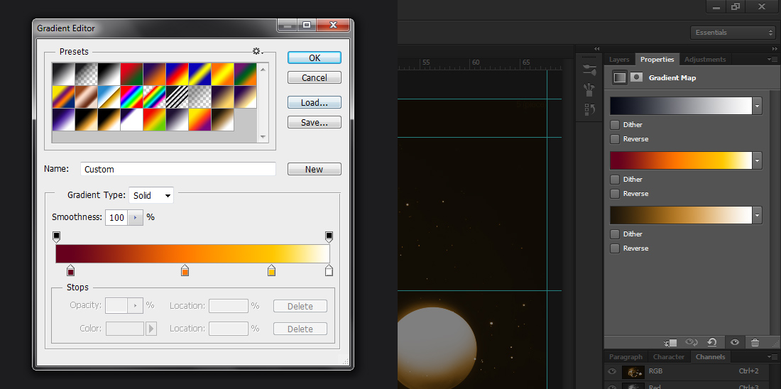
The last step was finishing colour correction. I primarily applied different gradient maps to the entire image, but slightly combined them in other cases to create the three final images. Of the three, I consider the middle version to be the main piece, and the other two to be alternatives.
Investigation 6 - Sphere Investigation
Before moving onto my final piece designs, I made a small investigation partly inspiring the designs to follow. The investigation's images are shown below.
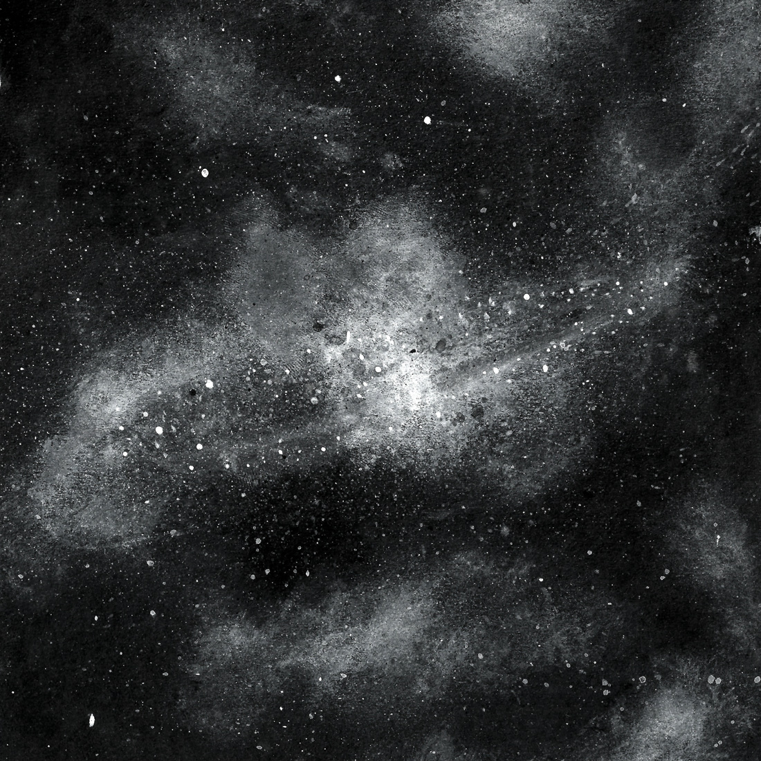
On a black, 12cm square of card, using white acrylic paint and a thumb, I created smudges of cloud. When I was happy, I began flicking paint using a brush to create the stars. The image above has been altered in Photoshop.
I created a sphere in Cinema 4D, and a close-fitting box around it. The main focus was on the materials, lighting and rendering, as opposed to actual content.
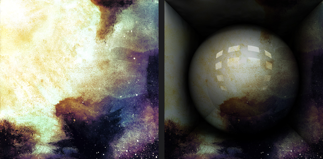
Using a paint brush and water-colours, I made an image of space on a square piece of black card. I scanned this into Photoshop, made minor colour-correction tweaks and tried to combine it with the render of the sphere. I didn't find the result rewarding at all, however.
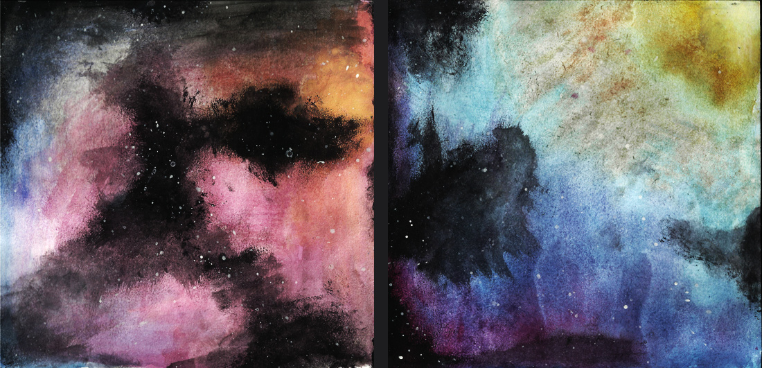
Two water-colour images intended to look like space. Due to the fact black was added after the colour, I don't think enough was applied, and the image is more space-clouds than space. Hover above the image to view it as scanned, before colour tweaking.
Five-Minuters
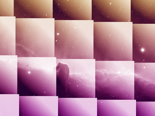
In order to gather ideas about bringing typography into the project, I made a series of small square pieces in space backgrounds. Each took around five minutes, and none any longer than ten.


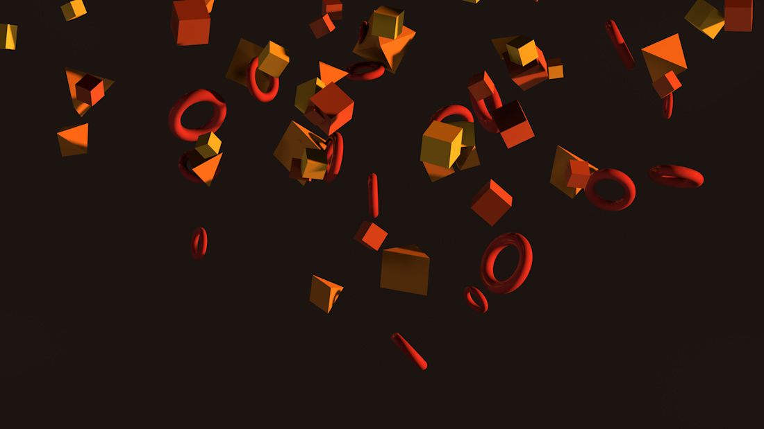
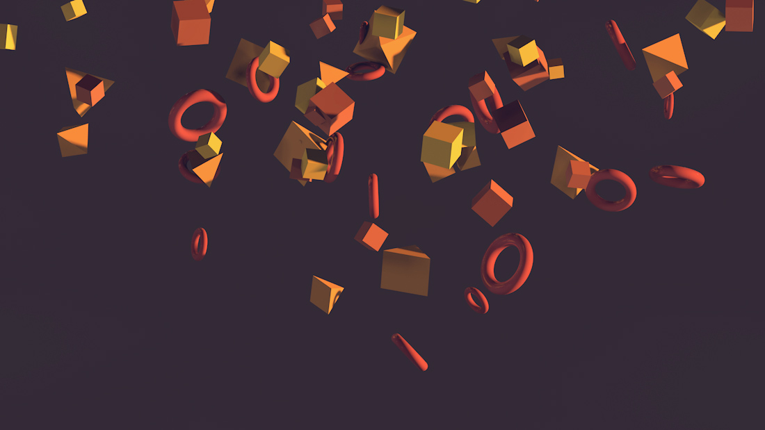
The following are the images that were either rejected or were merely renders.


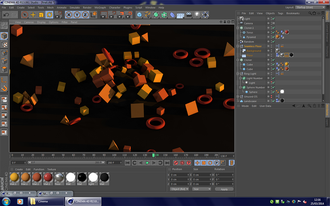
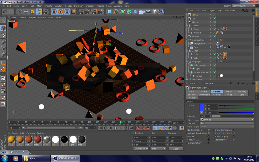
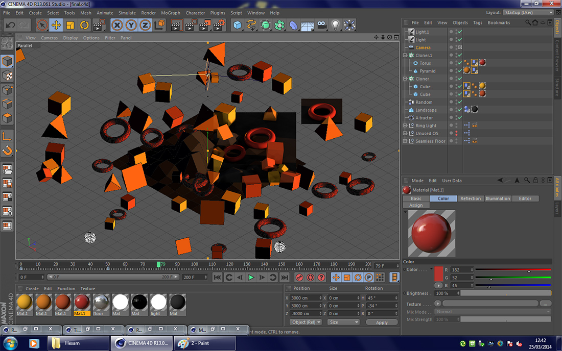
First Design for Final Piece
The first design for my final piece.
The original render for this design; without the image of space or colour correction on the 3D elements.
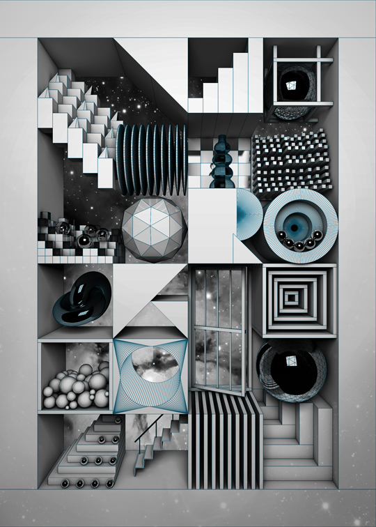
Second Design for Final Piece
The original piece by Pablo Alfieri. One of the biggest differences is his use of parallel projection, as opposed to the perspective projection I used.
One of the final images of my second design, comprising a series of 'modules' as I called them.
Slideshow showing the primary view of the piece as I added the items in each module.
Slideshow showing different versions of the final piece. Some, like the one shown against Alfieri's, were made with a stronger intention of emulating my artist's work.
- The shaded render with reflections was combined with a medium-beige and dark-purple wireframe render using the 'Screen' Blending Mode in Photoshop.
- After doing the same as with the first, I erased the wireframe in places on the torus. I also adjusted the wireframes contrast and saturation to ensure it blended smoothly, decreased the saturation on the main render to remove the blue from the reflection of the galaxy, and increased the contrast and brightness of the entire image.
- On the third image, I first inverted the wireframe image and used the 'Multiply' Blending Mode in order to get a black wireframe. I then used a gradient map to change the darkest parts of the image to a desaturated orange and the brightest parts to a light yellow.
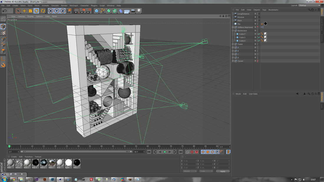
A screenshot of the piece as it appears in Cinema 4D, the modelling software I used to build the scene. The green lines represent the views of the cameras, showing some of the angles I rendered from.
Final Piece
For the final piece, I decided to take a different approach to the texturing of the model. I thickened the frame of the piece and pulled some of the modules forwards to give the piece more depth. Previously, I had used only a small selection of materials – chrome/mirrored metal, matte white, glossy white and glass. I created a series of matte and luminous textures in order to mimic one of Pablo Alfieri's other pieces, shown further below.

The piece, without colour correction.
A slideshow of alternative versions to the final render. These were primarily in experimentation.

Piece by Pablo Alfieri, which I attempted to work in a similar style to.
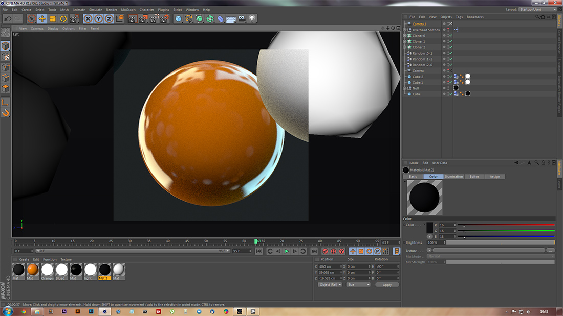
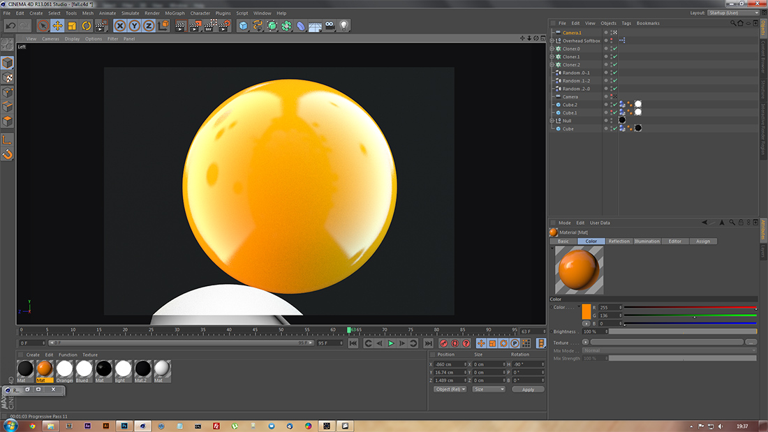
A render of spheres with each of the materials I used in the piece applied.
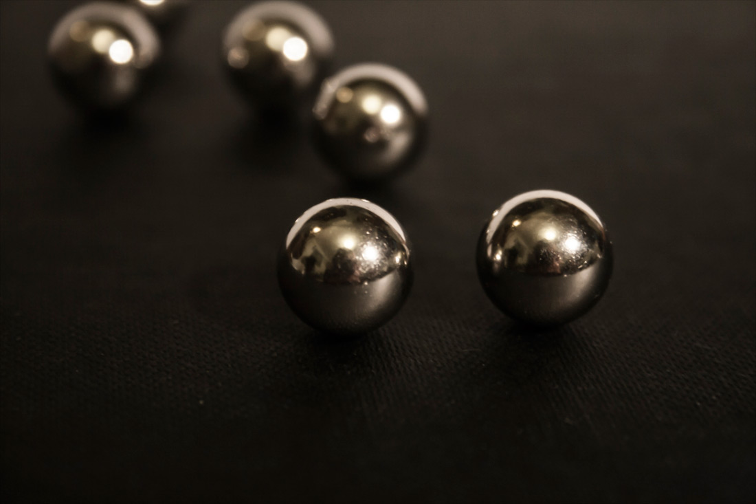
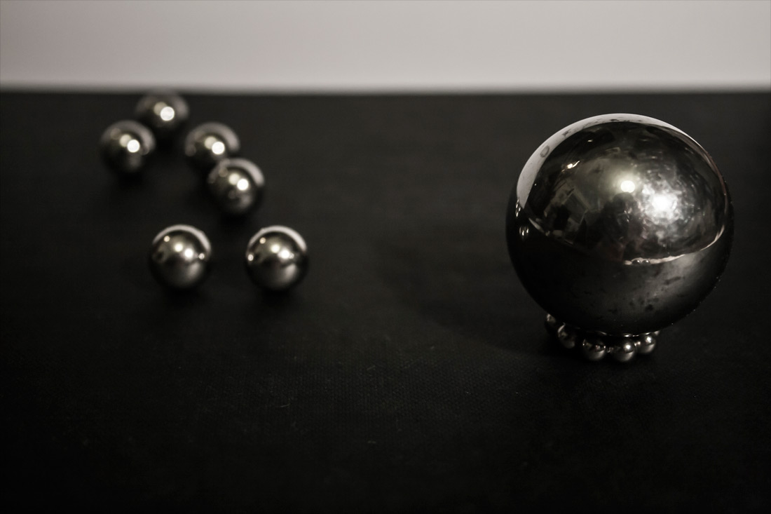
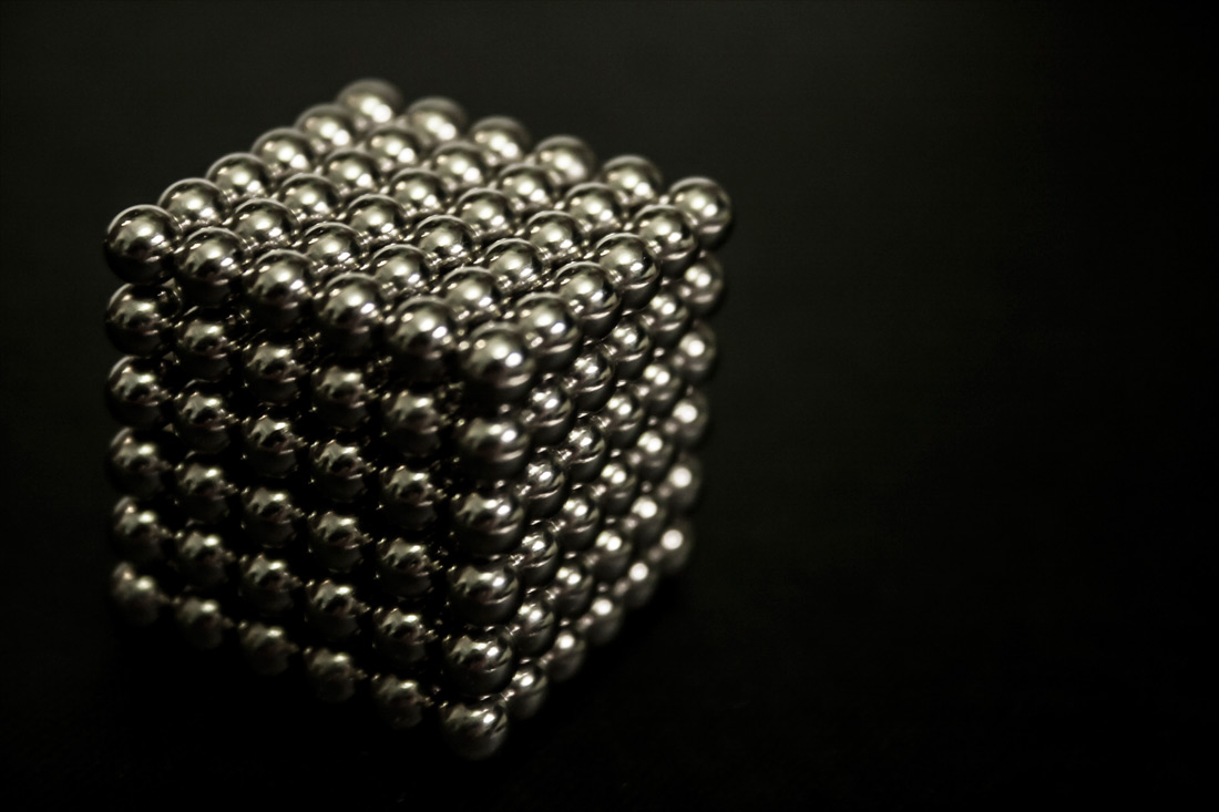
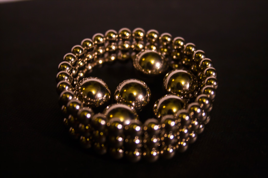
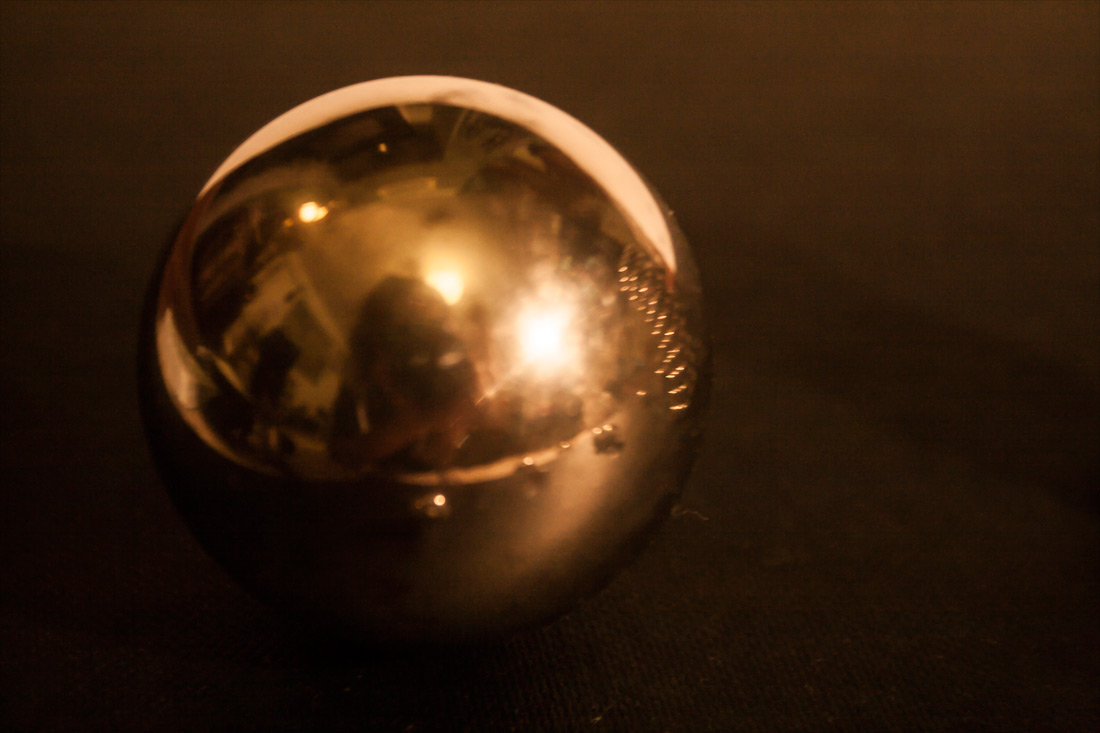
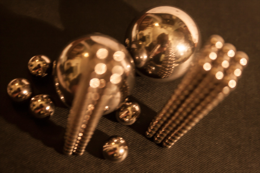
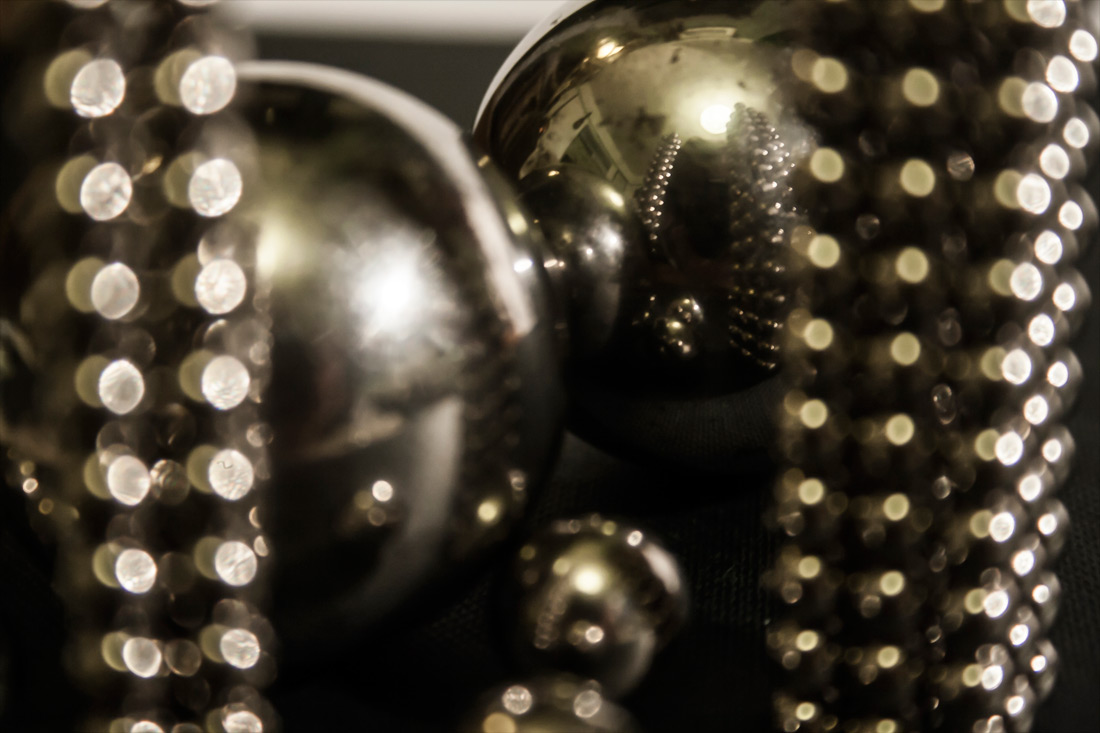
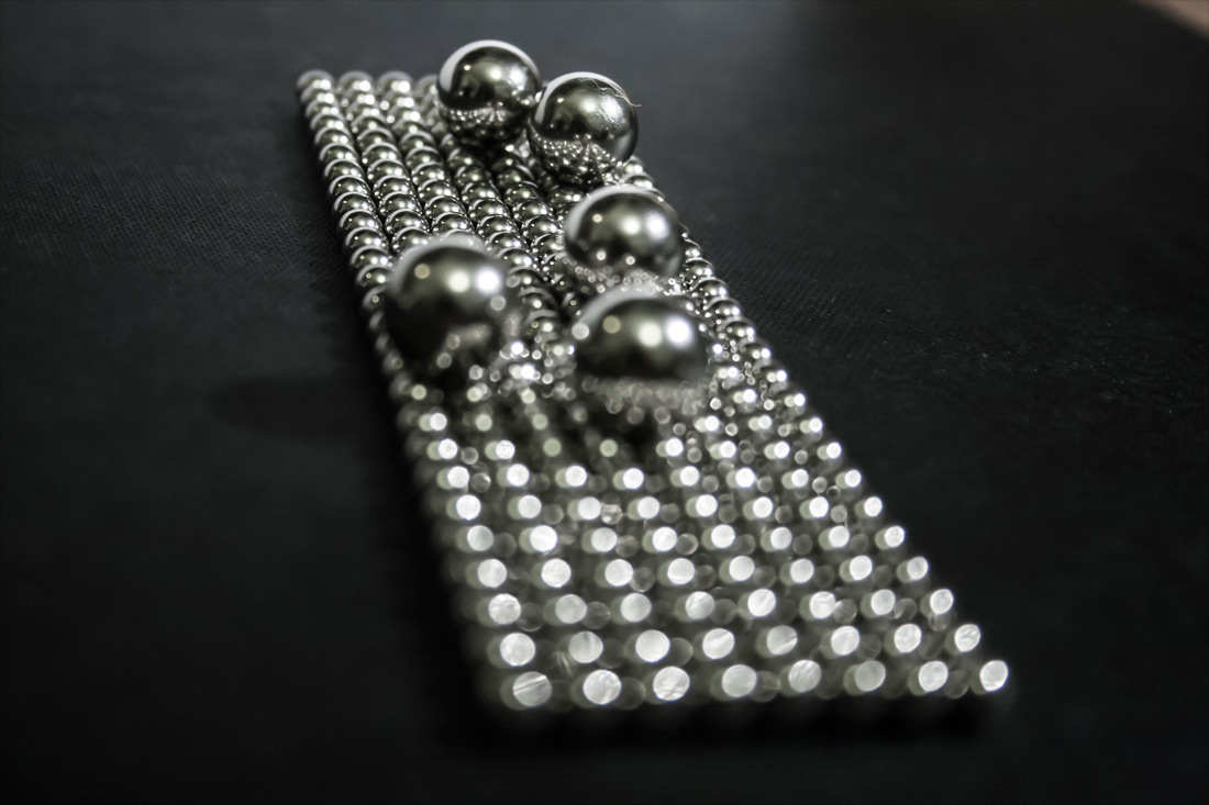
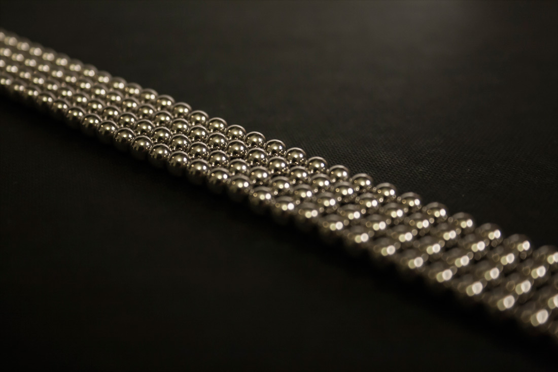
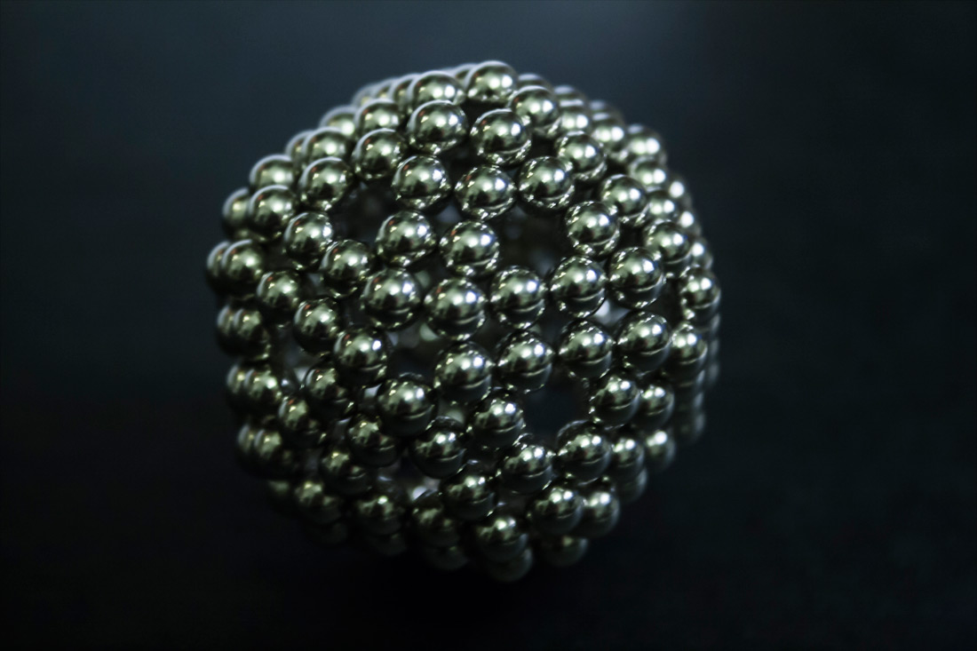
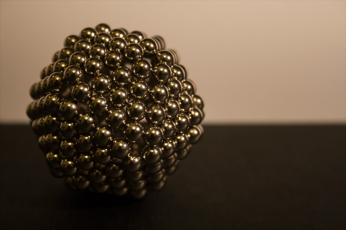
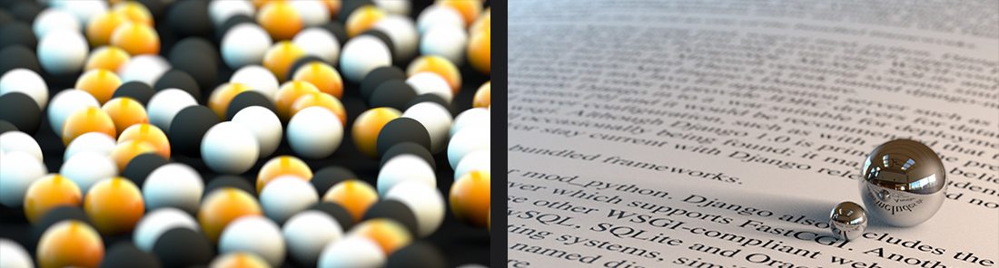
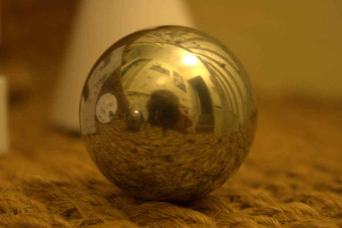
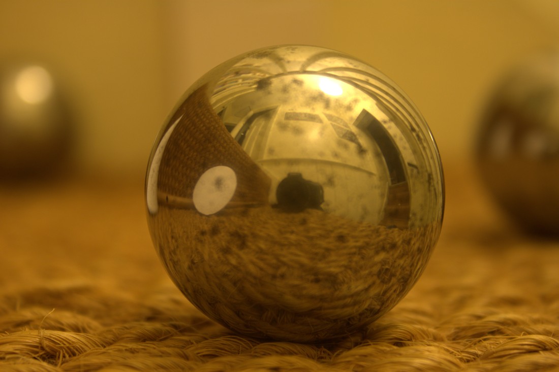
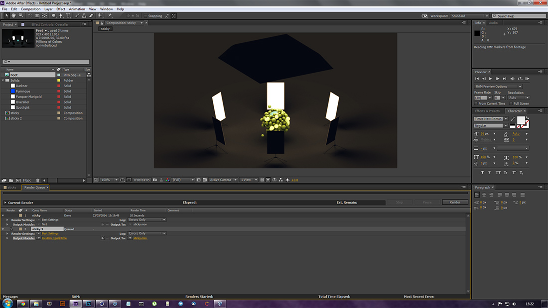
Photography
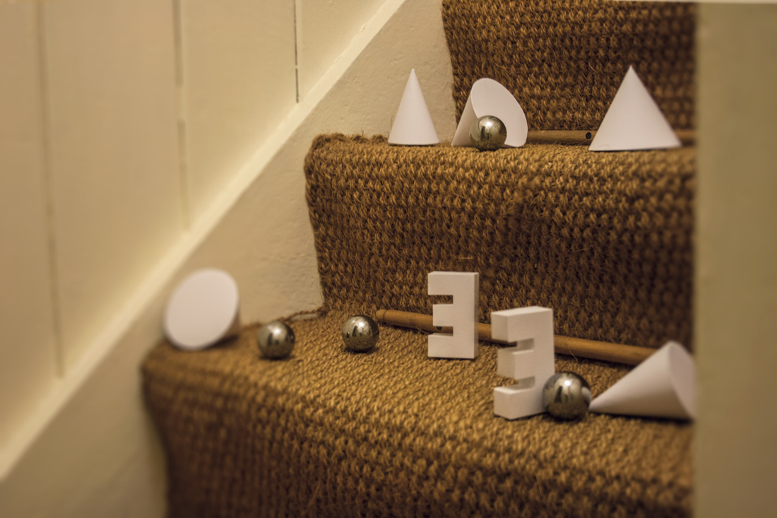
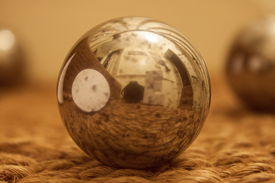
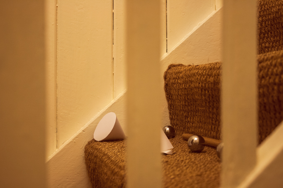
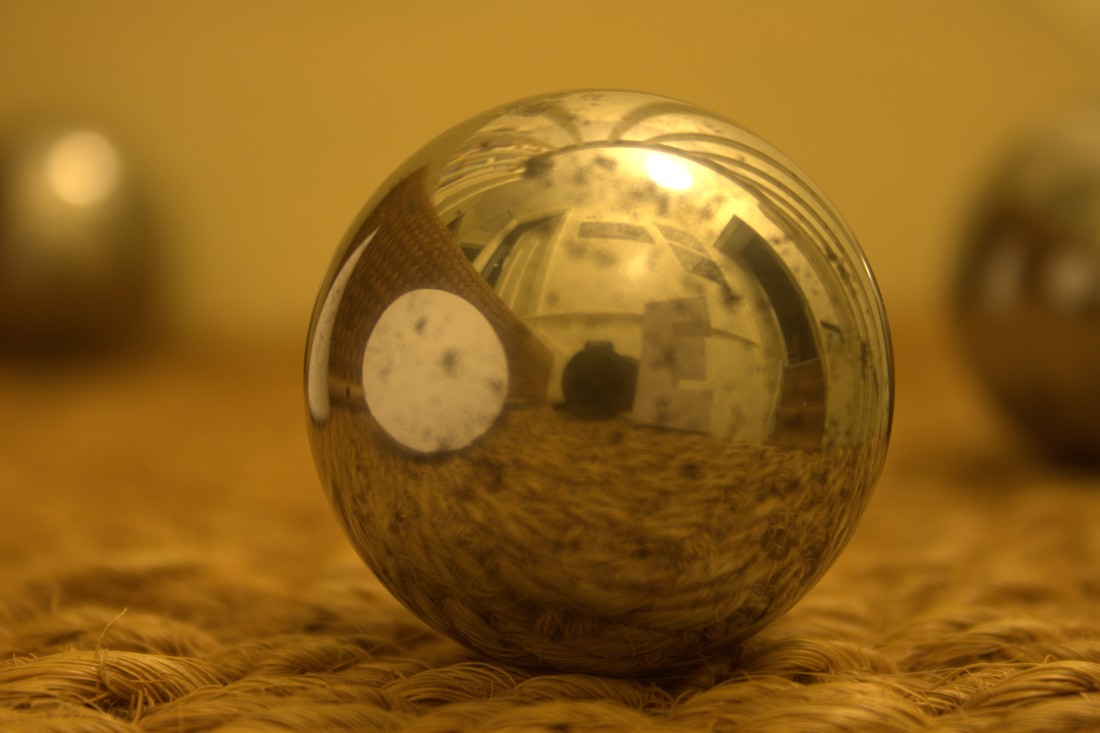
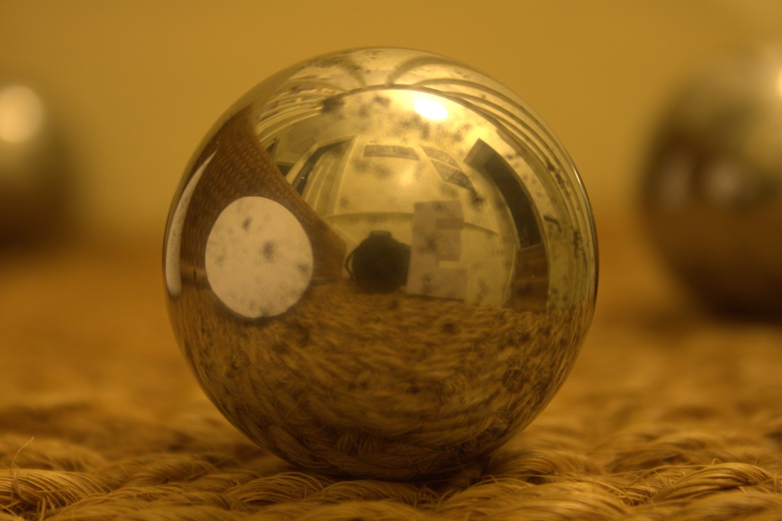
In an attempt to emulate the chrome-surfaced spheres in the second design, I decided to take photos of neocube magnets and some other reflective objects I could find. These photos received minimal editing in Photoshop consisting only of simple colour adjustments.
That's Unit two; click Unit 3:... in the sidebar to proceed.
Artist Research
In order to find inspiration and a basis for my project, I started by investigating other artists who made similar work to that which I had in mind. I found Nick Campbell, who I focussed on. I immediately made some investigations by emulating their work.
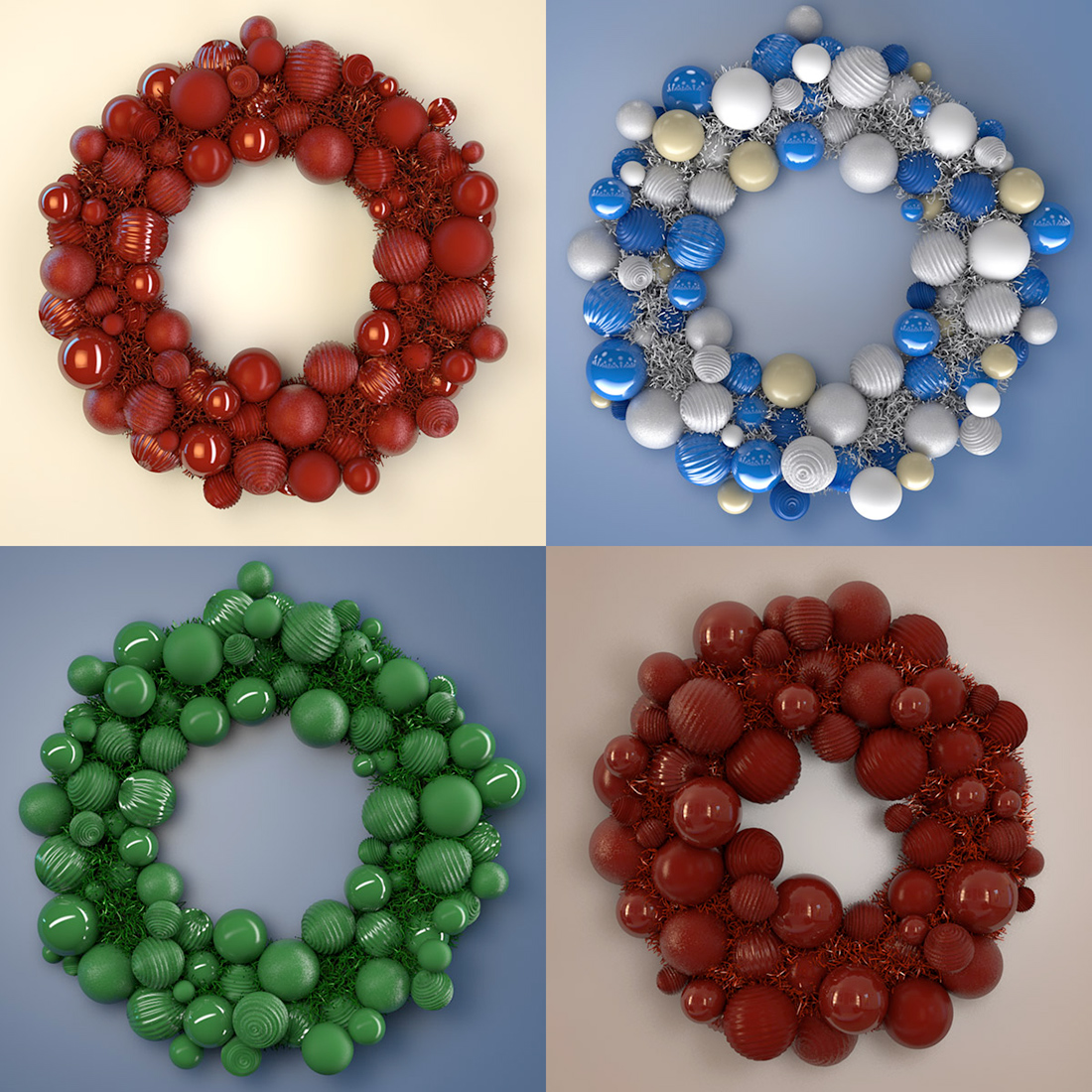
A festive wreath design by Nick Campbell, also known as the Greyscale Gorilla.
Four shots from an animation Campbell created as part of a Cinema 4D tutorial. This animation heavily influenced my final designs and final piece.
The pair of images above are both creations of Campbell's. The images above and below it are creations of my own.
Side by side: a still from the Attractor investigation and a piece by Campbell, as part of a Cinema 4D tutorial.
The render to the left is an example of depth-of-field that I created during the development of the Fall investigation, and the image to the right is part of depth of field tutorial by Campbell.
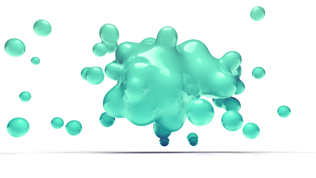
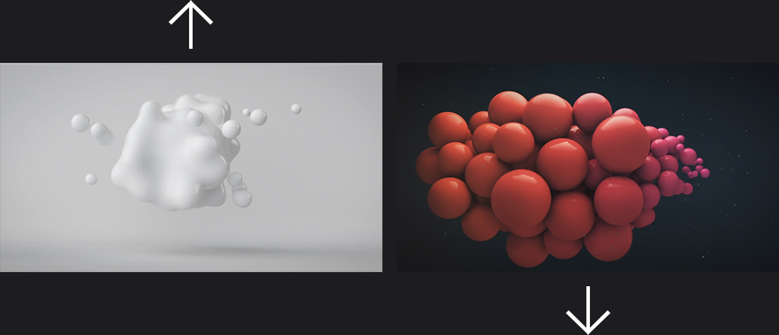
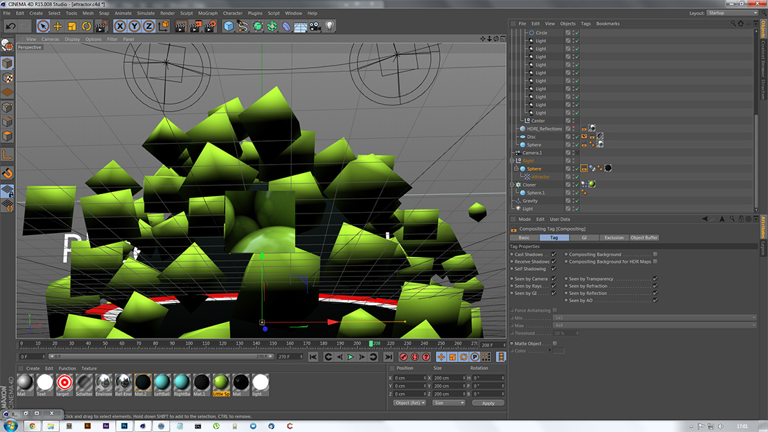
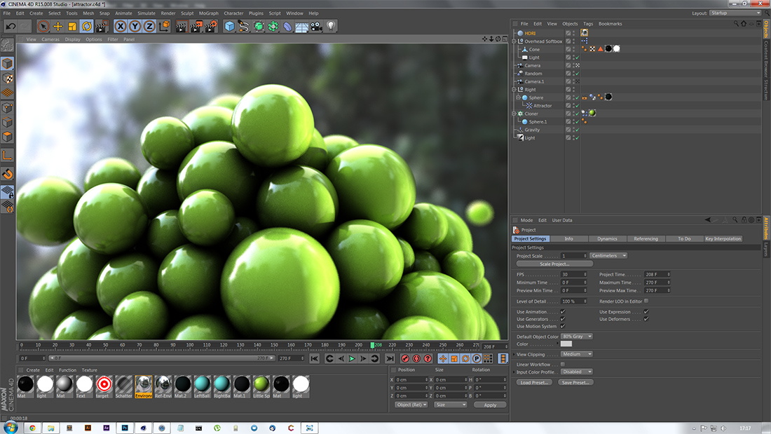
Investigation 1 – Attractor
The first investigation consisted of a large sphere in the centre of the scene. Inside it I placed an attractor object, giving the sphere the illusion of a gravitational or magnetic field. I then added a series of smaller spheres that would fall and become attached to the first. I also made an animation with two separate attracting spheres, between which the smaller spheres move.
The first render of the investigation, plus colour correction in Photoshop. I wasn't pleased with the result of this because of the reflections. I solved the problem and moved to the next render.
What I thought would be the final render also did not work out, however. This time the reflections and shadows didn't seem right, and I initially did not know why.
I realised I had left the reflections at 100% brightness, which had led to the over-contrasted previous image. I fixed this and rendered again.
Another render, that was left unused. This was because Cinema 4D rendered the wrong frame as a result of using the in-built physics simulation. I found a solution to this problem for later renders.
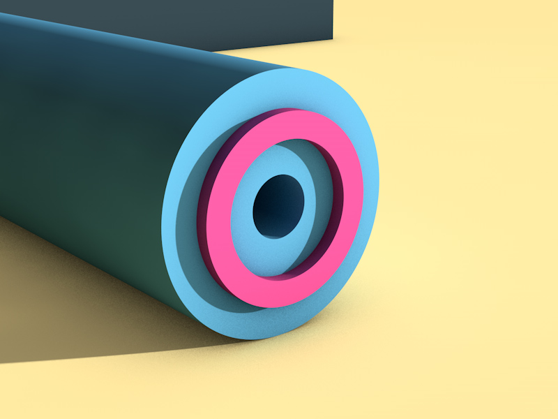
Investigation 2 – Interlock
Once upon a time in a Tesco far, far away I bought a small wooden puzzle set. It included six small cuboids, all unique, and with particular sections cut from them. They fitted, and indeed still do fit, together to create an almost knot-like object. I decided to remake the puzzle, it having fairly basic geometry, digitally, and animate its construction.
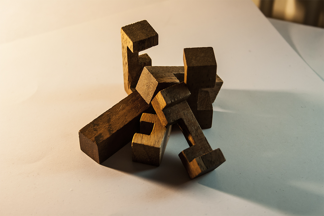
The photo's I took, before they were edited. They have been resized to fit this window.
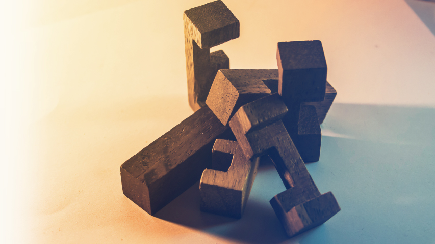
The photos after having been edited. Editing involved colour correction, resizing, stabilisation and compositing. This is also shown as an animated GIF near the end of the project.
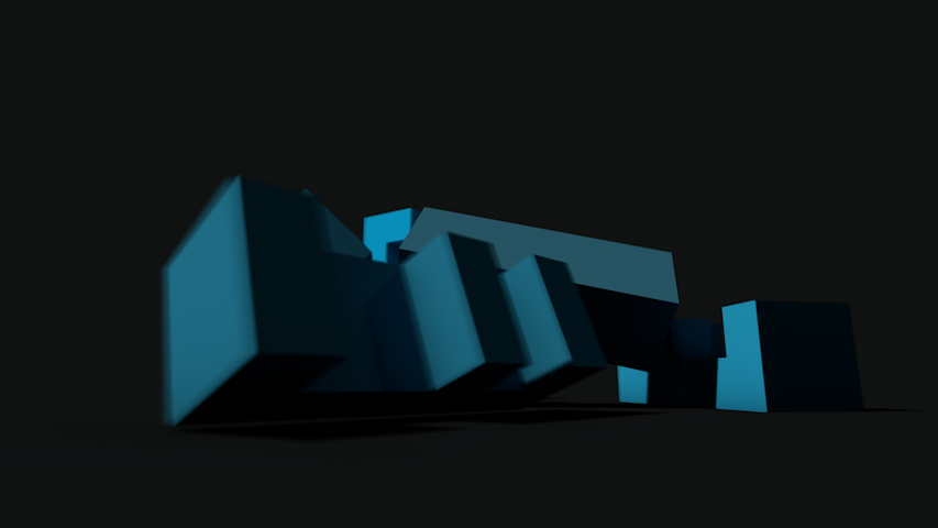
Four frames of a digital version I made in Cinema 4D. The whole animation, plus colour correction, is shown as a GIF later.
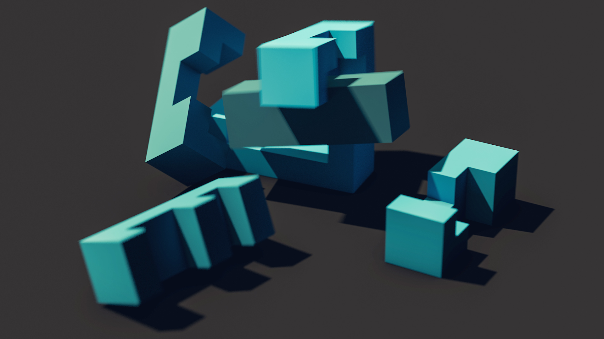
Another still shot of the pieces.
Investigation 3 – Fall
One of the first investigations I carried out was Fall. I dropped variously textured spheres down a ramp (of sorts) that I had modelled. Two large lights at either side provided illumination. The camera was positioned above, pointing down at a slight angle. Depth-of-field was evident here, something Campbell's work often shows too. The animation I created is shown in the Animated GIFs and Videos section later on.
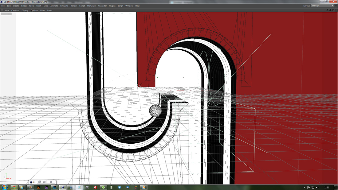
Investigation 4 – Line Rider

A still I rendered during the development of the Line Rider investigation. The actual animation can be seen in the Animated GIFs and Video section further down the page.
Investigation 5 – Loader

A still I rendered during the development of the Loader investigation. The actual animation can be seen in the Animated GIFs and Video section further down the page.
Investigation 6 – Grassy
I started an investigation using Cinema 4D hair simulation to create grass. I planned to roll a ball or something through the grass and for it to leave an impression. This was not successful, however, as I could not achieve the effect I desired.
Investigation 7 – Photography
At various points through the project, I took out my camera and captured photographs relating to the work I was doing. These also inspired the digital work, particularly in terms of lighting, for instance.
Below are all of the photos I edited in any way, typically the ones I found to be the best.
Here are almost all of the photos I took, without editing.

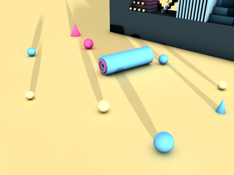
Animated GIFs and Video
On the web, it's possible to use a format of image that allows for multiple frames to be saved and played back from a single file. Many of the investigations above had final, looping clips, and they are shown below.
Animated GIFs of some of the previous investigations. Some may perform slowly, but this is simply due to the nature of GIFs and cannot be avoided.
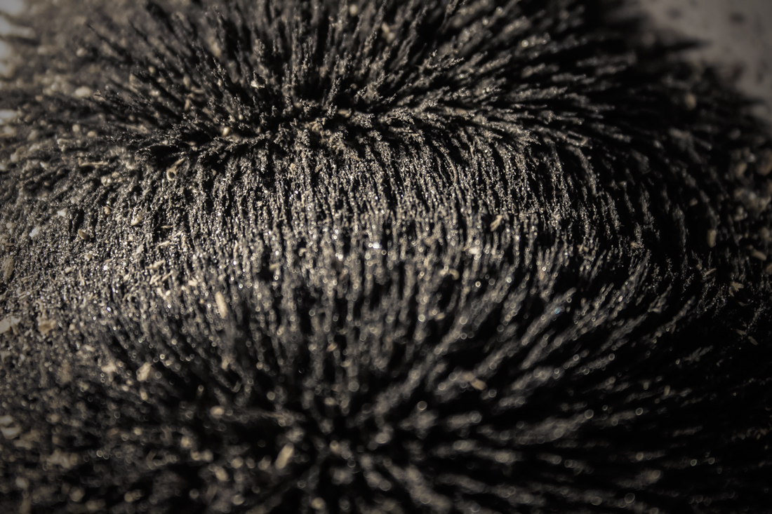
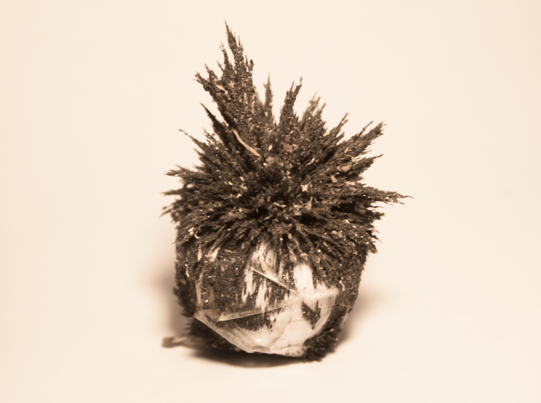
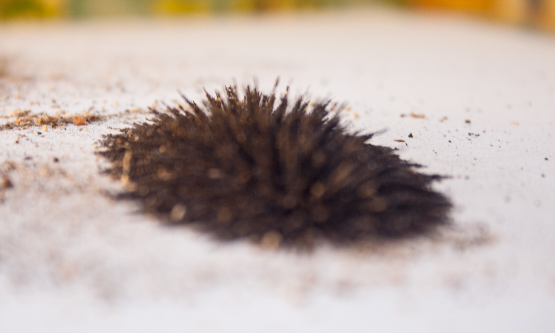
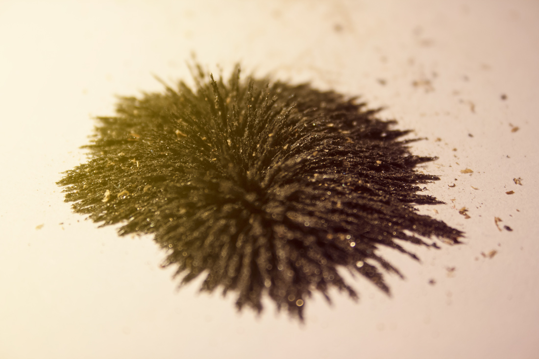
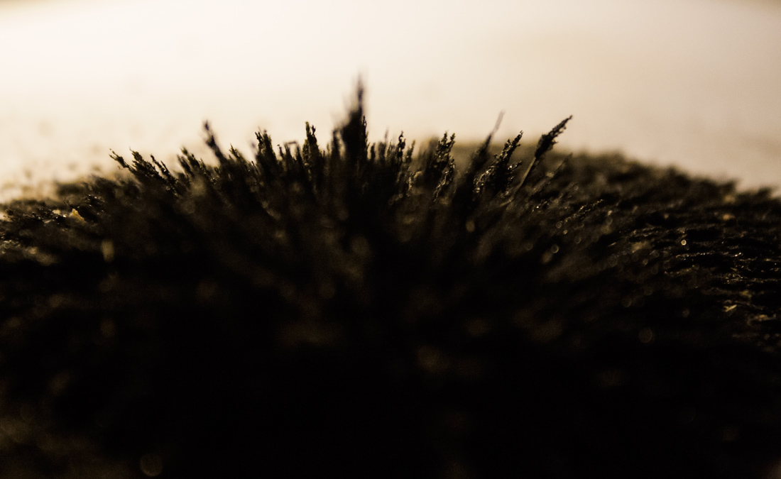
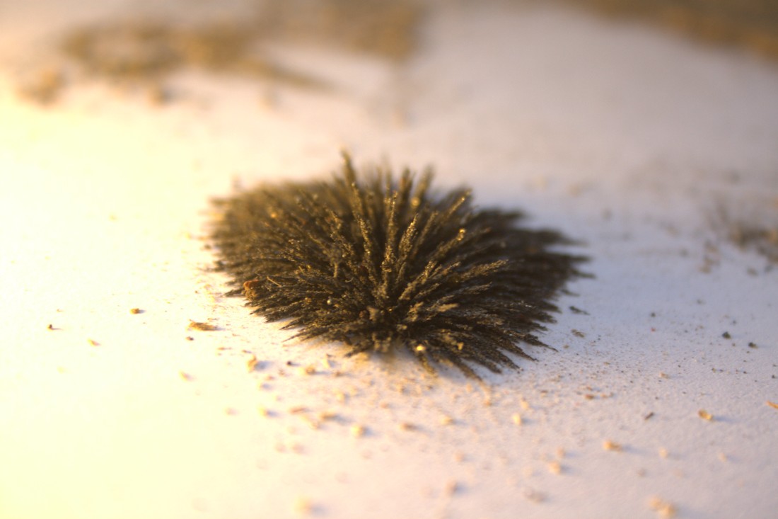
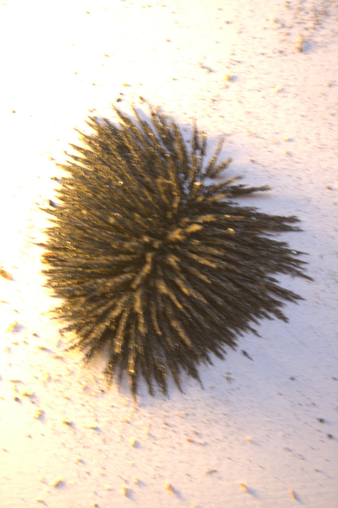
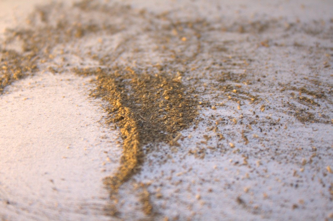
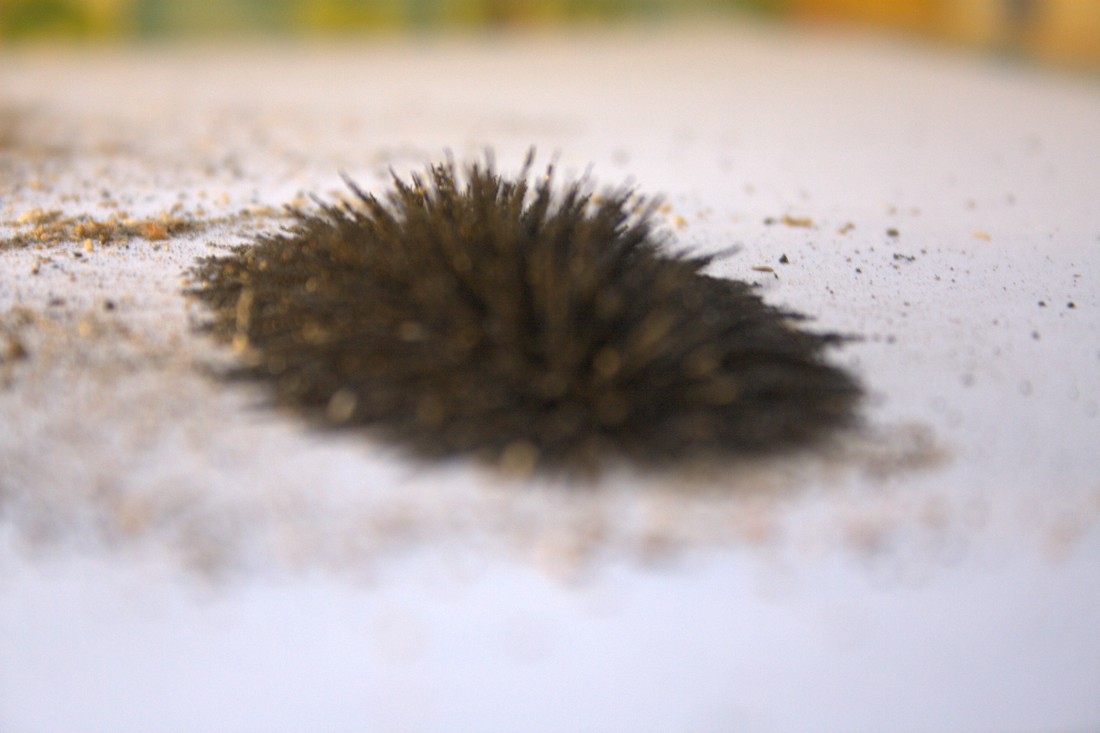
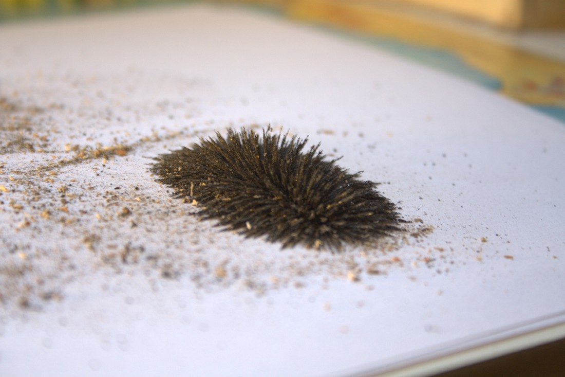
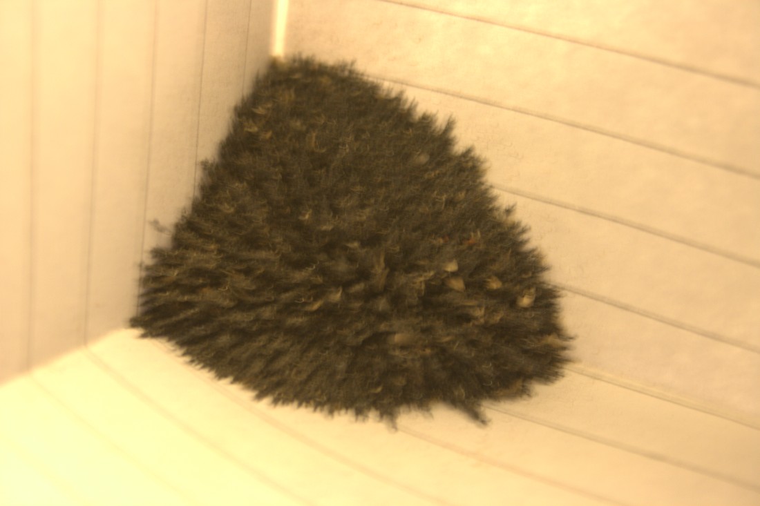
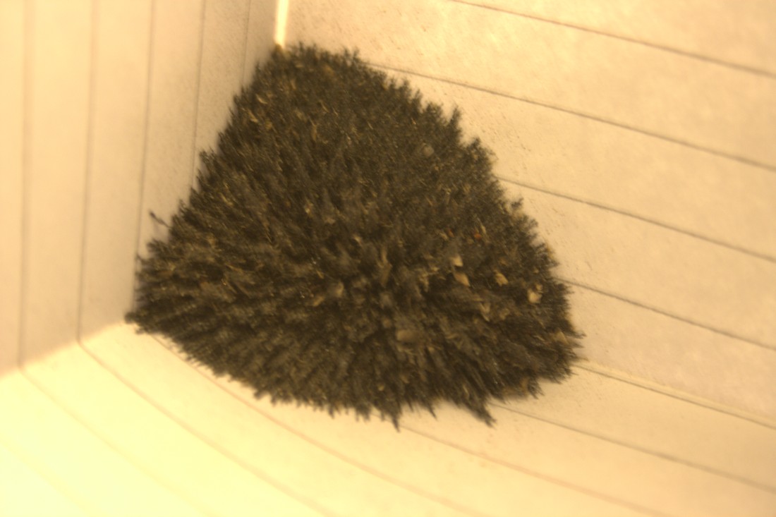
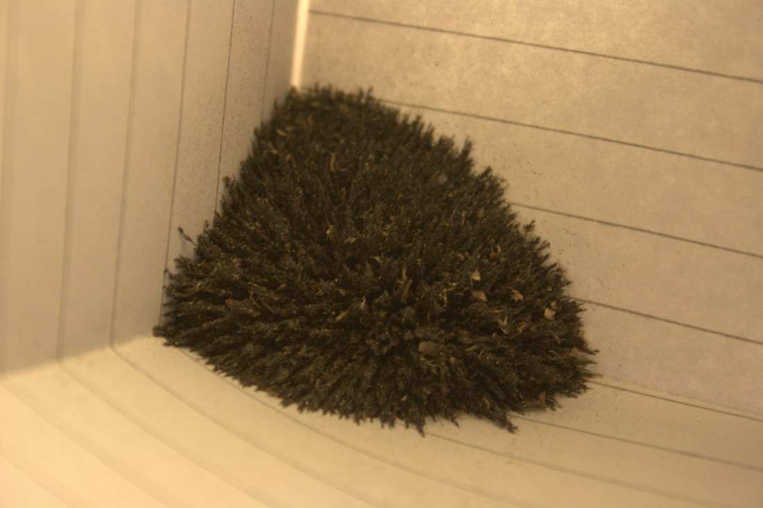
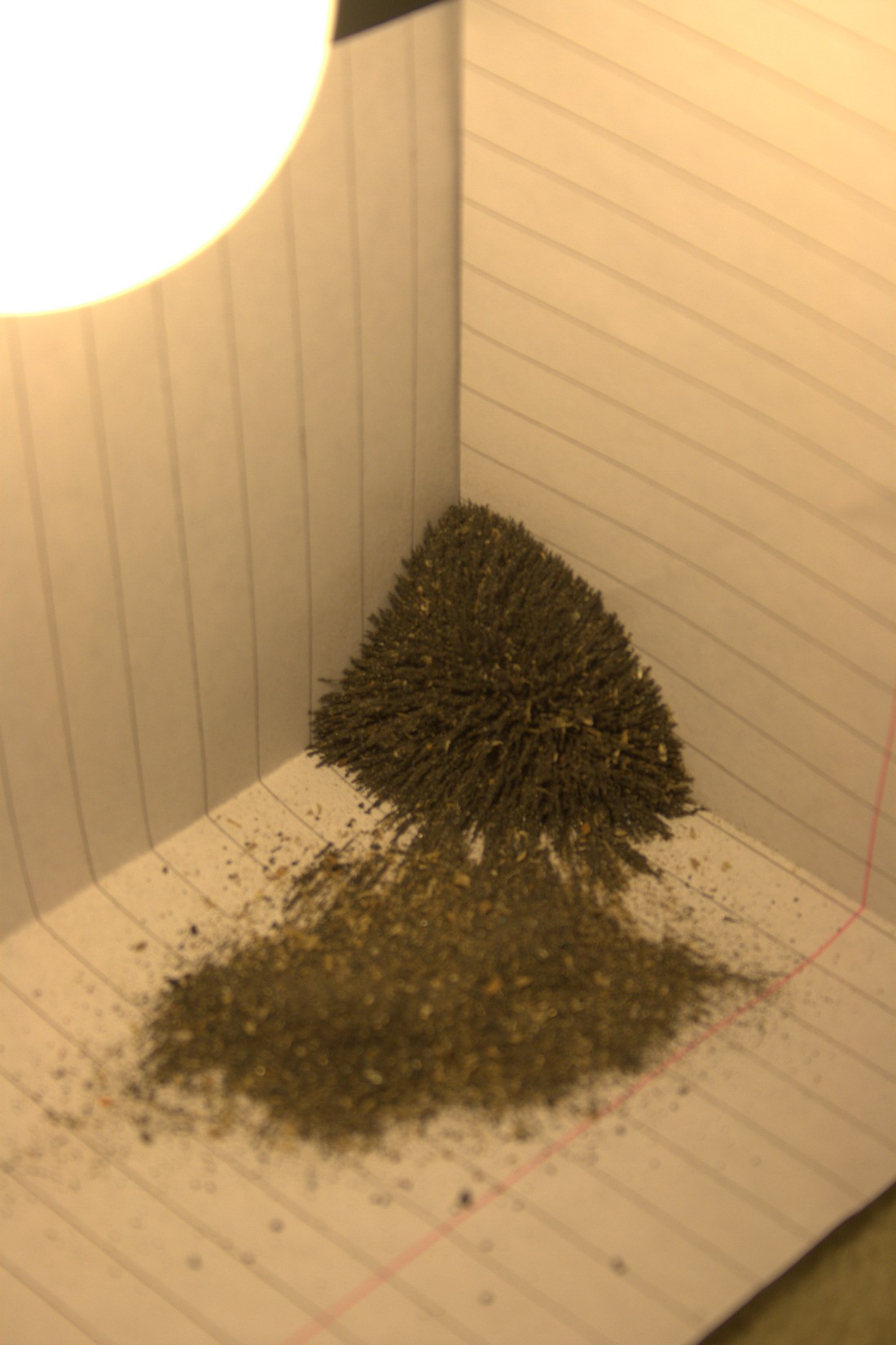
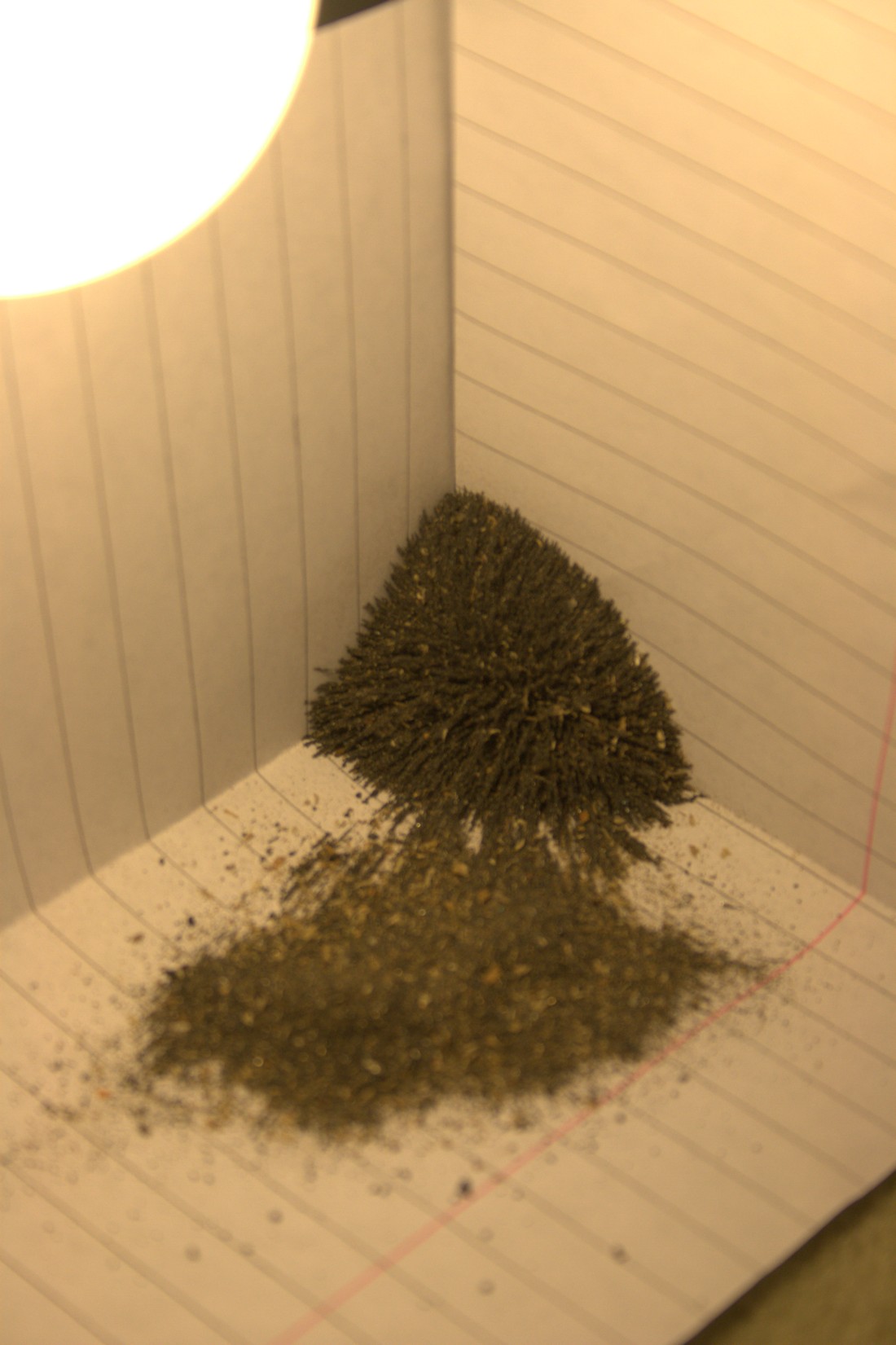
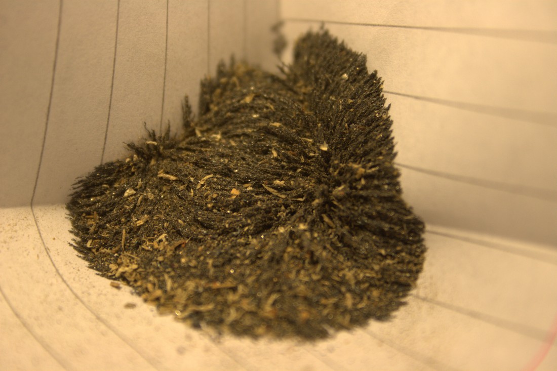
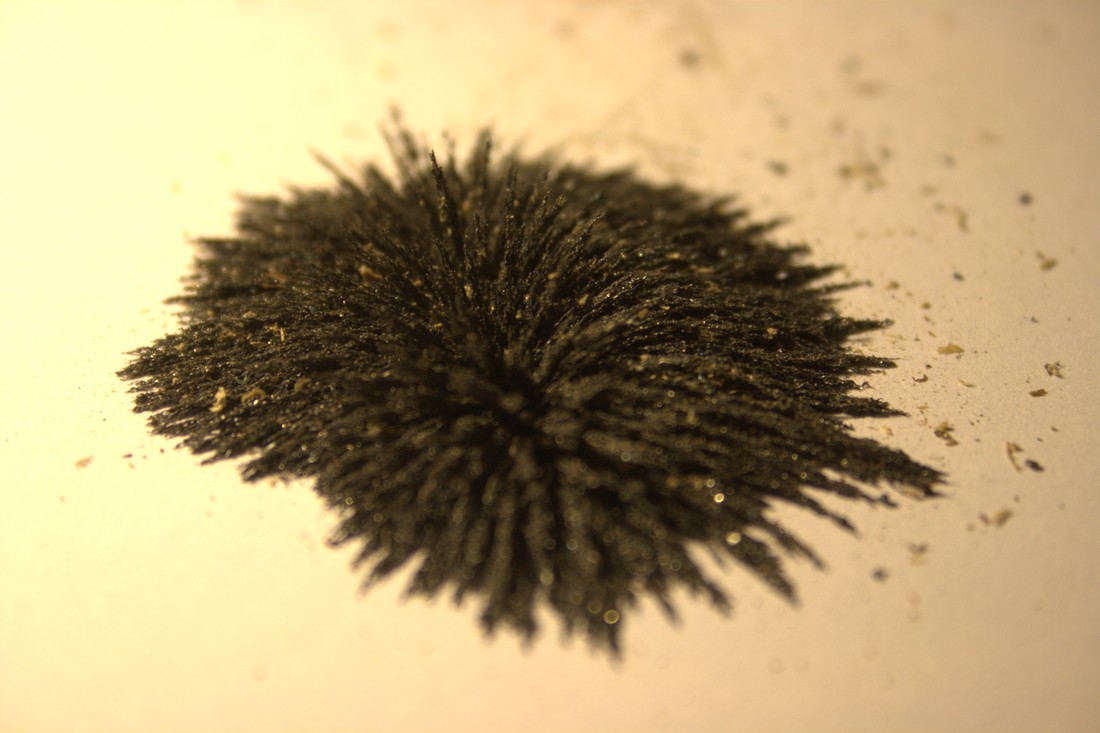
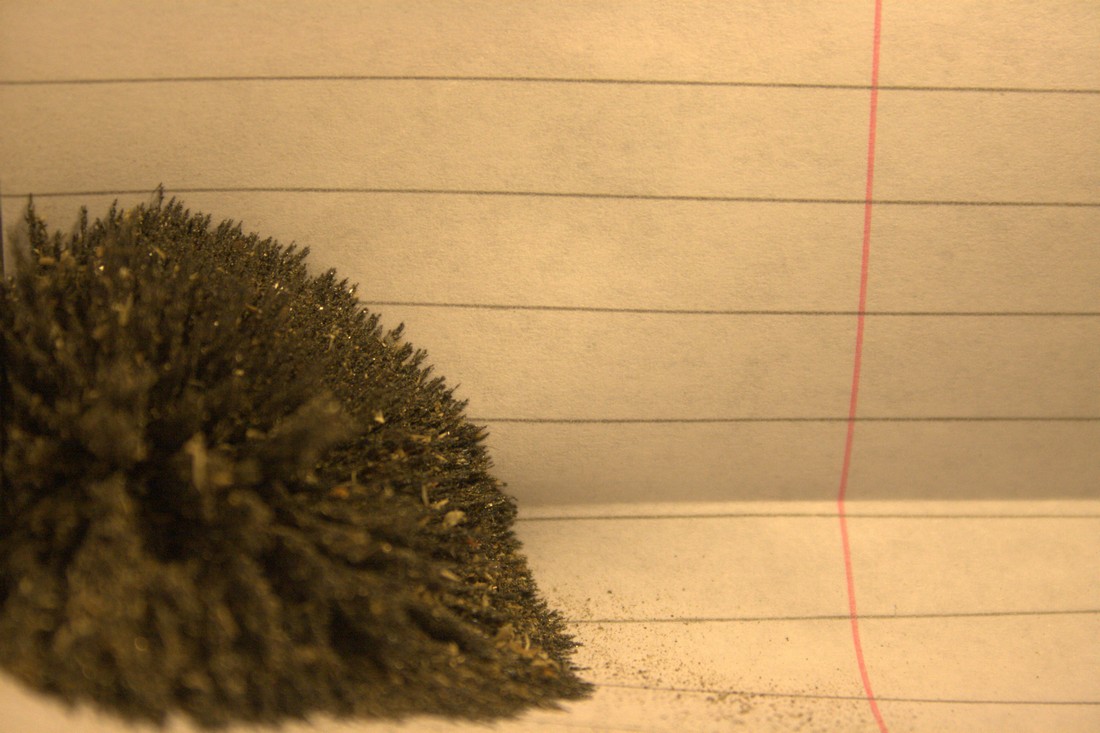
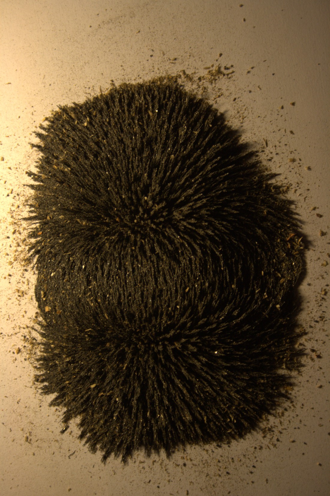
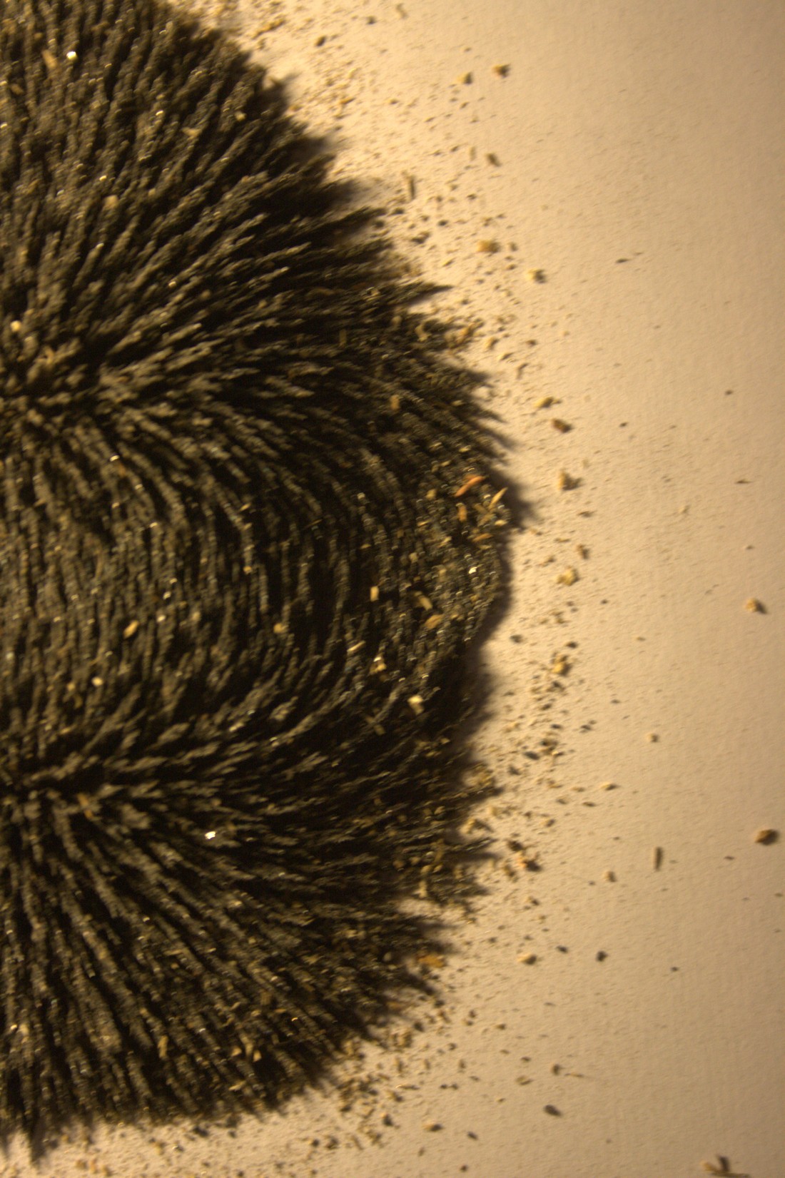
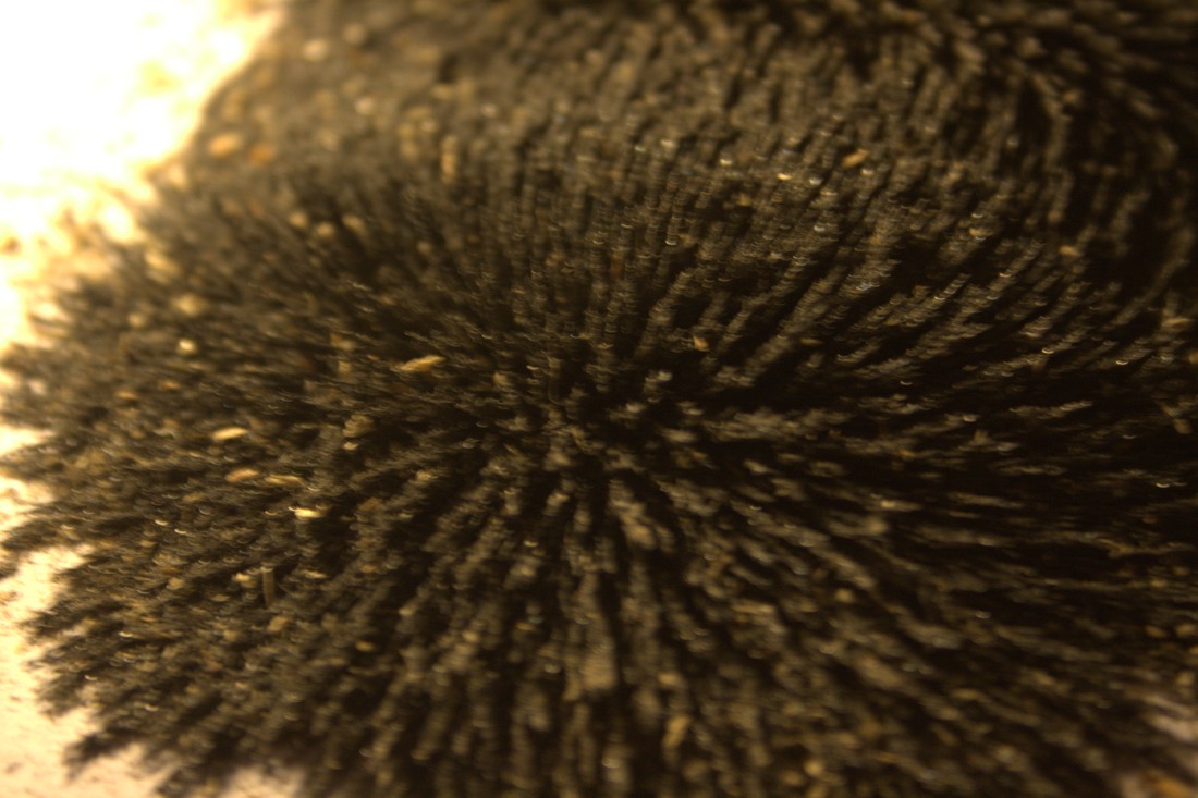
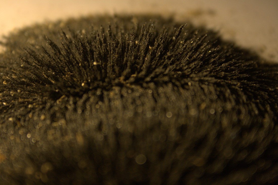
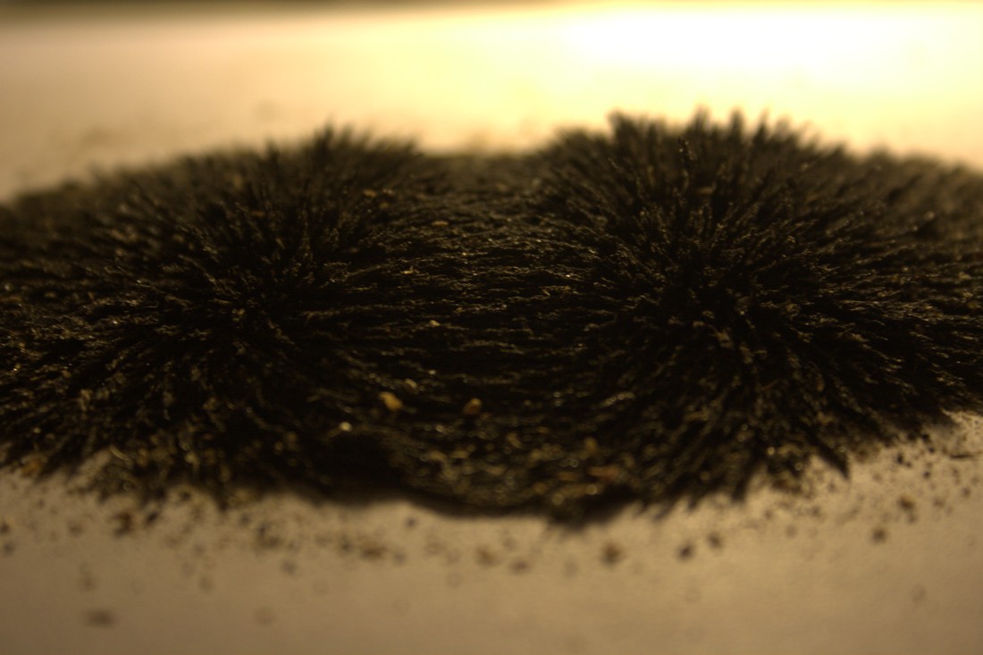
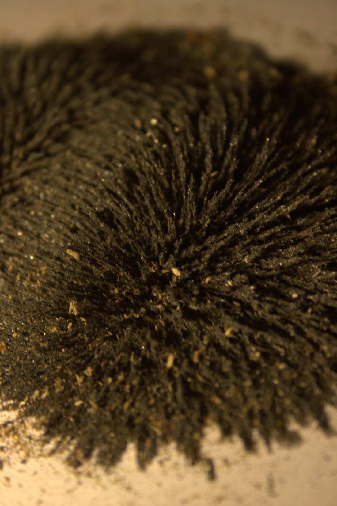
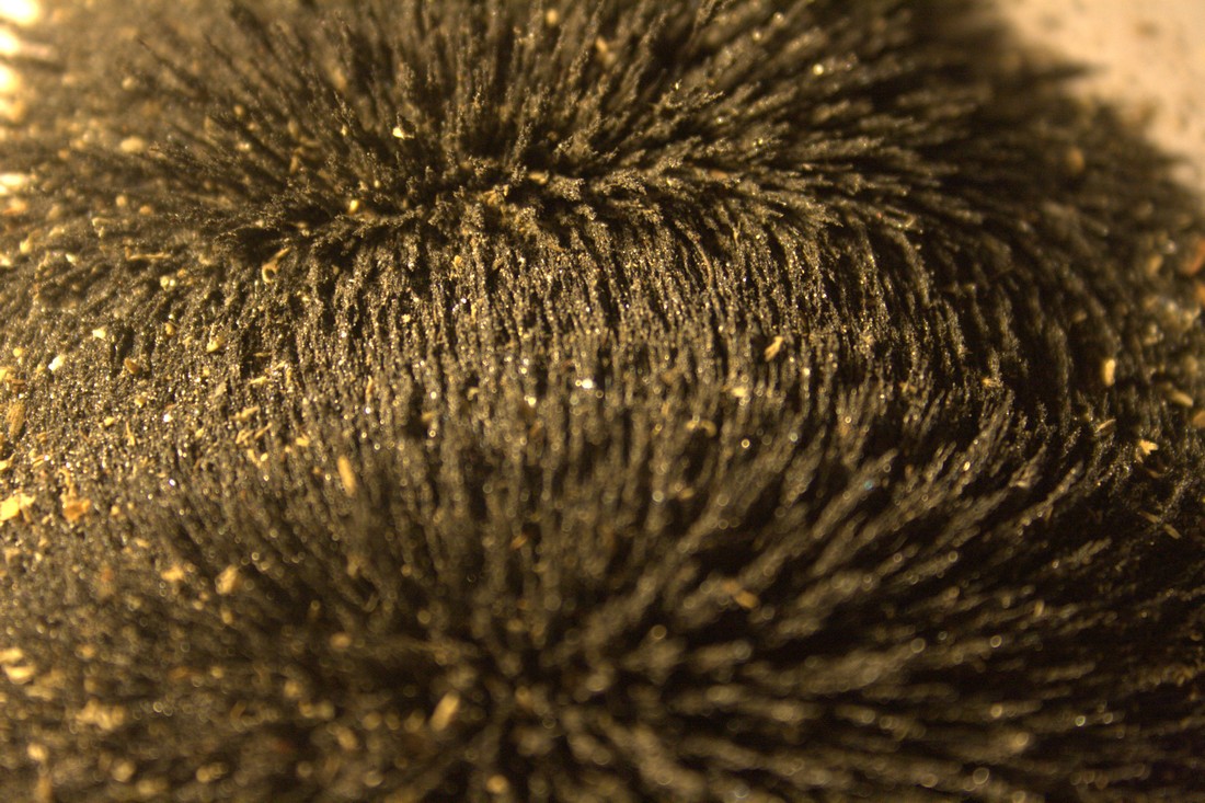
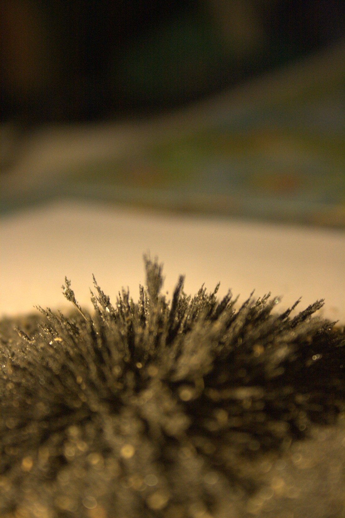
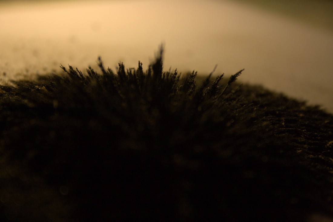
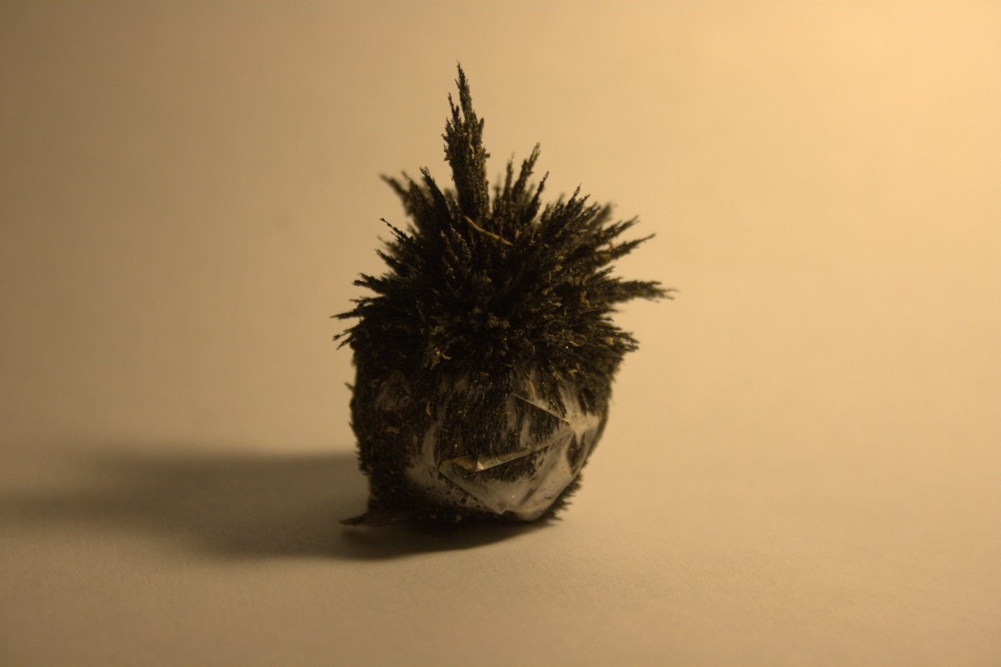
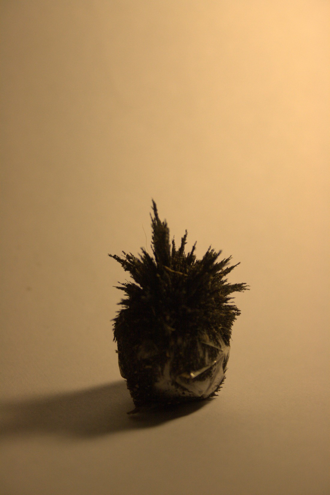
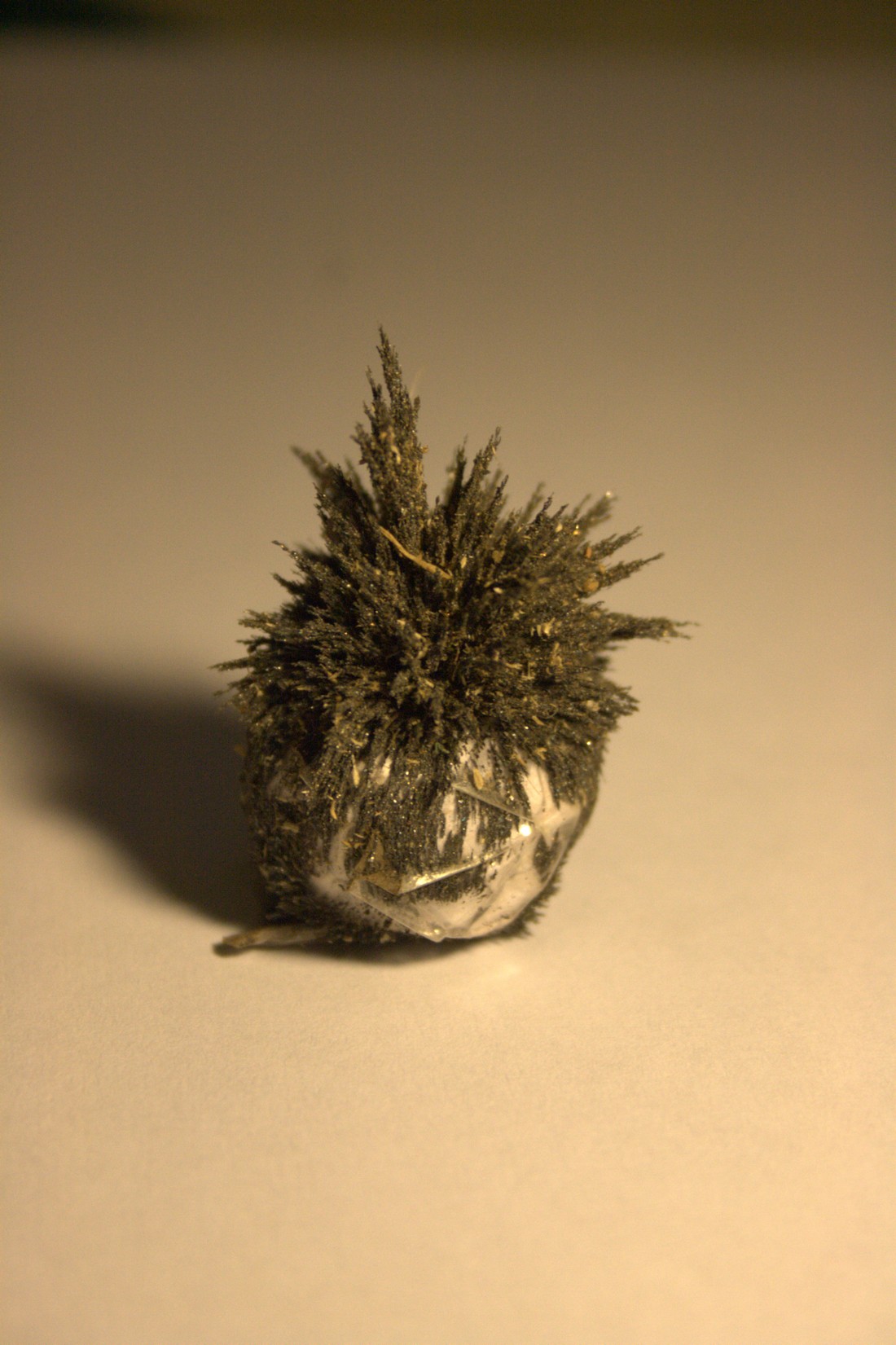
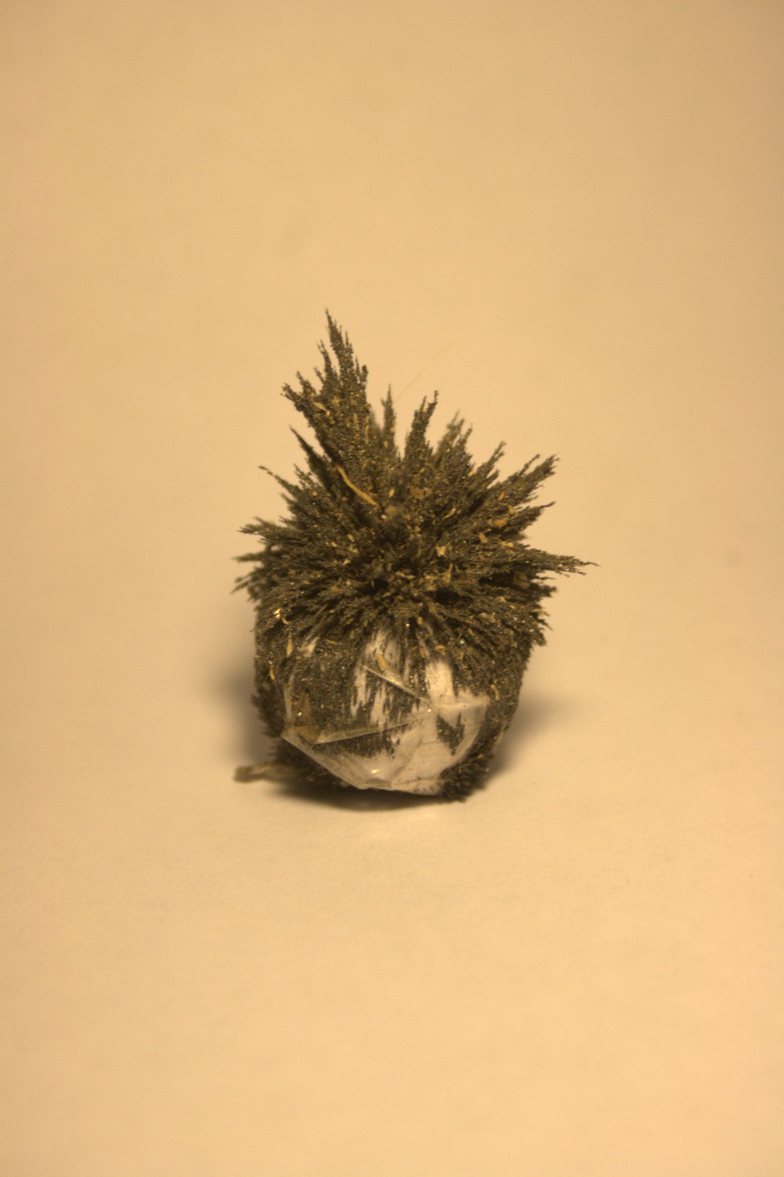
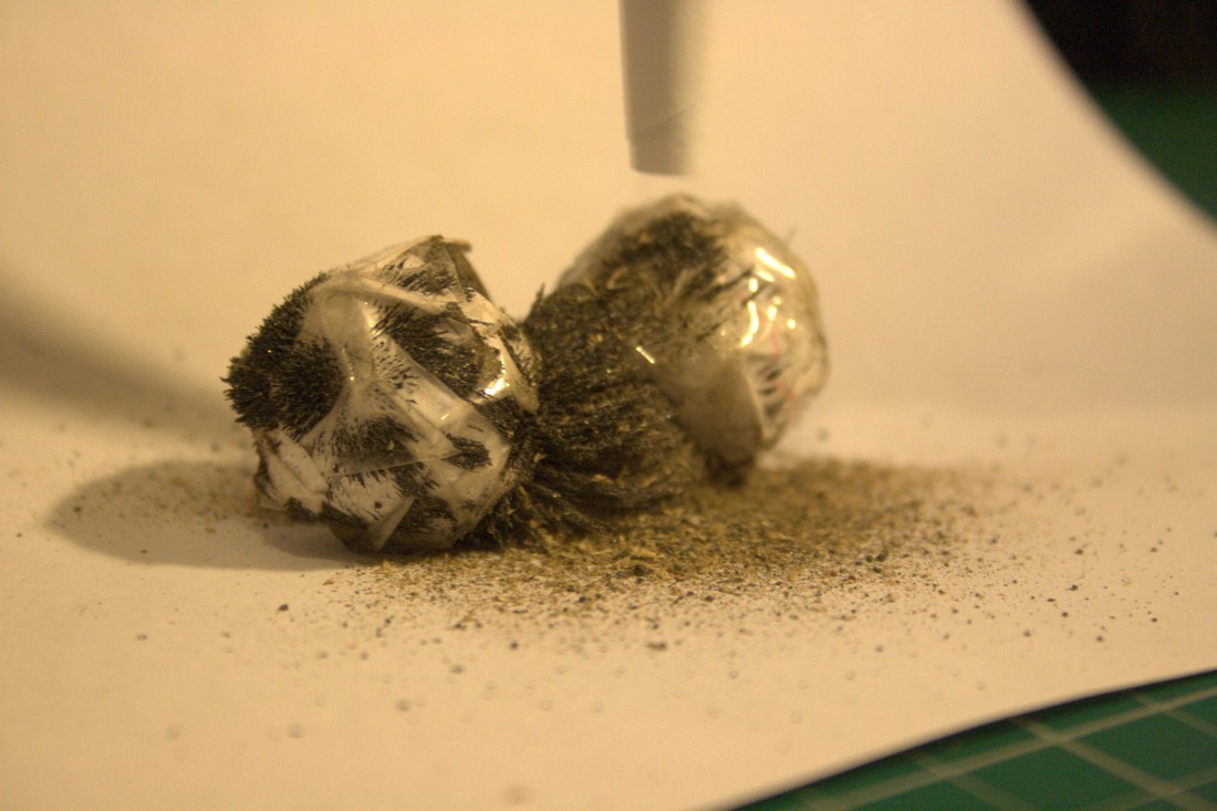
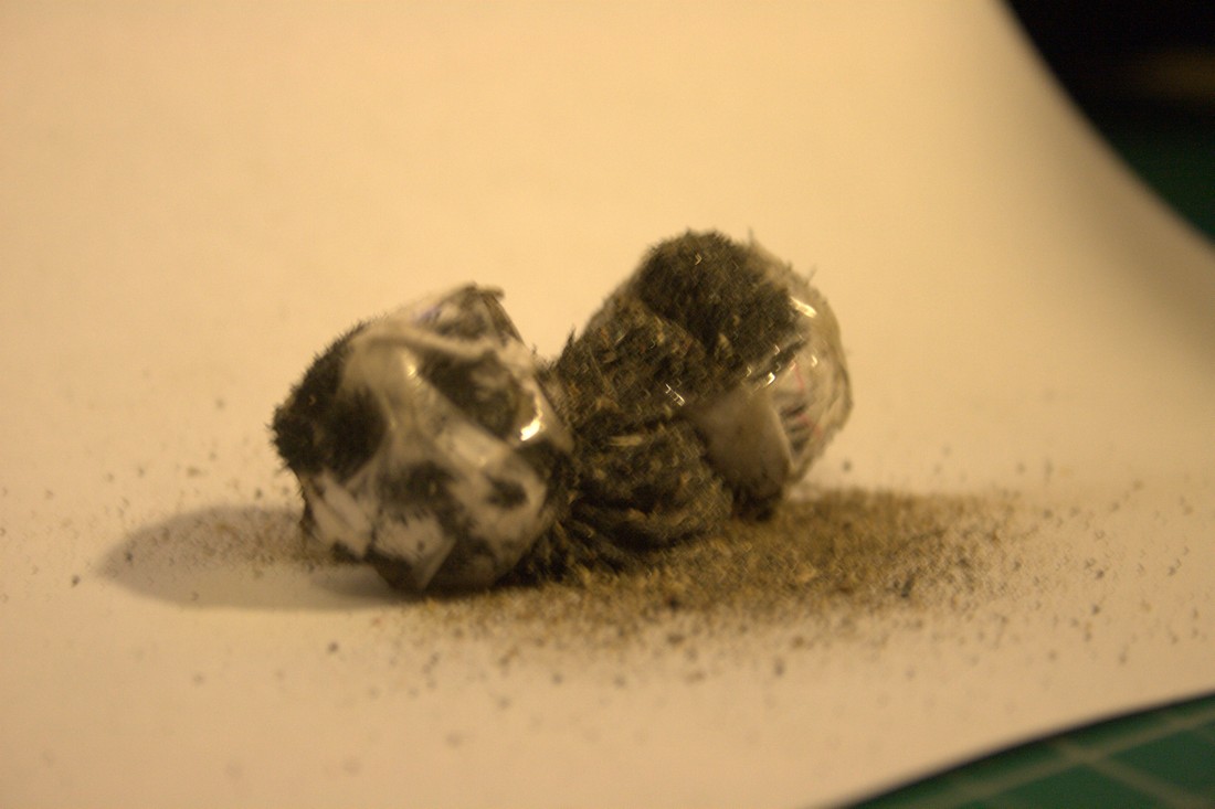
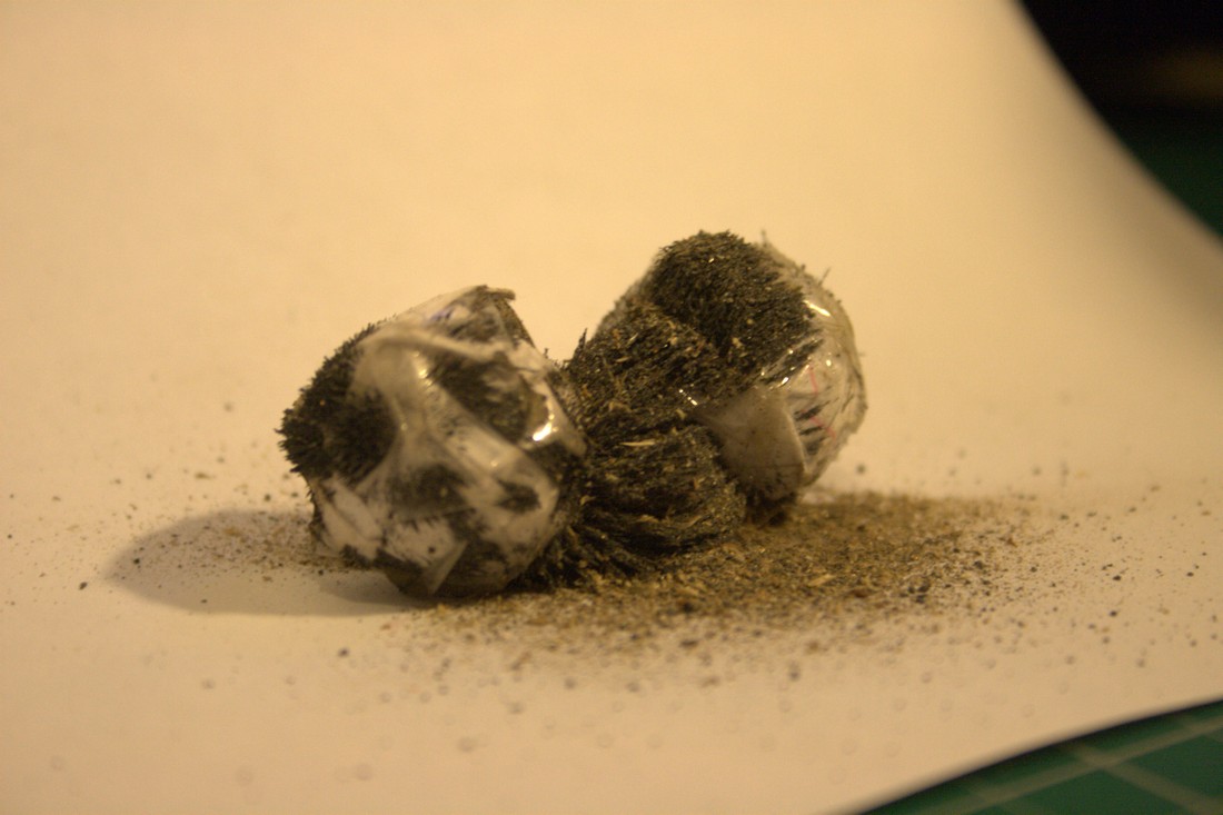
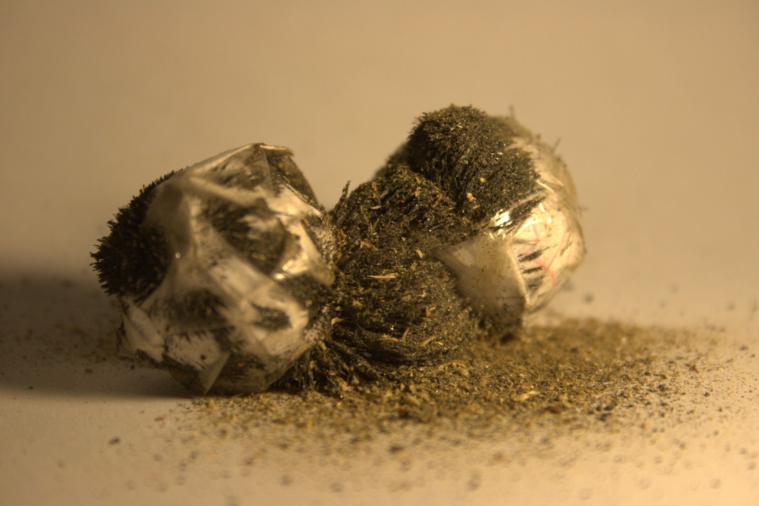
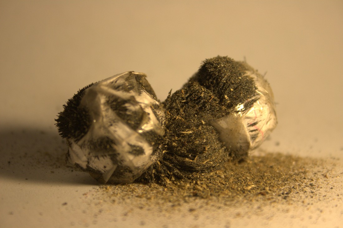
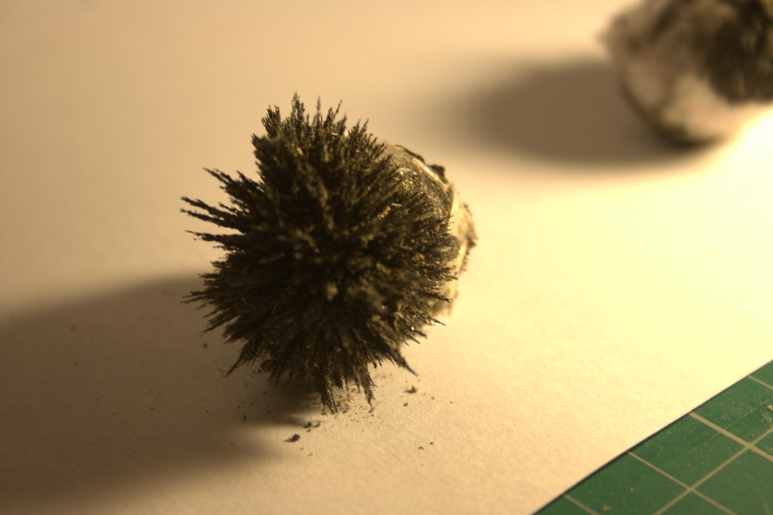
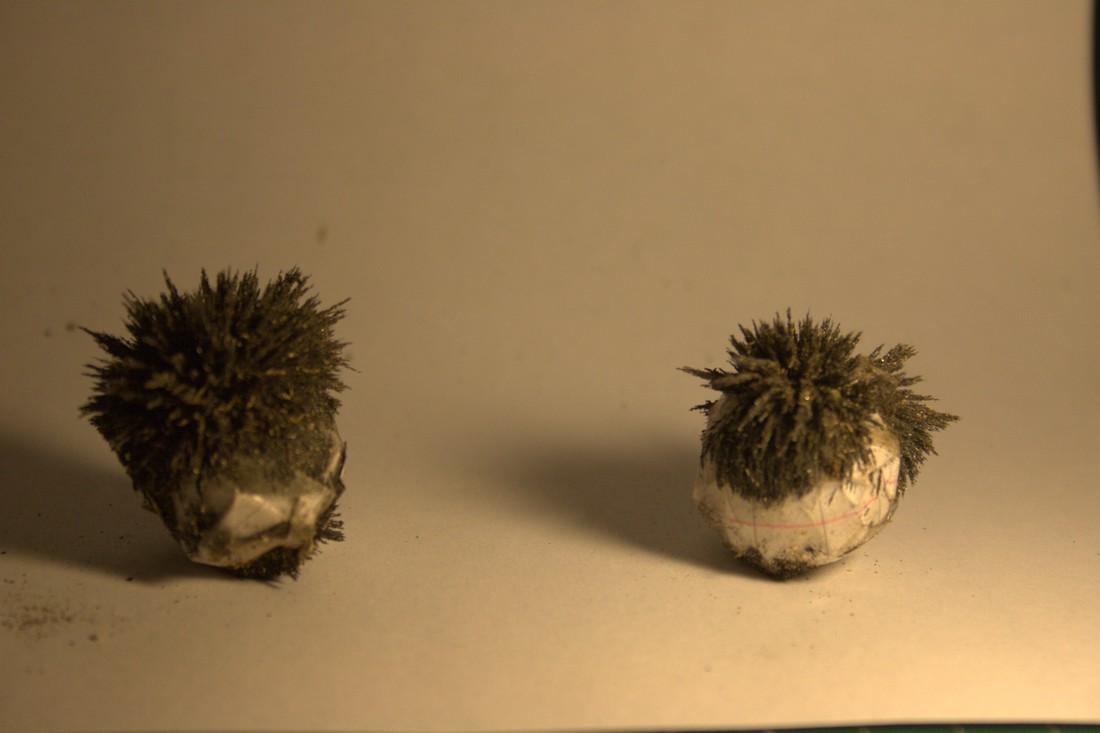
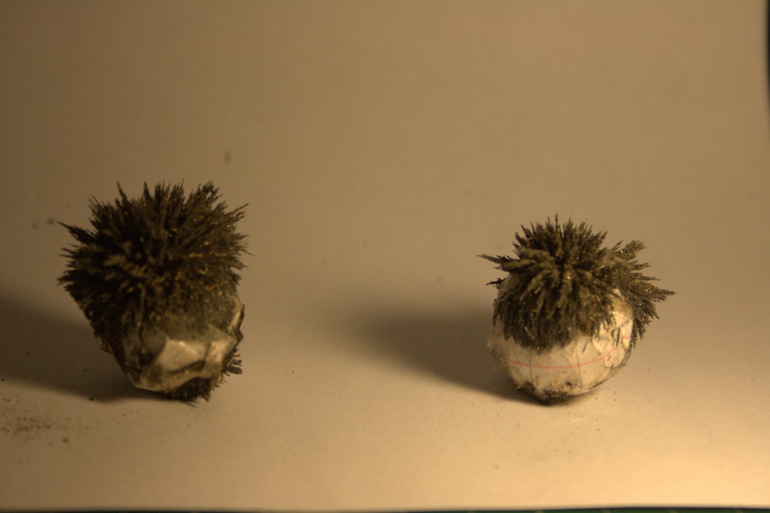
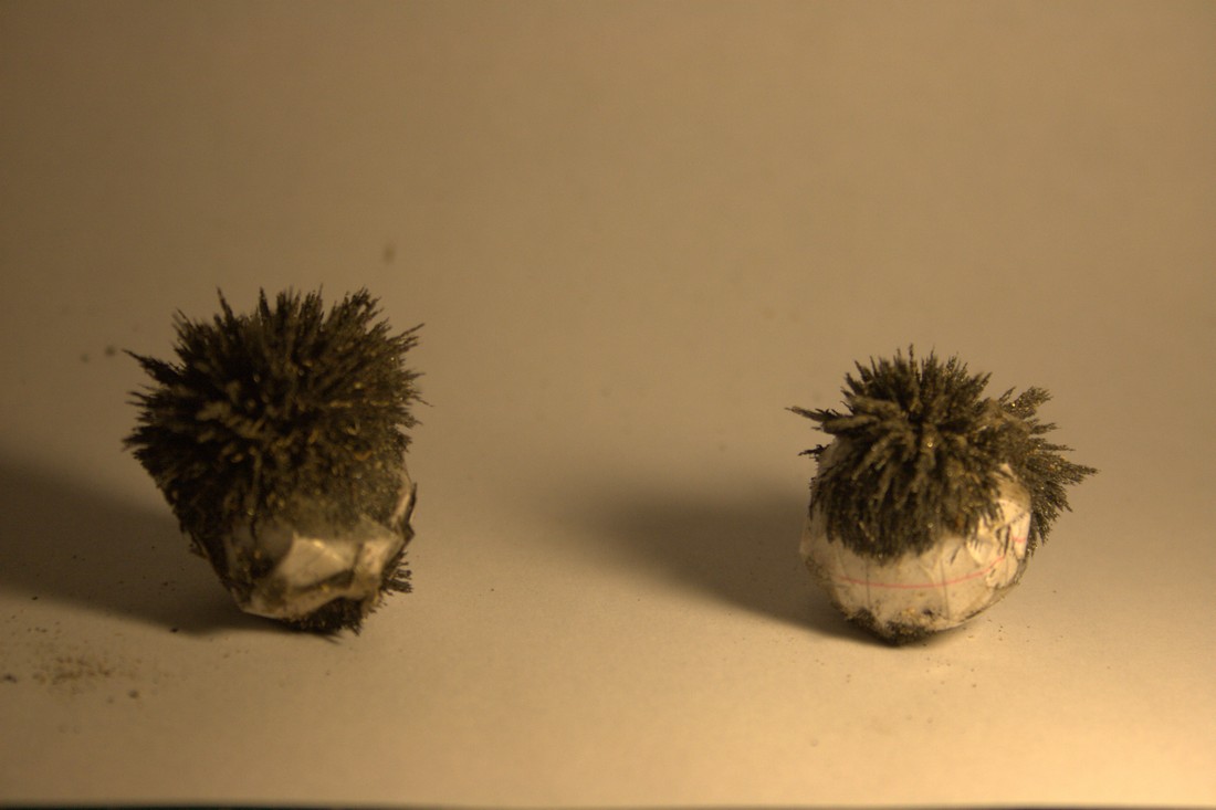
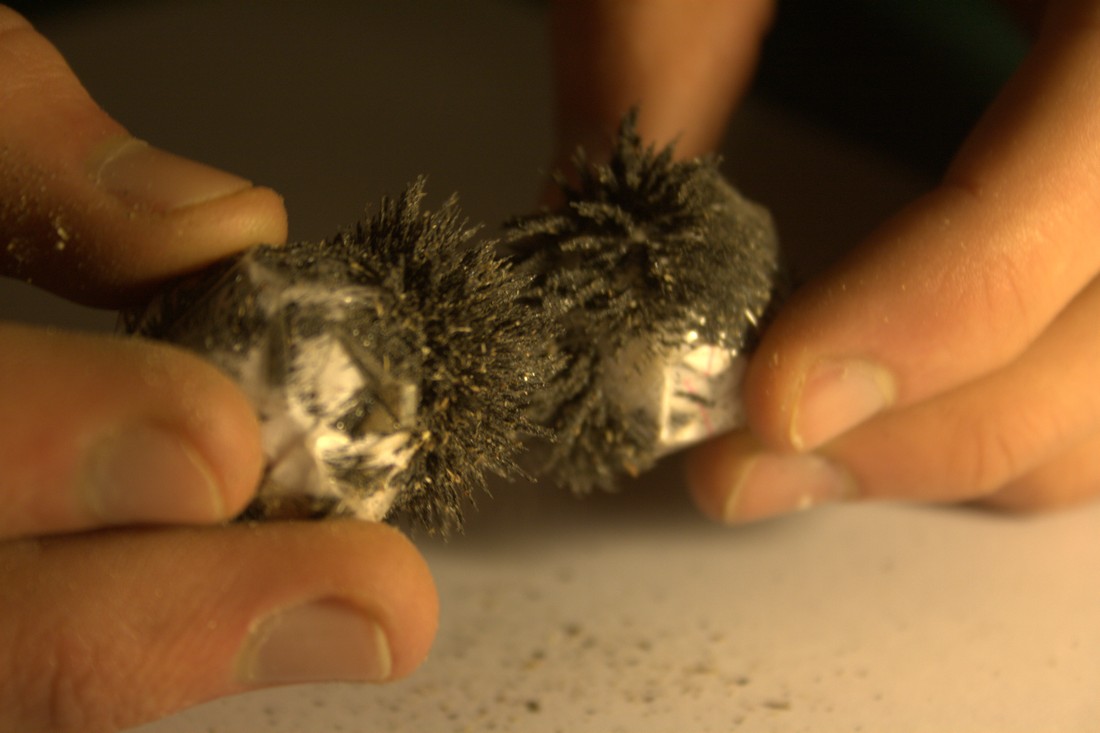
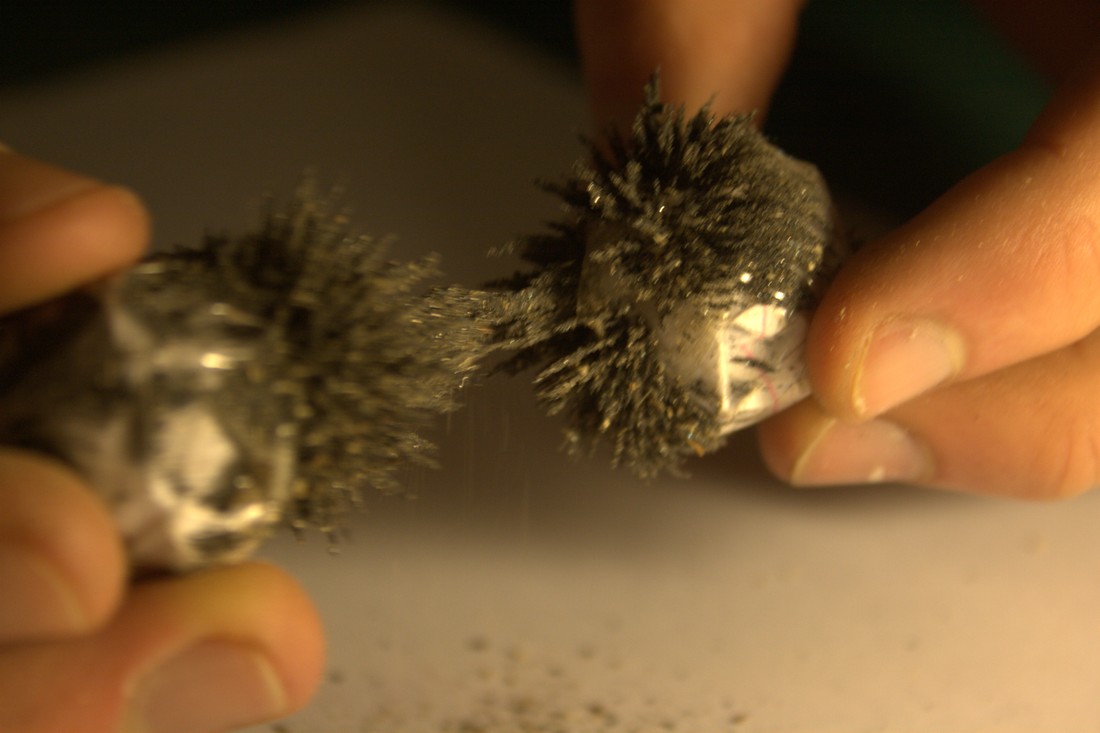
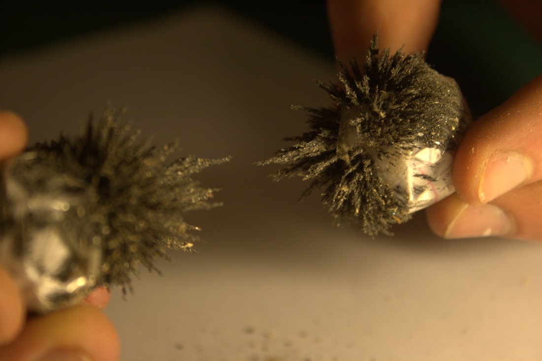
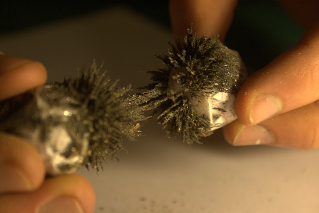
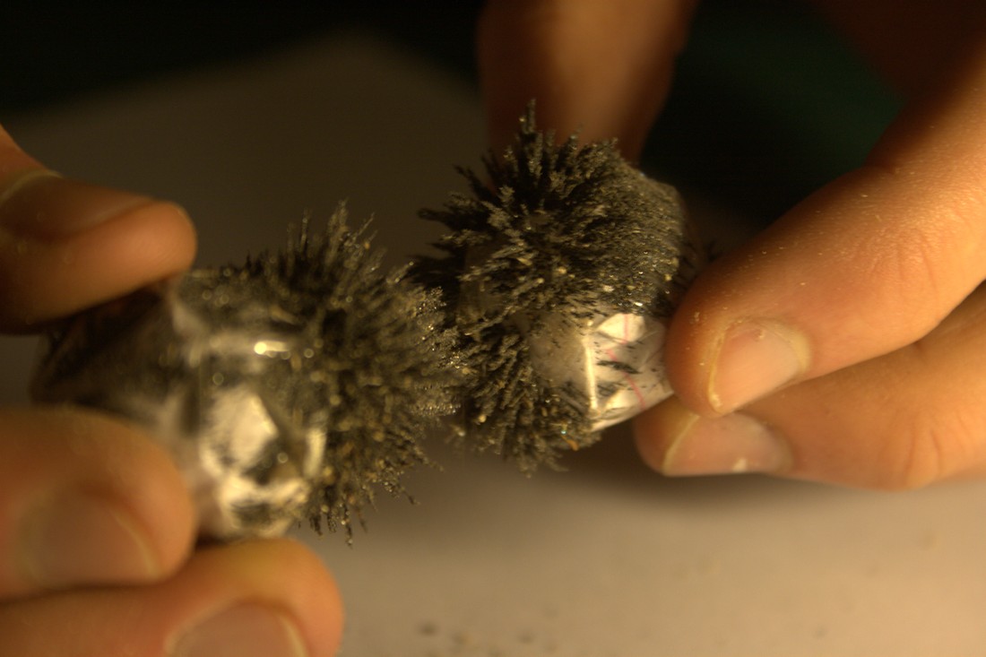
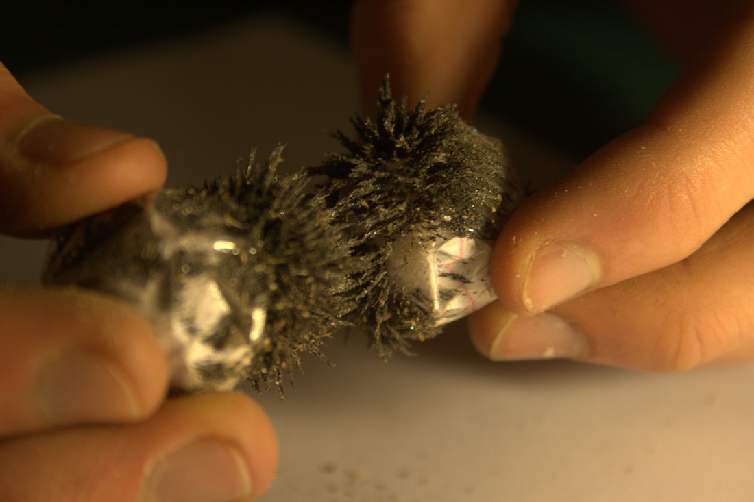
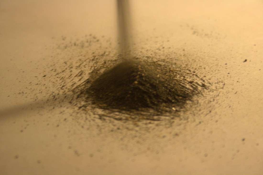
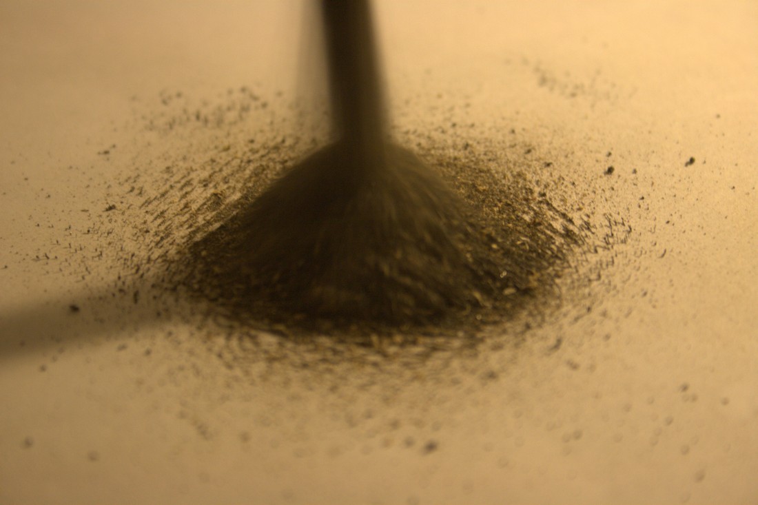
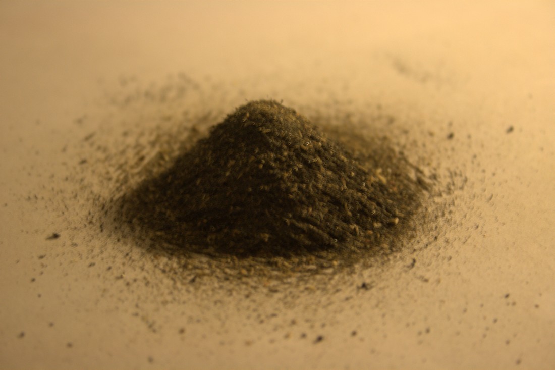
The first video was shot of two magnets, wrapped in paper, with iron filings being funnelled onto them. The second was of filings being dropped onto card, under which was a series of similar magnets.
First Design for Final Piece
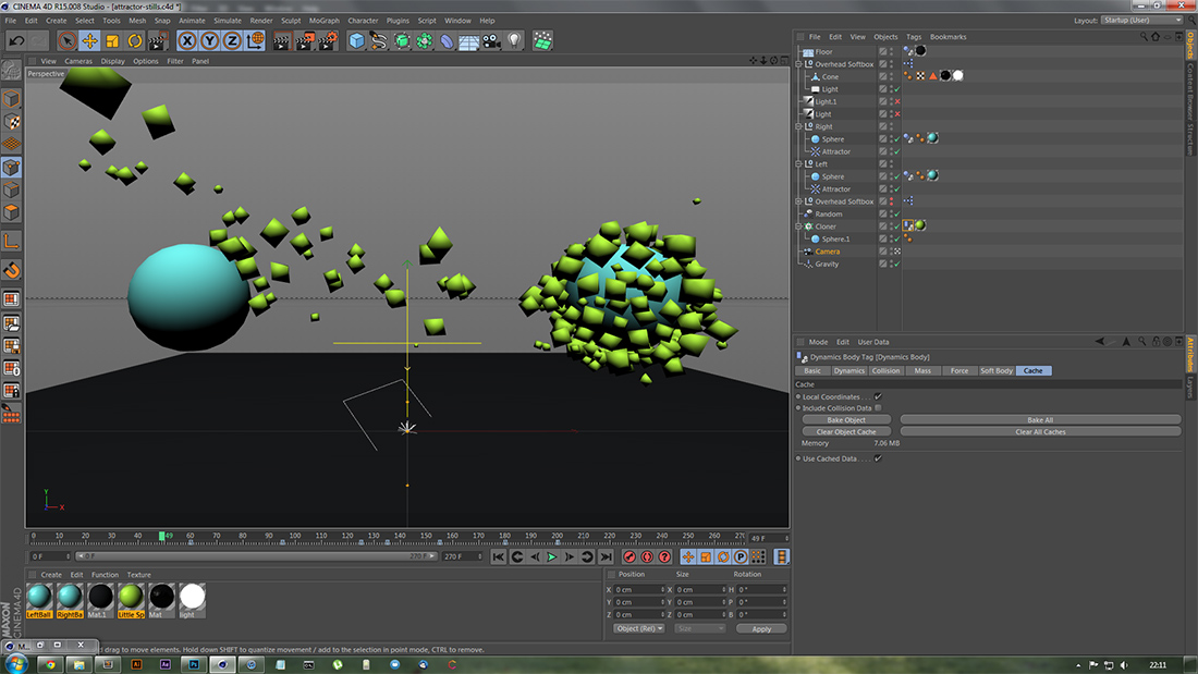
I began with a first design, consisting of a low-poly mountain that rises from the floor, after various shapes fall onto the floor around it's centre. As the mountain rises up, a dynamics attractor object slightly below floor level begins to to pull the shapes around the mount towards the centre.
Below are six short slideshows. The first, third and fifth are of the raw renders from Cinema 4D. The second, fourth and sixth consist of the same images with some basic colour correction applied in Photoshop.
Another still shot I rendered as I created the piece.
Second Design for Final Piece
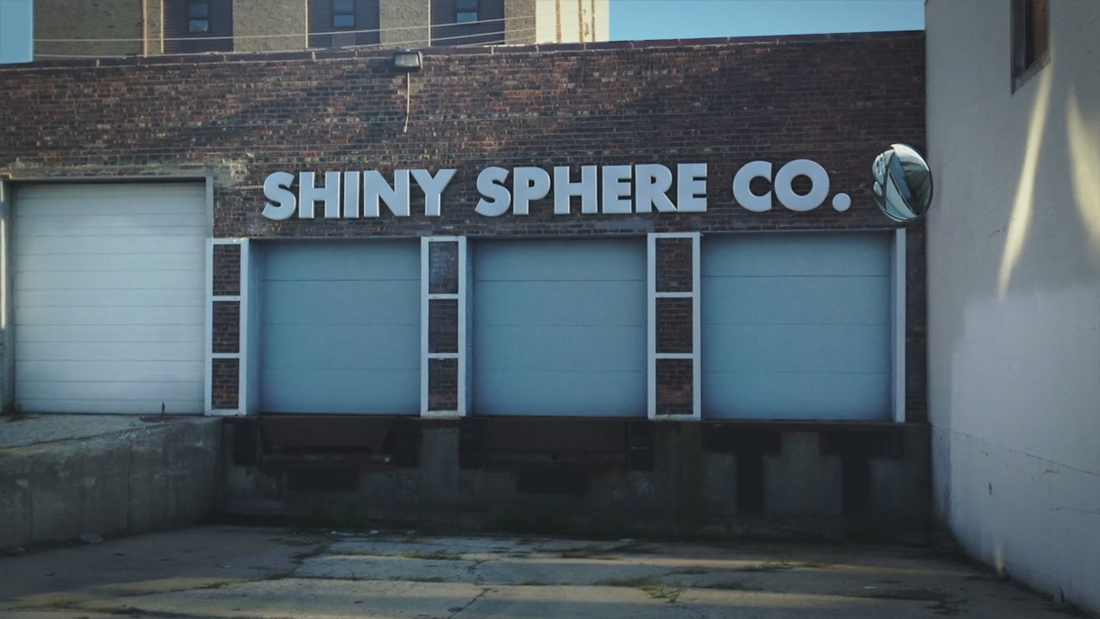
The second design that I created was inspired by the attractor tutorial by Nick Campbell and the Attractor investigation, as well as Campbell's Shiny Sphere Co. images and his trademark reflective materials.
The following slideshows are of second design images. Like before, the second and fourth image groups are comprised of colour corrected images, edited in Photoshop.


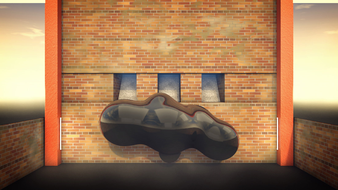
Final Piece
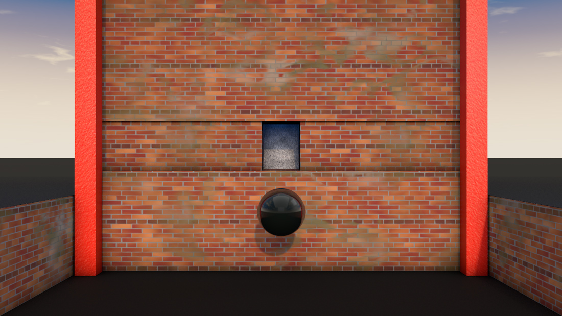
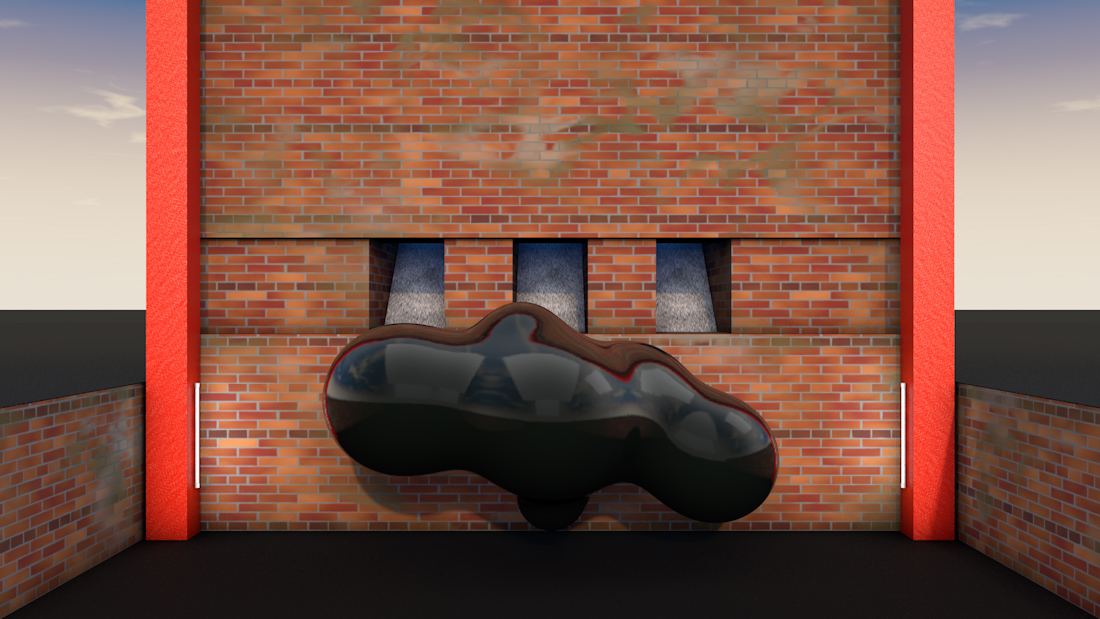
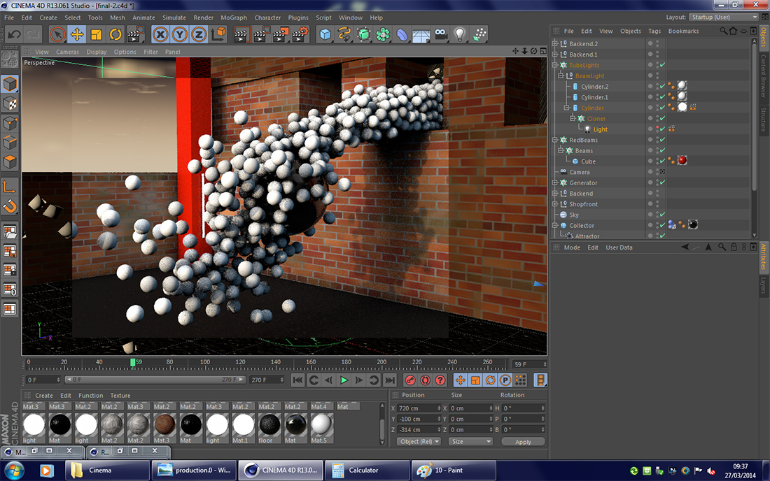
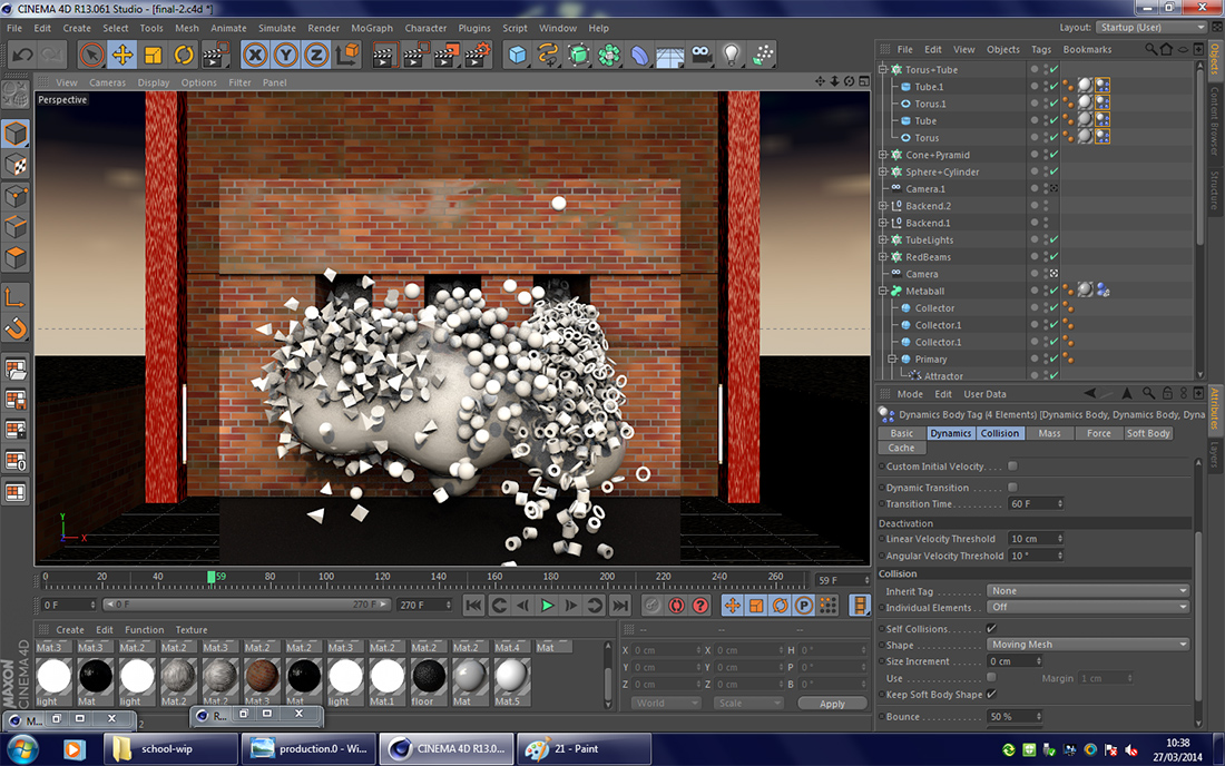
My final piece was similar to the second design, save for a few significant changes. I swapped out the single sphere for a number of spheres in a metaball shape. I also added more attractor objects to more evenly spread the gravitational/magnetic force of the metaball. Inspired by Campbell's Shiny Sphere Co. piece, I added another two chutes in the brick wall, each with different items falling from them.
The first of the two slideshows consists of untouched renders. The second shows the same images after having been edited in Photoshop. Editing involved adding smoke and vignette shading;adding light along the horizon;applying colour correction, such as more blue in the object chutes;and blurring in the chutes to give a sense of smoke.
Work In Progress
As I made the pieces you've seen throughout this project, I also tried to remember to take screenshots of the work as it unfolded. Those screenshots, from many different investigations, can be seen below.
An early, in-editor render of the fall animation, in order to check the lighting and colouring on the reflective spheres.
Another render in the Cinema 4D editor, this time with more developed lighting and materials.
Testing the reflections, lighting, and depth of field effect as part for the Halted investigation.
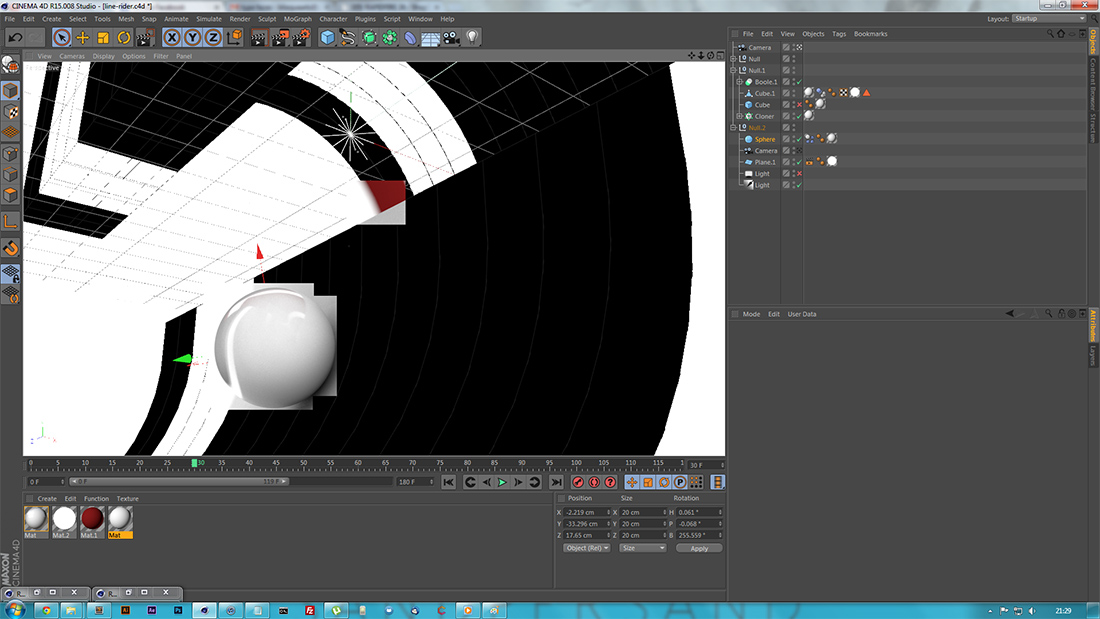
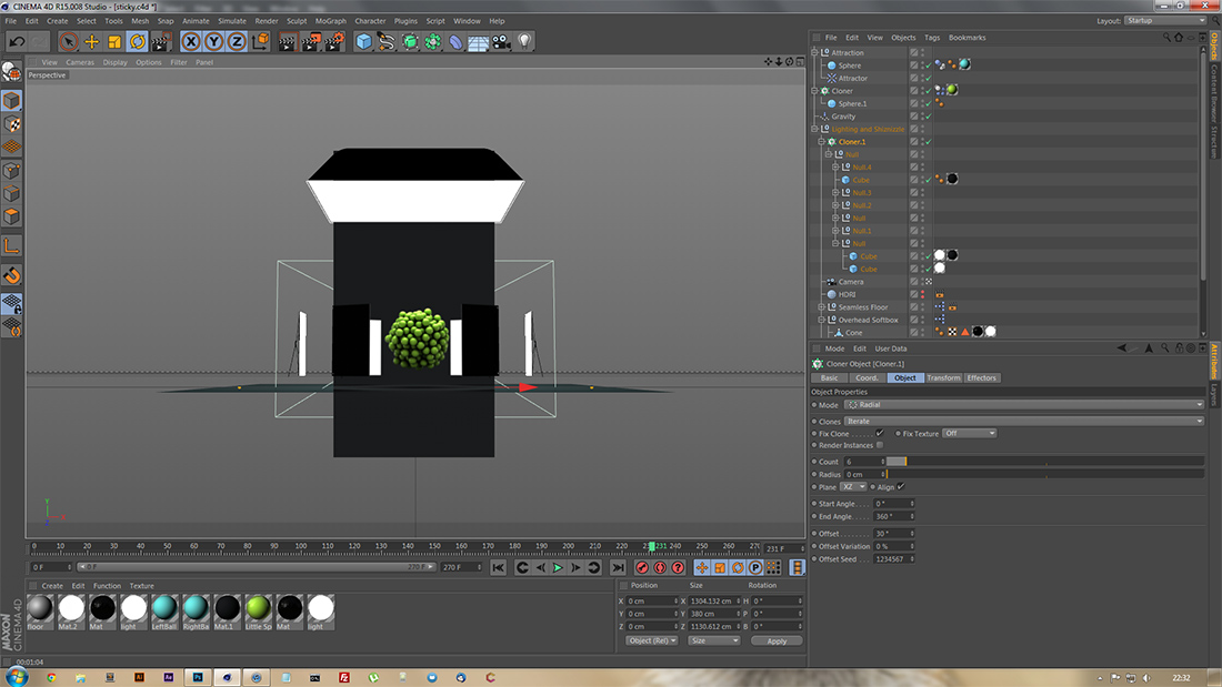
A screenshot of the editor, in full screen mode, when building the Line Rider animation.
A small test render in Cinema during the expansion of the Attractor investigation.
Like the above, but using a lower field of view by moving the camera upwards.
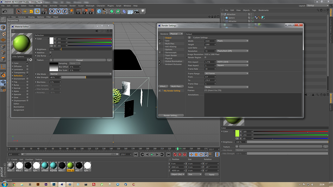
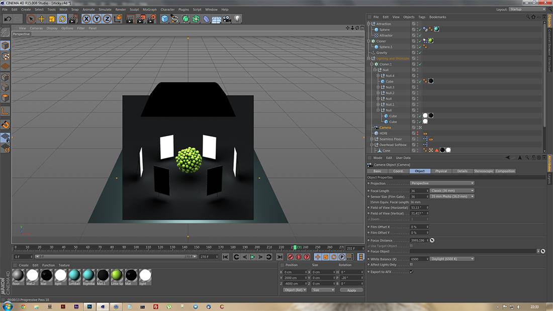
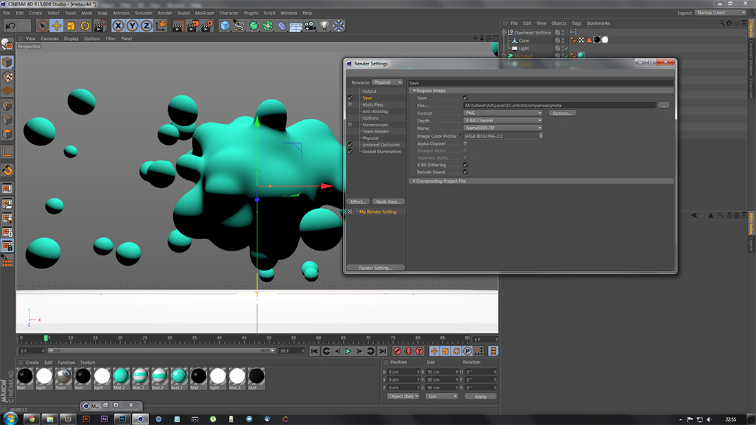
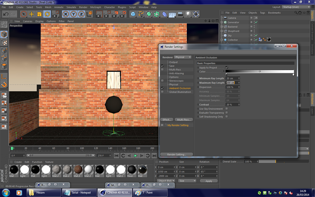
A screenshot showing the Render Settings and Material Editor windows open in Cinema 4D.
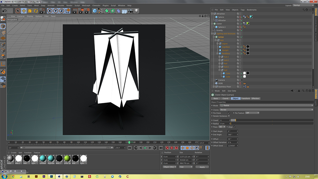
While building the lighting rig for the second Attractor animation, I found that an interesting sculpture was created by setting the radius of the softbox ring to 0cm.
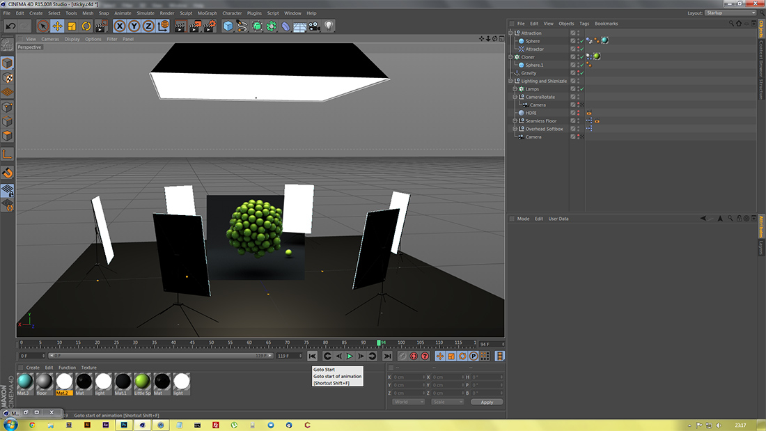
Another screenshot showing the first frame of the animation as it appears during creation. I also rendered the area around the sphere to test lighting and some of the floor in order to check shadows.
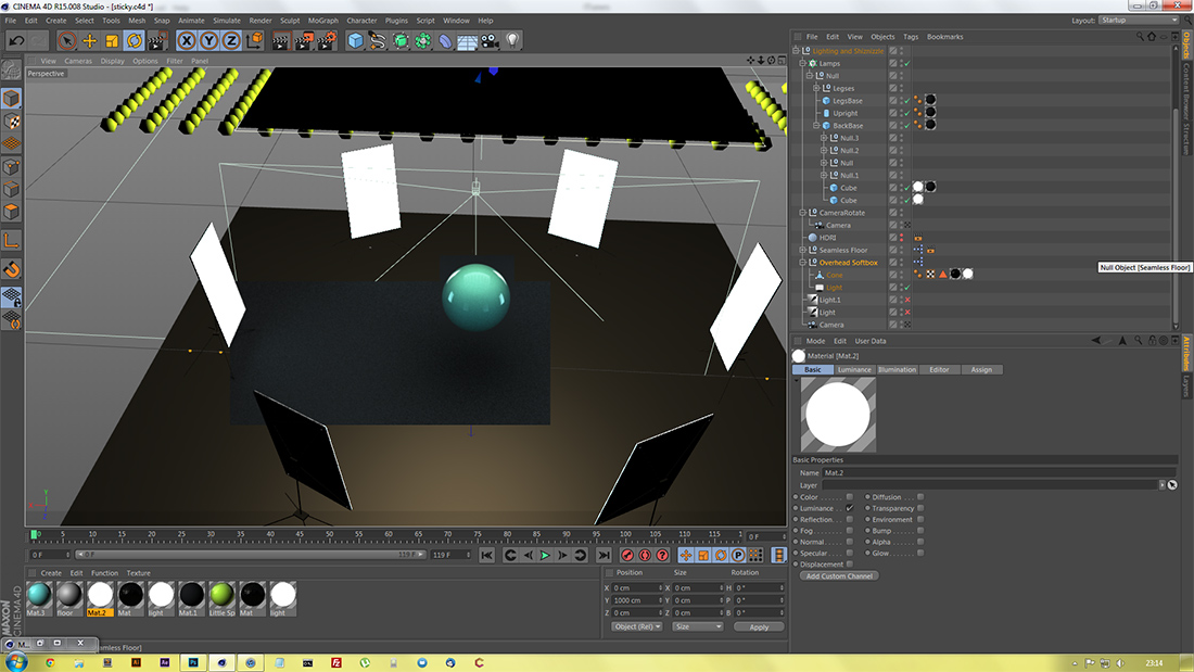
A screenshot once the lighting rig was complete, and I was content with the shadows and colours.
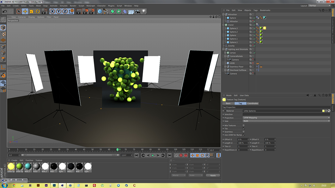
In order to set the second section of the investigation apart from the first, I gave 20% of the spheres luminance. I later also adjusted the sizing of the spheres to add greater variation.
After completing the animation in Cinema 4D, and rendering all frames, I took the video into Adobe After Effects for post-production. This included some compositing to make sure the animation looped, plus colour correction and other small tweaks.
As part of the Halted investigation, I created a scene with the Attractor spheres, using an HDRI image to create a virtual environment that would show most in the reflections.
A test render in the editor of the first Halted image. This was after I had overcome the reflection issue.
A screenshot of the original Attractor animation as it appears in Cinema 4D. I used a low polygon count on the spheresin order to reduce the load on the computer and therefore ensure smooth playback as the piece was being developed.
Showing the Render Settings window once more, this screenshot is of the metaball image, shown earlier, that was intended to directly emulate one of Nick Campbell's pieces.
The following were all from the 10-hour exam period:
A screenshot early in the process of creating the first design for the final piece.
After altering the lights, I rendered some areas again.
Further development of the mountain in the centre of the floor, adding more contrasted terrain and animating the movement of it over time.
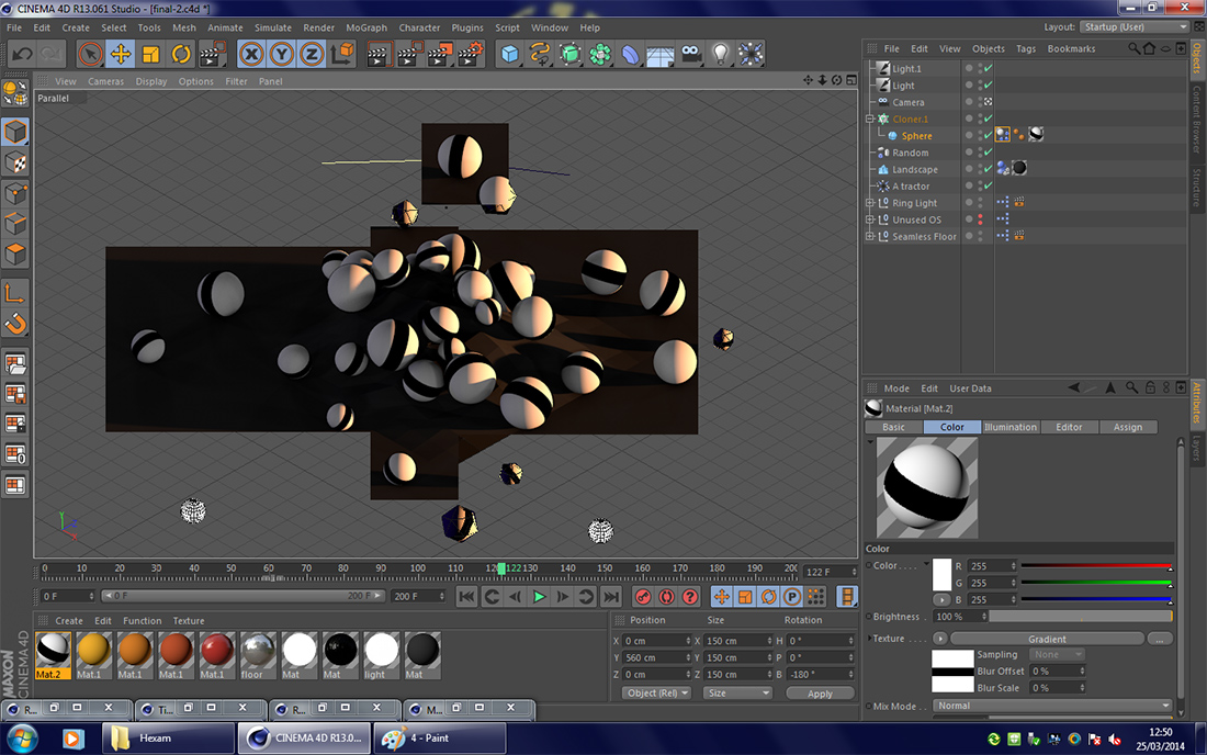
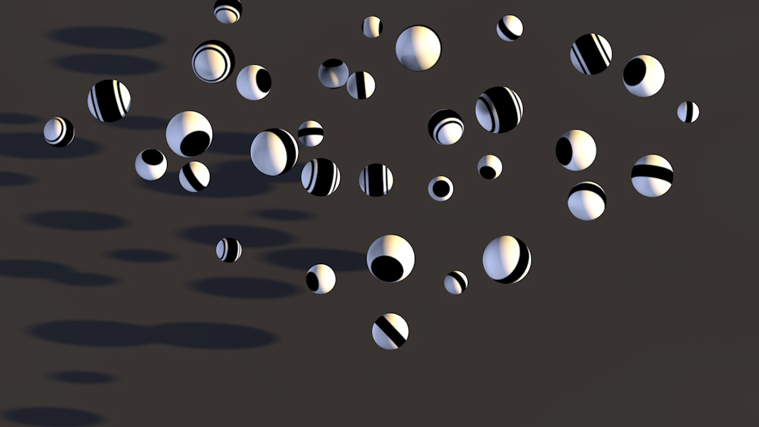
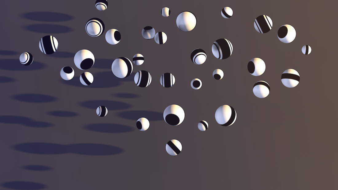
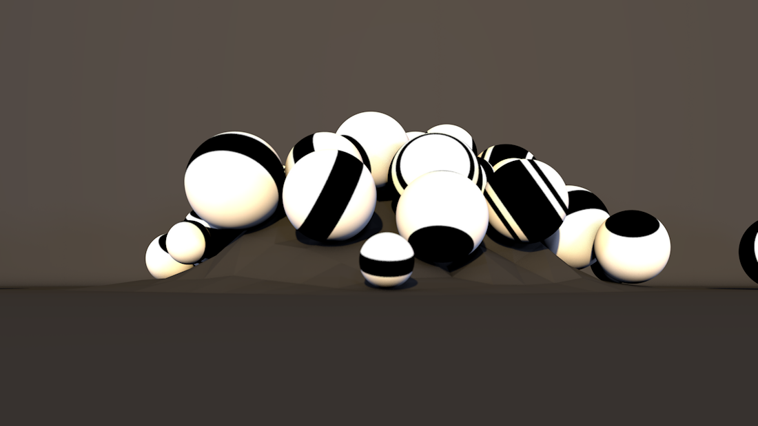
When expanding the first design to include a wider variety of shapes, I added spheres with black and white stripes wrapping around them. This screenshot was part of testing the shadows and lighting on the spheres' textures.
After tweaking the lights somewhat, and letting the animation roll forward a little more, I rendered parts again to test lighting.
Here the primary softbox, visible as the black triangle in the top right of the rendered region. Although not visible in the editor as it would get in the way, the softbox was still visible in the renderer, and was casting shadows over the wall. Both these problems were fixed using a compositing tag later on.
Once the camera was in position on the second design, I tested the shadows and Ambient Occlusion in the small wall indentation.
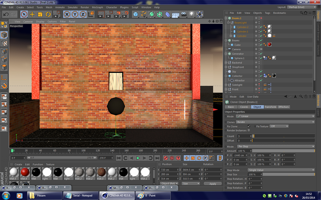
I also rendered the region around the two strip lights, ensuring that they had a noticeable effect but were also not too bright.
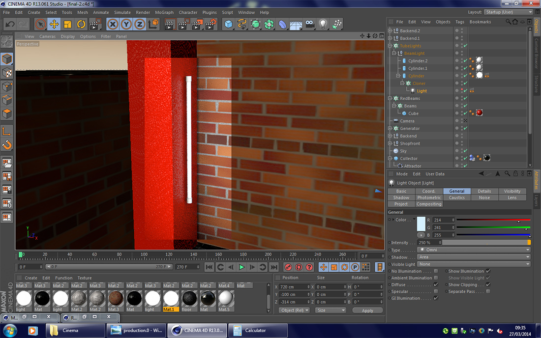
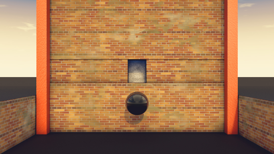
After deciding to change the red painted support pillars so that they reached the tarmac at the bottom of the scene, I moved the two lights and set about making the reflections/specular in the pillars look as I desired.
As I moved into making the final piece, I looked into different perspectives to render the scene from.
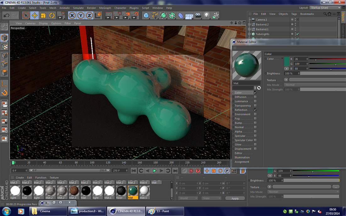
After deciding to use a metaball shape instead of simply a sphere, I looked into using a different texture for the shape than in the second design.
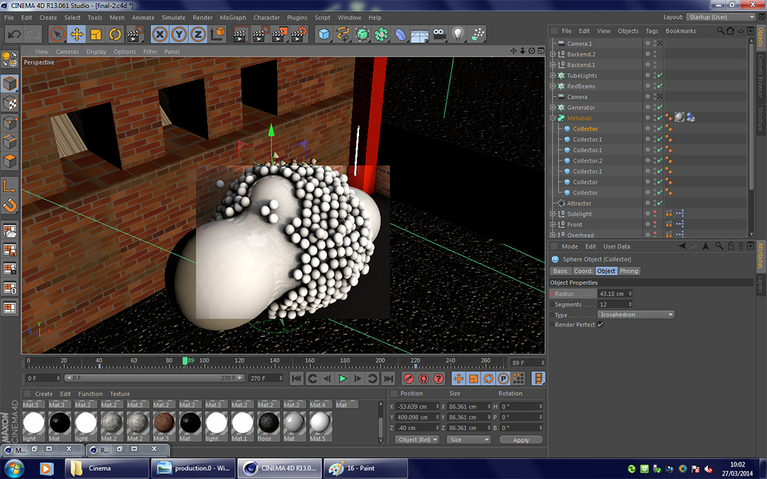
This shows the distribution of the spheres across the metaball while using a single attractor object, like I had used with the sphere.
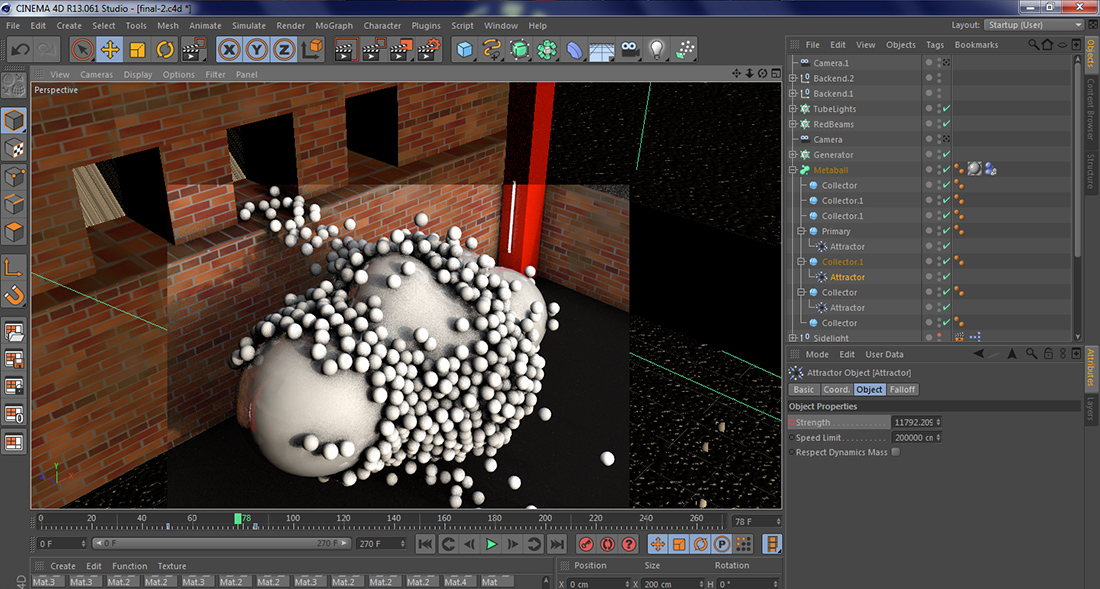
This shows the distribution of the spheres across the metaball after I had added another two attractors – one at either end – so that the force was more balanced.
Another quick render showing how the spheres would spread out almost immediately after contacting the metaball. Only later would the attractors have an affect, and pull the small spheres back.
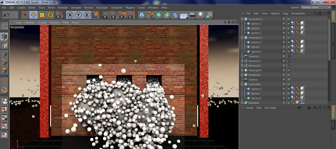
After the animation has been left to play, the spheres slowly return to the metaball, and spread across it's surface.
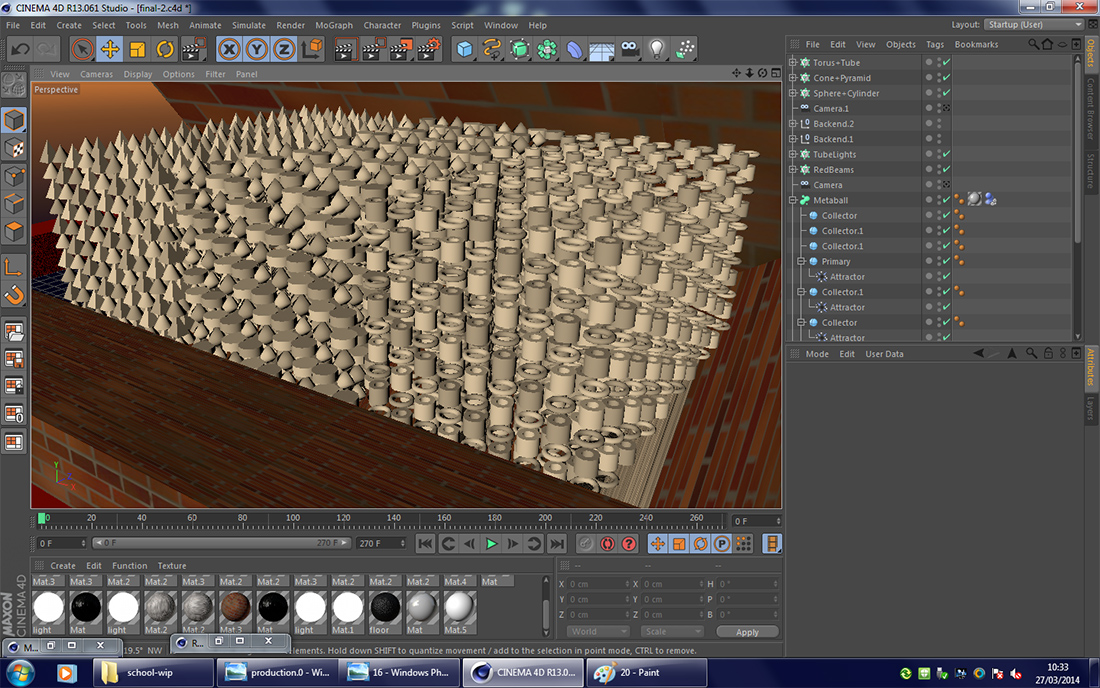
In order to make the final piece more different from the second design, I added a variety of new shapes into the mix, comprising of tori, cylinders, tubes, cones and pyramids.
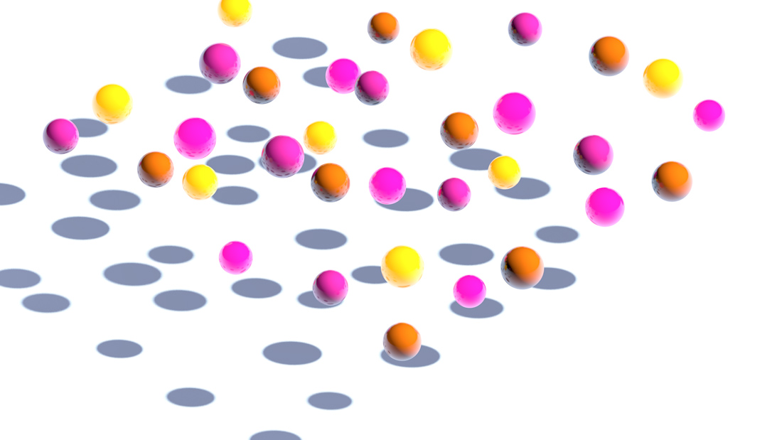
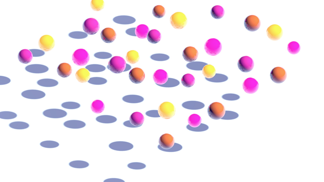
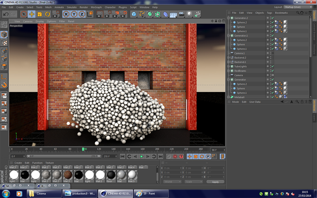
With all the shapes using the same texture, I rendered how the scene would appear at a particular point in the animation. Before the final render, I created a total of 12 textures, and evenly distributed them across the eight different shapes.
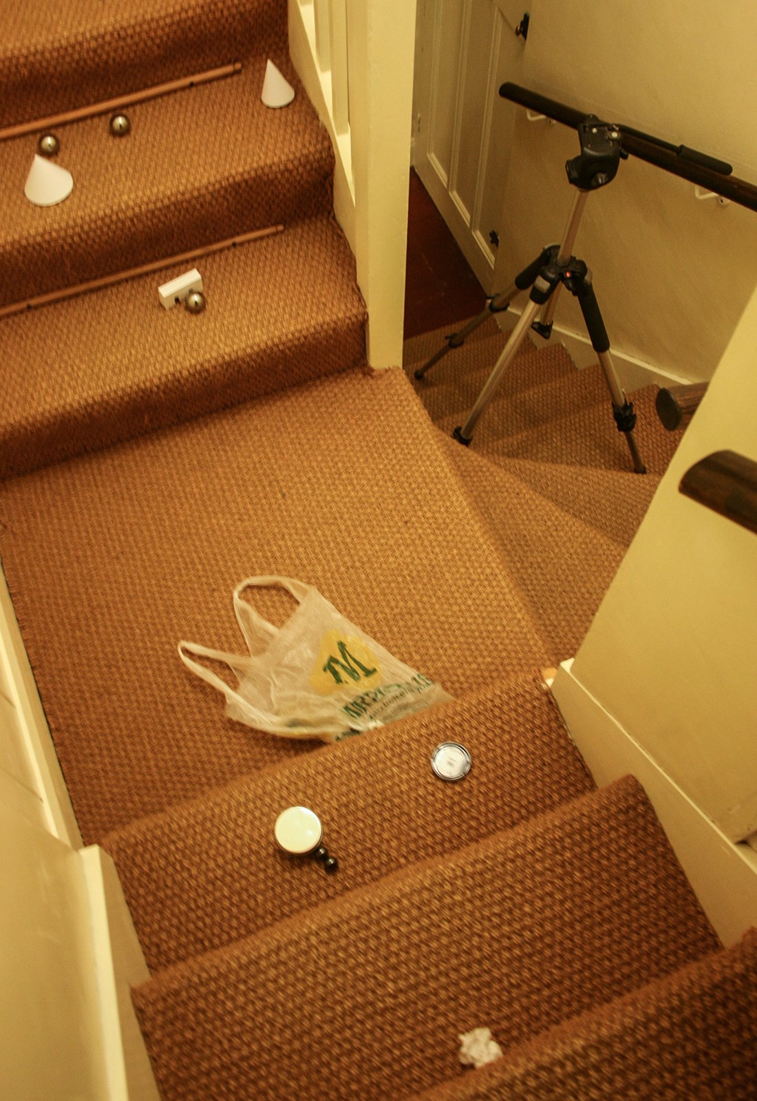
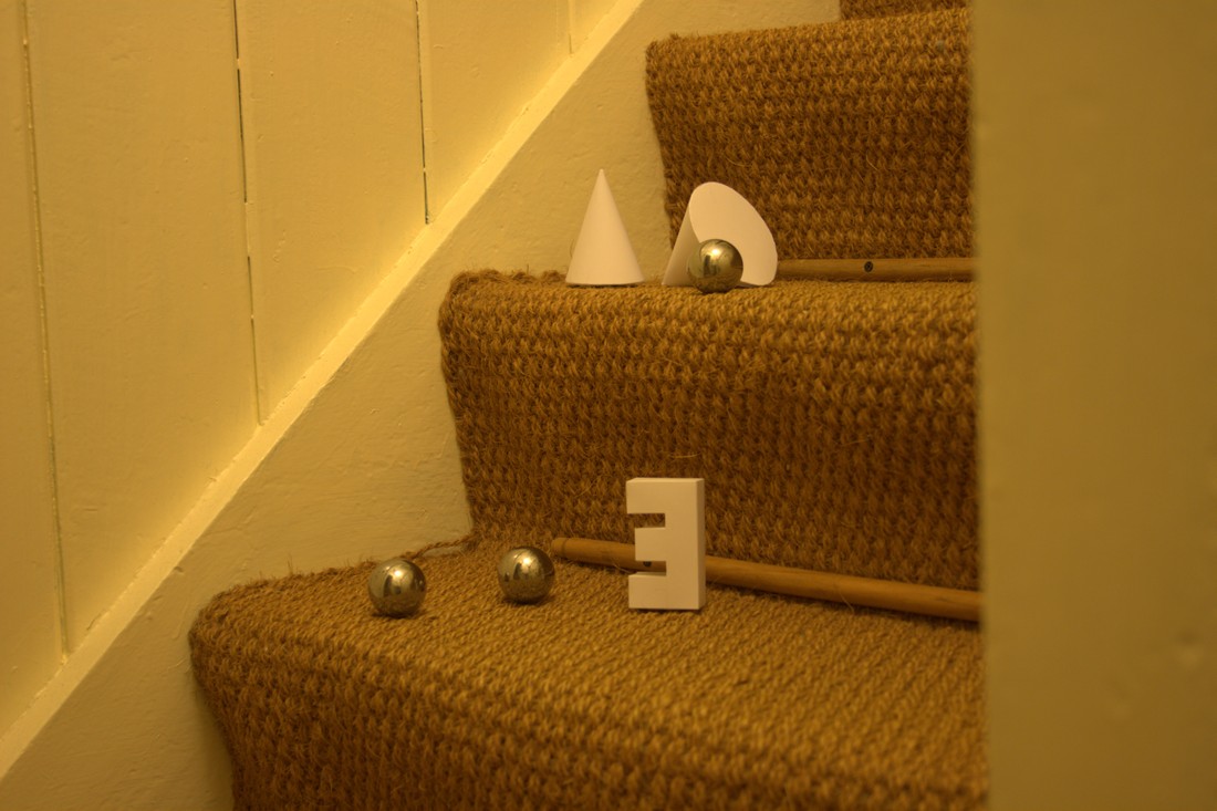
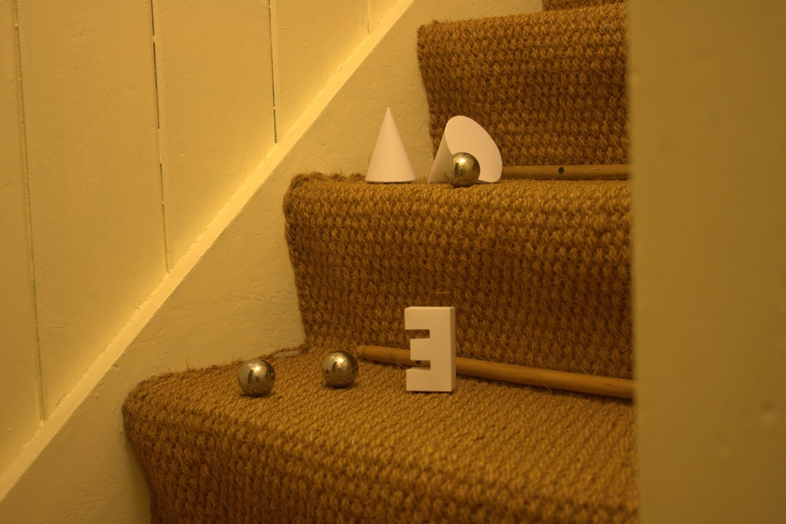
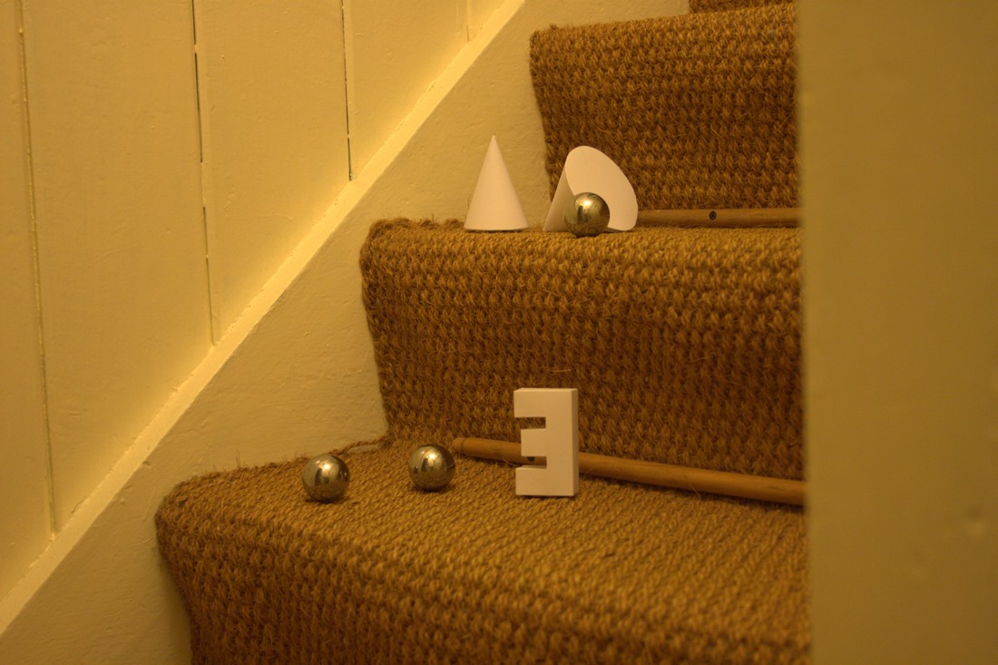
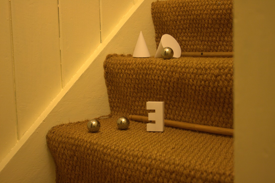
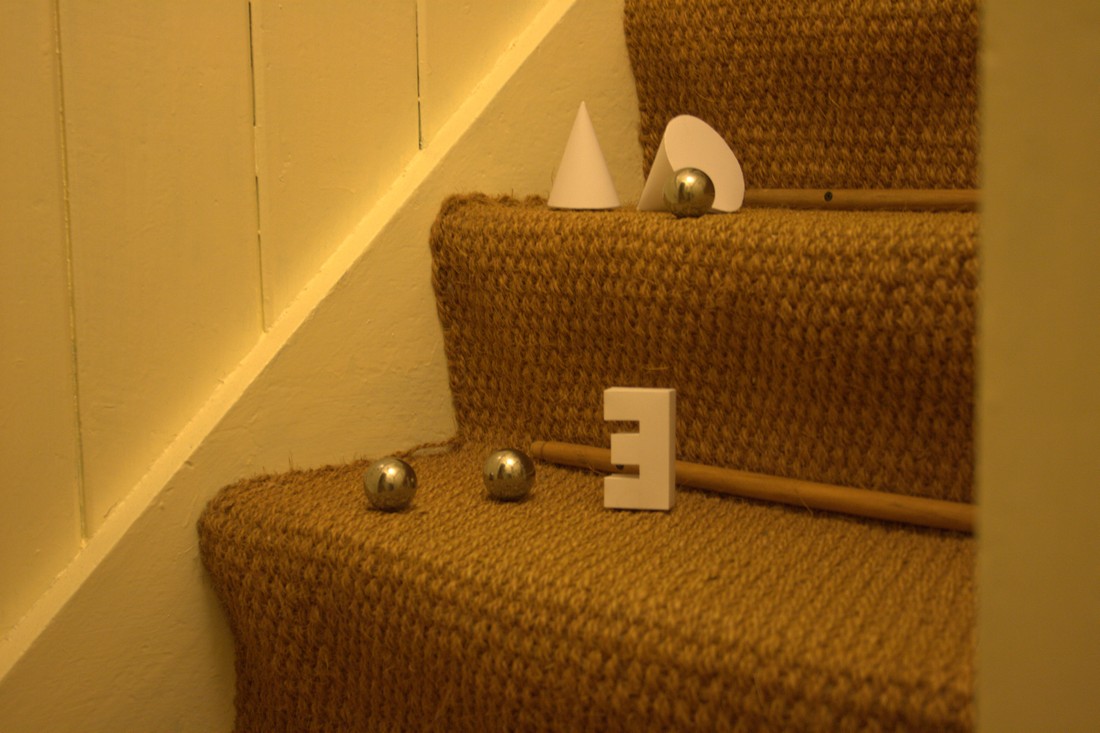
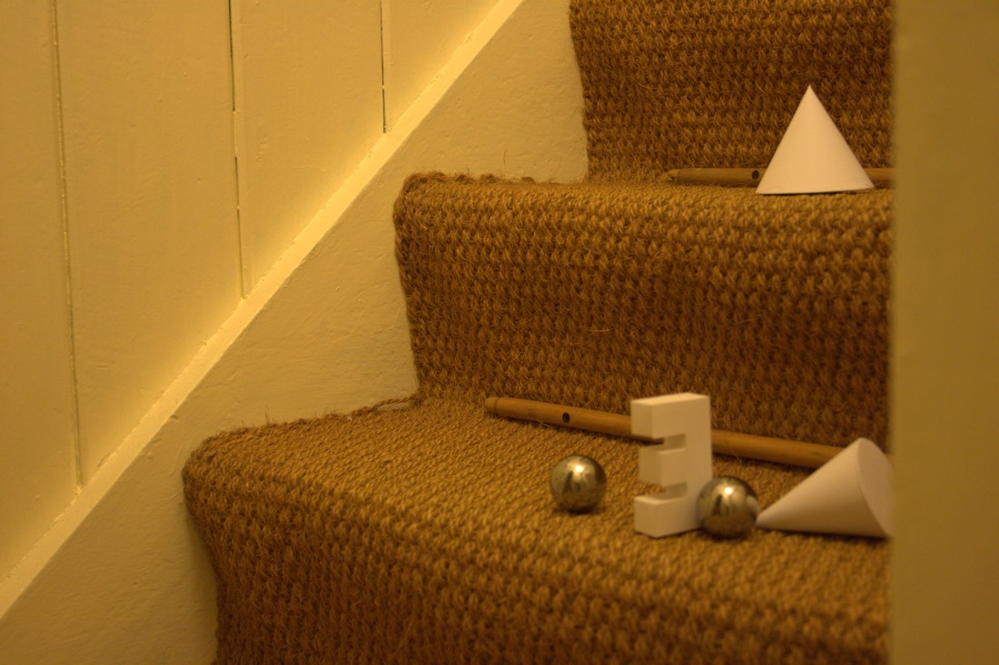
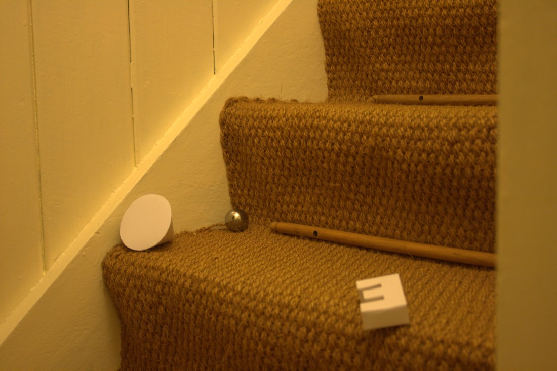
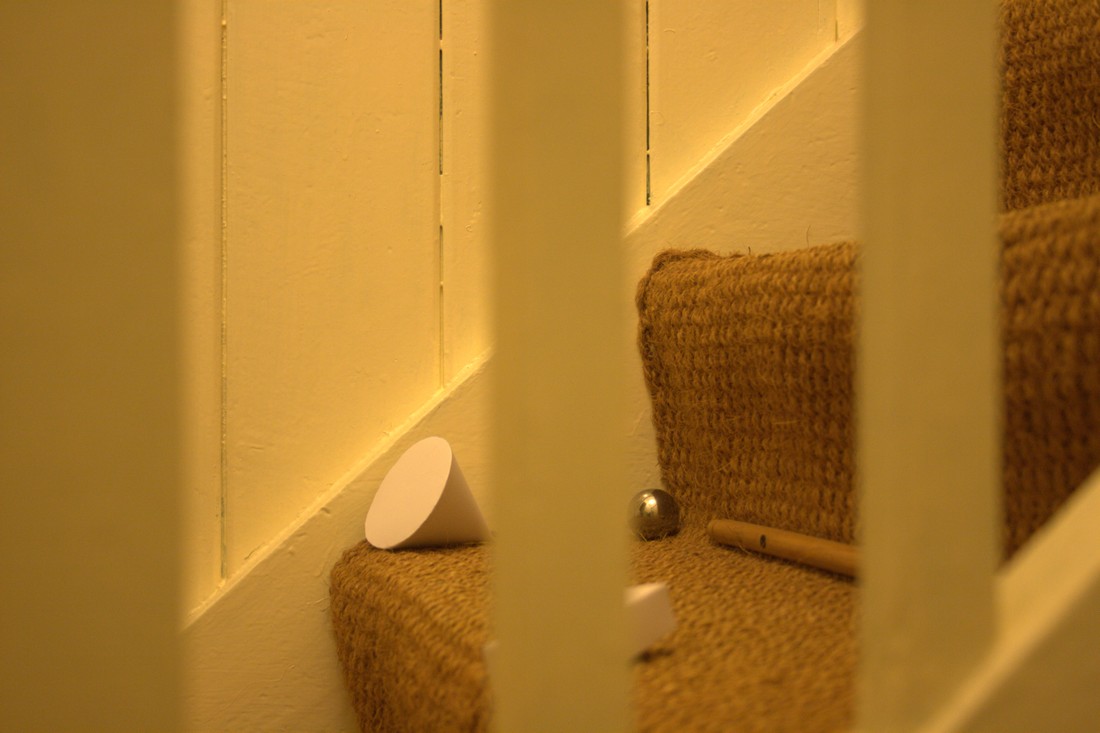
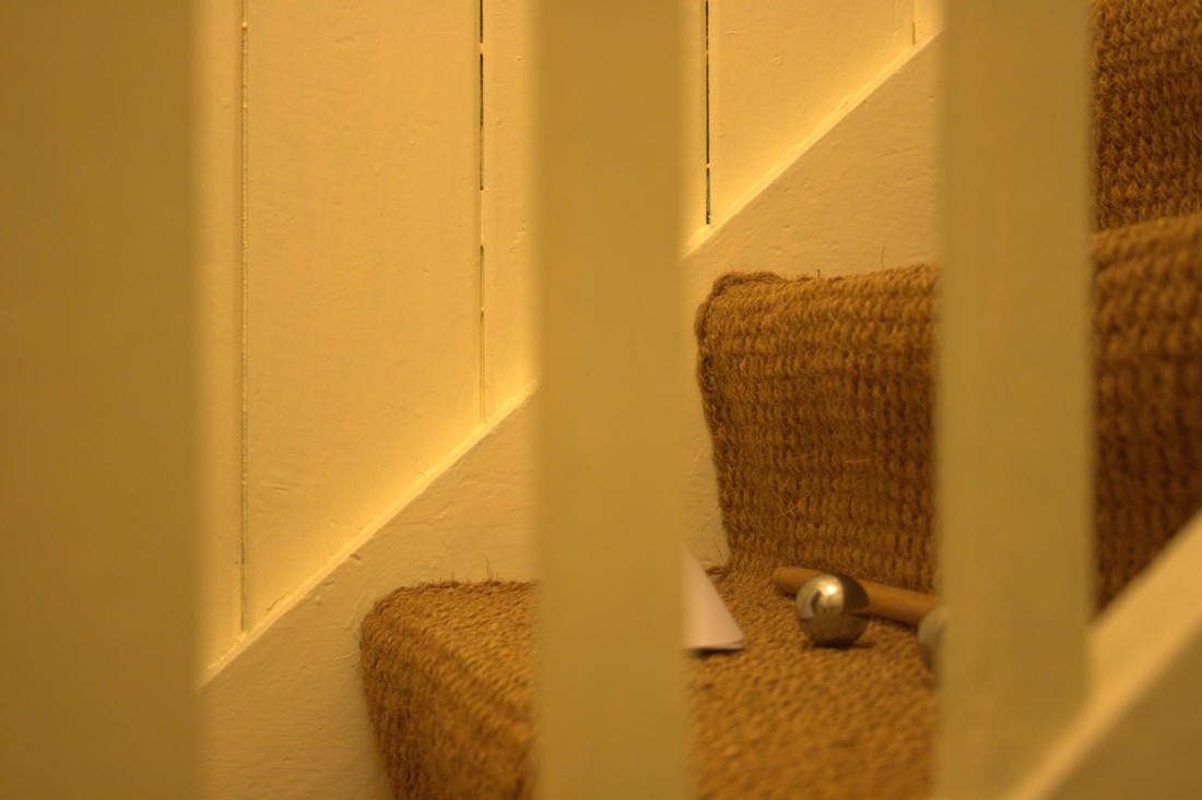
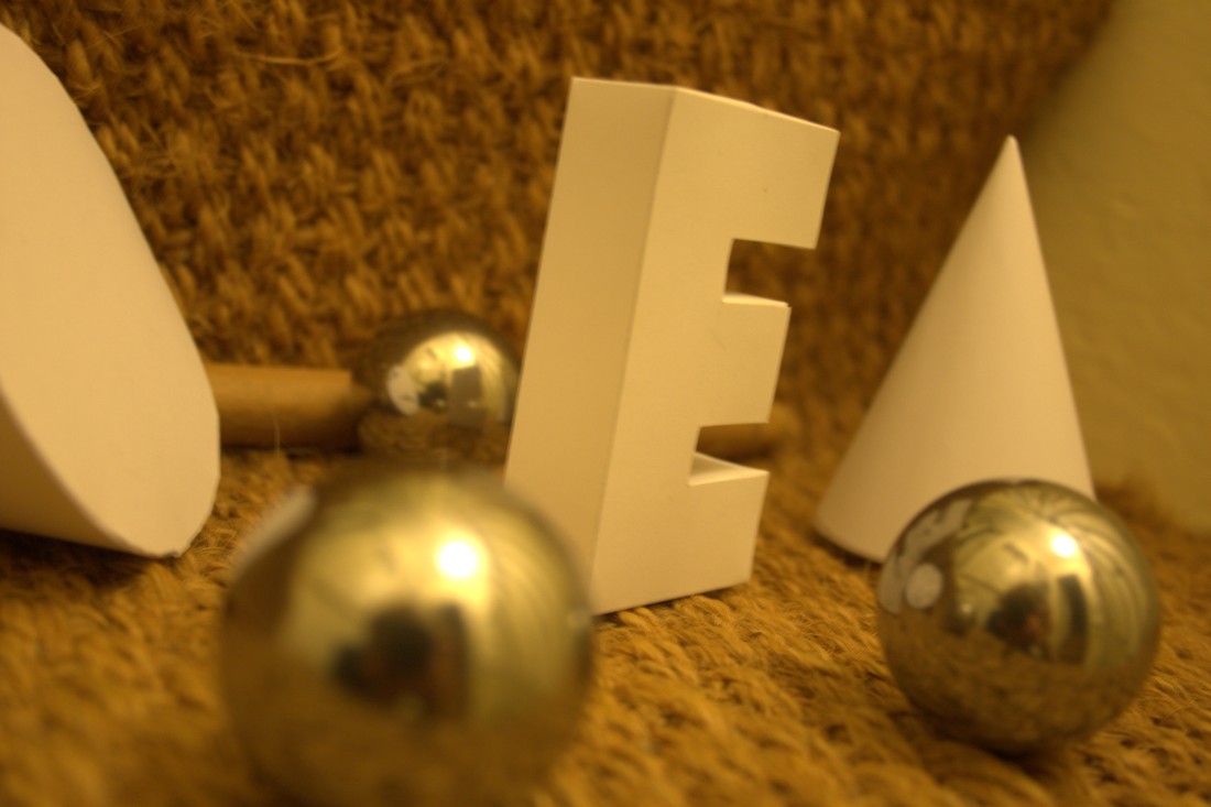
A photo of the setup I used when photographing the chrome spheres and paper models on the staircase.
That's that! Time for tea and biscuits.