Digital Graphics – Assignment 2
Logo [P4]
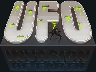
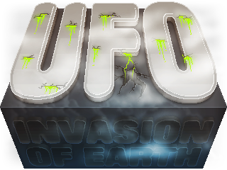
 The logo I created. I would recommend opening the image in a new browser tab by clicking it, therefore seeing the image at 1:1 scale. This is because of the pixel-art visual style I used.
To begin with, I designed a logo for a fictional game. The specification stated that the game was to be called UFO: Invasion of Earth, and had to include the colour RGB (170, 255, 0). It also needed to be 320 pixels wide and 240 high, at a resolution of 300 DPI or higher.
I created the image in Photoshop using a number of techniques. A number of images showing the development of the logo are shown below.
Progression
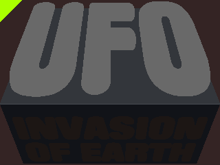
 The logo was started using Free Transform in Photoshop, particularly in the perspective mode, to distort two rectangles into trapezia. In the correct position these shapes would create the illusion of a three-dimensional cuboid, two sides of which would have text lying on them. To create this text, I used similar warping methods, applied to text which I had disables anti-aliasing on. I had disabled this to achieve a retro, pixelated effect. I also spent some time creating a triangle in the top left in the colour that was required to be in the image. This would both remind me to include the colour, and allow me to easily find the correct colour.
Afterwards, I created some simple layer styles to enhance the appearance of the text. By repeatedly duplicating and then carefully erasing with a pencil-mode eraser, I was able to create a 3D text effect, which I detailed with more layer styles. I used drop shadows, inner shadows and inner strokes. I also added a clipped layer above the two faces of the cuboid to add a highlight up the sides and back of the top half, and a slight shadow along the bottom of the other half. The highlight line in the centre was created with layer styles.
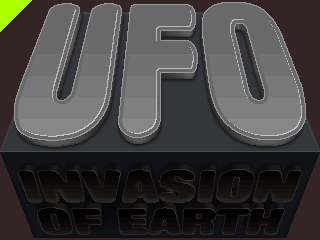
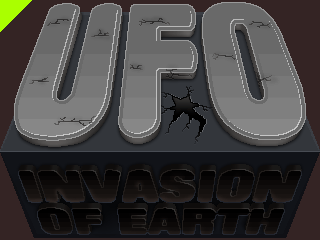 In order to further develop the 3D text, I added more layer effects and added pixelated gradients over different parts of text. This was to create an illusion that the surface of the text was concaved. I used the brush tool to create a softer shadow below the text on the bottom half of the dark-grey block. Using clipping masks, I also added shading and highlighting to the extruded parts of the lettering.
I then used the pencil tool to create cracks in the text and the base block. I used a soft brush to create patches of darker material around these cracks, and then also added a cracked hole in the block. I used more layer styles to create a highlight below the cracks, and therefore giving them the subtle appearance of being 3D and set into the text and cuboid. I could have also used the Bevel and Emboss effect in the Photoshop layer styles to create this effect.
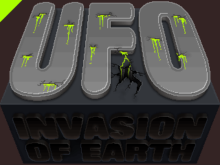
 After having created the cracks, I used the pencil tool again with the specified green colour to draw the drips of acid being released from the subject of the image. As all of the drips were on the same layer, I added layer styles to make the acid appear more three-dimensional. I added an inner shadow to the top of the drips, which I made white and set to the overlay blending mode. This made the tops of the drips a brighter green colour, which appears as a reflection. I made sure that the majority of the liquid was still of the correct colour (RGB [170, 255, 0]), and placed the layer above all of the others so that the colour would not be affected by any adjustment layers I created, something I did in the following step
The last step of designing the logo was the colour correction that I added. I used adjustment layers to alter the brightness, saturation and contrast of the logo, using a mask so that the adjustments would not affect the temporary background I was using. I used a soft, white brush – particularly around the "UFO" text – to highlight certain areas of the logo. I also added simple, filled layers which I set to the Screen blending mode, giving the logo a blue haze at the bottom, a warmer orange tint towards the top, and a generally more washed out appearance. Although often considered a negative attribute of an image, I think the lightened shadows improve the logo.
Poster [P3]
I also designed a poster for the fictional game. Below, eight steps of progression I took are shown and explained, and the first version of the poster is shown.
Progression

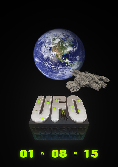
 The poster started with a blank, portrait, A4 canvas at 300 DPI. I unlocked the white background layer, and inserted it to create a black canvas. I also added some slight lighting in the lower-centre area, where the logo would be positioned. I then copied and pasted the logo from the logo document into the poster, and increased the size of the layer with the free transform feature. I made sure to use "nearest neighbour" resampling, giving the logo a retro pixel-art style. This also meant that the logo – which was only created at 320 × 240 pixels – would not lose quality in an ugly way.
 The next step I took was to add a release date to the bottom of the poster. I used several layer styles to make the text green, add shading and highlighting, and add a 3D effect with shadows below the text. I added layers below the text to create a light haze around the date, and highlight the 3D effect. I used clipping masks with layers added above the logo layer to add a green highlight along the bottom of the logo, particularly at the sides. This was to give the impression that the logo and date existed in the same 3D space, and that the date text was glowing. I made the text the same lime green as that which had to be included in the logo beforehand, but I changed this before finishing the poster.
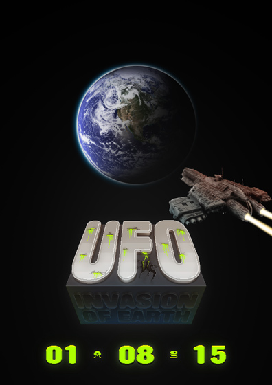 The next step I took was to add the first two images I had sourced online. I placed an image of the world just higher than the centre of the canvas, and added the spaceship image to the right. I had isolated the spaceship from a black background using the magic want tool, the negative effect of which has been hidden by down-scaling the image.
I slightly warped the spaceship so that the perspective matched where I imagined the camera to be better, and applied some basic colour correction. I used several clipping-mask layers to brighten particular areas of the craft, and increased the contrast of the layer itself. I added a few layers to create the beams of light being released from the ship's engines as well. I used clipping masks once more to darken a good portion of the earth, giving the impression that the sun was somewhere towards the top left of the image, but out of shot. I created a new circular shape layer and used layer styles to make a more obvious atmosphere.
The next step I took was to add the first two images I had sourced online. I placed an image of the world just higher than the centre of the canvas, and added the spaceship image to the right. I had isolated the spaceship from a black background using the magic want tool, the negative effect of which has been hidden by down-scaling the image.
I slightly warped the spaceship so that the perspective matched where I imagined the camera to be better, and applied some basic colour correction. I used several clipping-mask layers to brighten particular areas of the craft, and increased the contrast of the layer itself. I added a few layers to create the beams of light being released from the ship's engines as well. I used clipping masks once more to darken a good portion of the earth, giving the impression that the sun was somewhere towards the top left of the image, but out of shot. I created a new circular shape layer and used layer styles to make a more obvious atmosphere.
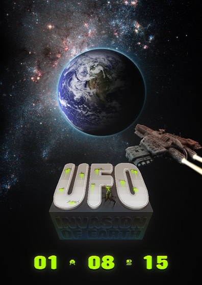
 The last steps of the poster's creation involved adding a background, further colour correction, some re-composition, the addition of a logo for superior software, and some small finishing touches. For the background, I used an image I found on the web of a particularly dense area of space. I altered a lot of the image's properties, positioned it behind the image of Earth, and added a more pleasing colour gradient. I also added more colour correction to the spaceship to make it seem more realistic. If I were to guess, I'd say that the original image had been rendered without a specific light source and just with a matte texture across the entire model and ambient occlusion taking care of shading. I spent time developing the light trails behind the craft, part of which involved the addition of lens flares on the engine's nozzles. I created a separate logo for Superior Software, the fictional development company responsible for the game, with the shape of Lake Superior in North America used as the focus and text in Franklin Gothic placed to the right. I felt that the green colour being used for the date was too garish and commanding, and I decided to use a light grey with a gradient instead. I kept the 3D effect below the text and the pixel-art aliens I had created before. The last step was to add further colour correction, while ensuring this didn't affect the logo. This gave the poster a slight blue/purple tint in the shadows, and made the logo fit more seamlessly into the scene.
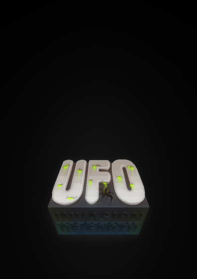
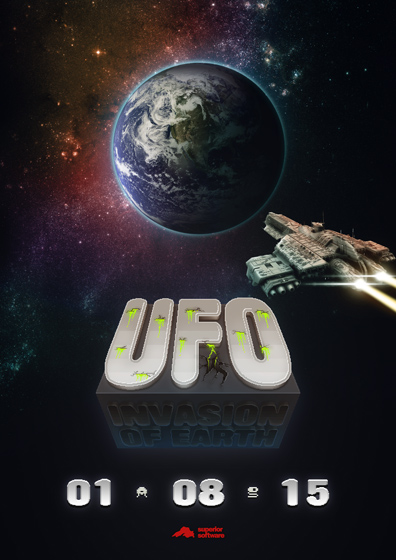
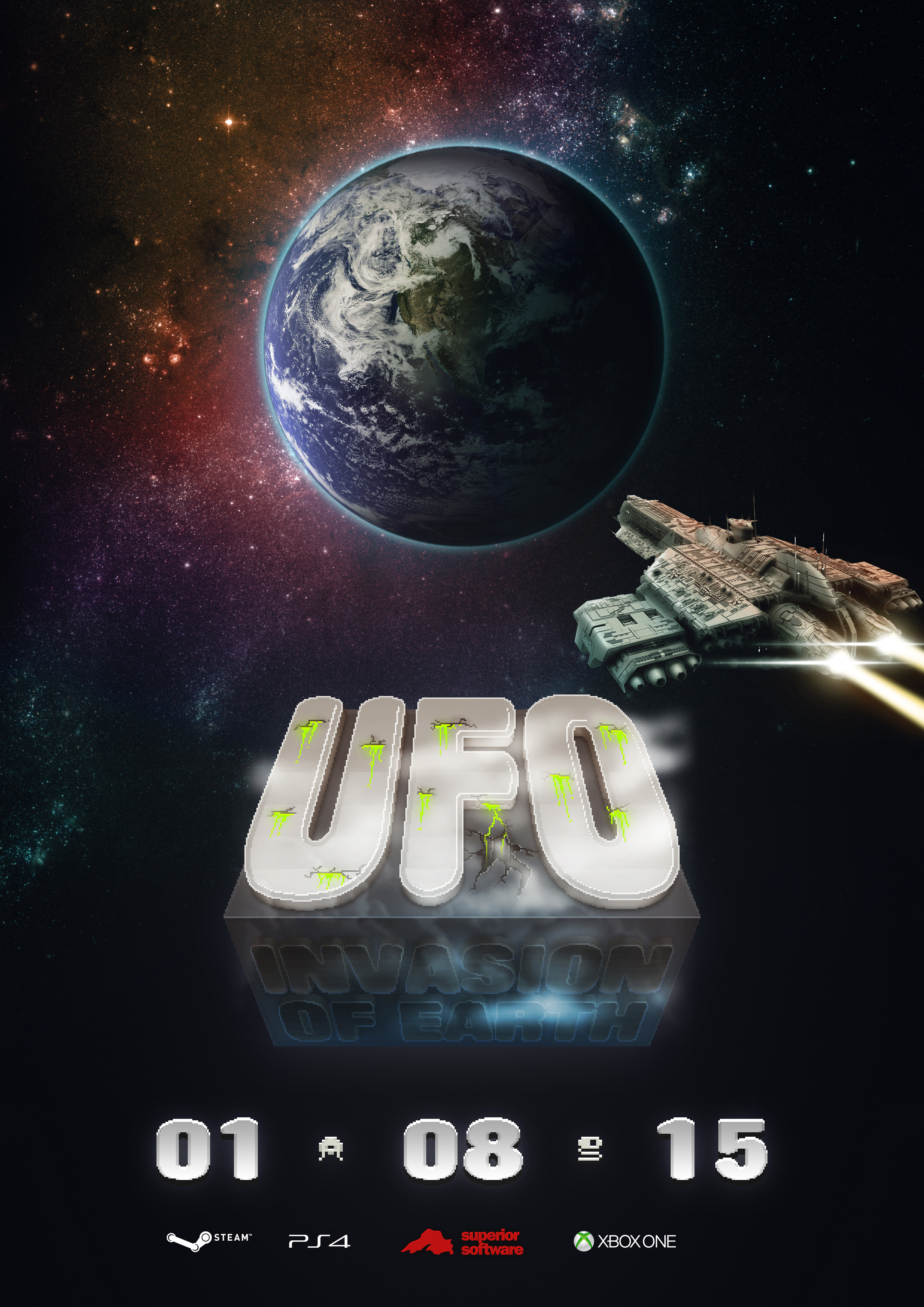 The first version of the poster I created. Click the poster for a full size version.
Images I Used
I used several images from the internet in the creation of the poster. Links to the websites from which I downloaded the images are given below.
- Earth – visibleearth.nasa.gov
- Galaxy NGC 4449 – NASA, ESA, A. Aloisi (STScI/ESA), and The Hubble Heritage (STScI/AURA)-ESA/Hubble Collaboration, www.spacetelescope.org
- Spaceship – space.desktopnexus.com
- Clouds – commons.wikimedia.org (used in logo redesign)
Digital Design Tools [P4] [P3]
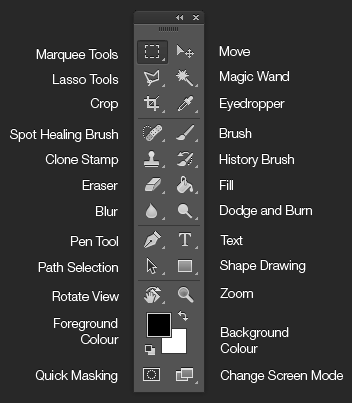 An annotated screenshot of the Photoshop tool pane, showing many of the tools I used when creating the poster and logo.
Brush
The size of the brush is one of the main properties that can be changed by the designer. By increasing the size of the brush, the area that it covers when used increases. When the brush tool is selected, the size of the brush tip can be changed by pressing the
[and]keys on the keyboard.The hardness of the brush is another aspect of the tool which has a great effect. By increasing the hardness of the brush, the edge of the area of colour that the tool creates will be more defined and less blurred. A lower hardness is more useful when shading objects and creating soft blends of colour. Like the brush size can be adjusted with the keyboard, the
{and}keys can be used to change brush hardness, which is usually performed by holdingShiftand pressing the[and]keys.The opacity and blending mode of the brush can also be changed. The opacity of the brush refers to the intensity of the colour when the tool is used. The blending mode changes how the colour added to the image reacts with the content already on the layer. For example, using the brush tool with the foreground colour set to white, the opacity to around 20% and the blending mode to Overlay yields a tool similar in effect to the dodge tool. Brush packs can also be downloaded online which can add more brush tip shapes to Photoshop.
Eraser
The eraser works in much the same way as the brush tool, except that it takes pixels away rather than adding them. As a result of this, the blending mode option is not available as it is for the brush tool as such a setting is irrelevant when subtracting pixels from an image.
As well as the brush mode, which allows the changing of brush tip size, hardness and opacity, the eraser tool offers pencil and block modes. These modes use circular and square brush tips respectively, but do not use anti-aliasing to make the result smoother. This may be seen as a disadvantage in many cases, but is useful when designing in pixel-art styles.
Selections
Creating and modifying selections is one of the most common tasks in Photoshop, and there are a number of tools to make this as easy as possible. The marquee tools allow the user to draw anti-aliased selections in various shapes, such as rectangles and ellipses. The lasso tools allow one to create freehand and polygon-shaped selections, which can often be used as a quick alternative to creating a path with the pen tool and converting the result to a selection. The magic wand allows the user to create complex selections by clicking in areas of similar colours around an object. The tool will detect boundaries between strongly contrasting areas of colour, and place the edge of the selection at this point.
Once a selection has been made, there are a number of tools available in the Select menu that allow one to perform operations such as feathering (blurring) the selection, expanding or contracting the selection, and saving the selection for later use. One can also use the usual selection tools in addition, subtraction or intersection modes to build on the current selection.
Once a selection has been made, it serves many purposes. If one is being used, the brush tool, for instance, will only be effective inside the selected area. The same goes for similar tools like the eraser.
Responding to Feedback [P5]
In order to gauge the success of the images I created, I asked members of my class to fill out a small form about the poster and logo. I took their feedback and recommendations into consideration and changed both.
The altered poster, changed after having received feedback from people in class. I added the logos for Steam, the PlayStation 4 and the Xbox One, showing the three platforms that the game would be released on. The revised logo shown below was also added. Again, you click the image for a full-size version.
 The altered logo, with mist/smoke added as per suggestion. I used the brush tool, clipping masks and cloud rendering to achieve the effect. I also used a photo of cumulus clouds, mentioned previously.
Decisions Made During Design [M2]
File Format
While I was developing the images, I used the Photoshop Document file format, which uses a .psd file name extension. I did so that all of the layers, typography, layer styles and blending modes I was using would be preserved when the file was saved. Using this format means that the project can be saved and picked up again at a later date without the loss of any information.
Because the PSD format saves all of the data in the image, and does so losslessly, the files generated are very large. This is not ideal for transmission over the web or even saving when storage space is limited. The PSD format can also only be read by a limited number of programs. PSDs cannot be embedded in Word documents or in webpages, and Photoshop is generally considered a requirement is one wishes to view a PSD. The majority of people viewing the file would also not need the layers, layer styles, etc. to be editable, and would be better suited with a single, flattened image in a more compatible format.
For these reasons, I chose to use the PNG format for the final logo. This format is lossless, like a Photoshop Document, meaning that no quality is lost when the file is saved and reopened. PNGs also support alpha transparency, meaning that I can save the image as it is with a transparent background. This makes the image much easier to use in practice, such as when it came to importing the image back into Photoshop to create the poster.
Also for the reasons mentioned before, I chose to use the JPEG format for the poster. As most of the image was comprised of photographic or photo-realistic imagery, the JPEG format was more suited. Using advanced compression techniques, the JPEG format is able to save many images in a much smaller amount of digital space. PNGs are better suited to digital graphics created solely on the computer, that don't use photographic images and which must be saved losslessly. For photos and similar-style images, the JPEG format is better suited.
In order to compress the images as much as possible, I used the "Save for Web" feature in Photoshop, which can be used to save images in a number of formats commonly used on websites and in mobile applications. I then compressed them a little more using the optipng and jpegoptim Linux utilities for PNG and JPEG files respectively. Optimisation of image files usually involves the removal of excess information and metadata, and sometimes resampling and recompression.
Image Compression
When saving the files in the "Save for Web" dialogue, I was fairly conservative with compression. As the PNG format is lossless, the compression options are not hugely extensive, but there is a quality slider one can adjust when saving JPEGs. The slider is able to represent any number between zero and one hundred, and I used a setting of around eighty-five to ninety when saving the poster and progression images. This retains the vast majority of the quality, while still providing a good amount of compression. The difference in file size between an image saved with a quality setting of one hundred and one saved at ninety is a lot more than that between images saved at eighty and ninety, but the loss of quality is very similar. The settings I used are settings which I have found to be a good balance between quality and compression.
Image Resolution
For the logo, I used a resolution of 300 PPI (pixels per inch), despite the fact that the logo would much more likely be included in digital content (which would only warrant a resolution of, typically, 72) than in print. By using a higher resolution, however, I ensured that the image will appear at a more appropriate size when the file is imported into other applications such as Microsoft Word. As content created in Word is generally intended for print, the image will be placed on the document at a size which will keep the image high-quality even when printed, which requires a much higher amount of pixels per square centimetre/inch than a digital screen.
Colour Depth
In order to keep the images lossless, I used a colour depth of 24 bits per pixel. This was true for both the poster in JPEG format and the logo in PNG format. This colour depth is often referred to as "16-million colours", and can represent up to 2563, or 16,777,216, colours. This is also referred to as true colour, as very few projects call for more colours to be available.
For some of the progression images for the logo, I used the PNG-8 format rather than the usual PNG-24. This format uses only 8 bits per pixel, but includes an index of colours defined at the beginning of the file. An 8-bit PNG file can have any of the usual 24-bit true colours, but a file can only use up to 256 of them. For some of the earlier progress images, fewer than 256 colours were required to perfectly reconstruct the image, and for others very little quality was lost. Despite the minimal loss in quality when using PNG-8 over PNG-24, some of the files were as little as half the size.