Client Side Customisation of Web Pages – Assignment 2
Website Design and Planning [P4]
 The filesystem layout of the website can be shown by the diagram above.
 The basic page layout that will be used throughout the website.
 The page layout that will be used on the individual cube pages. The page title will be a short description of the cube, the text content more details about the cube, and the image a full-size version of the relevant image shown on the home page.
Implementation of Website Design [P5]
Once the design stage was complete, I started the process of implementing it as a real website, using the HTML, CSS and JavaScript computing languages. As mentioned in the M3 task, I adhered to recent specification published by the W3C – the World Wide Web Consortium. This included HTML5; CSS3; and ECMAScript 6, the standard of which JavaScript is an implementation. I used the popular text editor Sublime Text 2 to build the website, using third-party plugins such as Emmet and integration with Git to improve workflow.
Employing Good Practice in Development [M3]
I made sure to follow HTML5 and CSS3 standards during the construction of the website. Following the current standards is an important responsibility of web developers, as they offer the most efficient methods of achieving certain goals and will theoretically offer the best compatibility between browsers. The source code of the website I created can be viewed using the developer tools in a modern browser (such as Mozilla Firefox), but it can also be viewed more easily online in its Git repository.
Testing Phase [P6]
When building websites, it's important to test not just the final product, but the components of the website as they are developed in different browsers and using different operating systems. As different browsers use different parsing software and – more importantly – rendering engines, single websites can potentially display differently in different environments. By understanding different platforms and their requirements, one can cater for most devices from the beginning of development, but some less-obvious caveats can drastically change a website in a way that'll only be noticed during testing.
For a more complex website than that which I designed for the task, a testing grid would be suited to tracking the process of testing and tracking errors uncovered and confirmed in the website. For a website of the scale my own occupied there is little testing to carry out. The website consists of only two page layouts, both of which are greatly similar. Server-side programming or scripting hasn't been used to generate the website markup dynamically, leaving the website to pre-generated static content and the user-agent. Below I have summarised how the website created behaves in four major browsers, covering both desktop and mobile platforms.
Firefox Developer Edition, Lubuntu 15.05
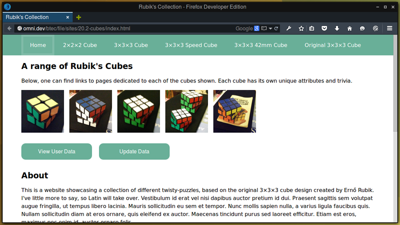 The website displayed as intended when using Firefox and a Linux operating system.
Firefox on Linux displayed the website as expected, showing the correct text, images, layout, colouring and effects. The JavaScript used within the page executed flawlessly as well, and the browser accepted the localStorage requests as per web standards. User-agent styling added to the user data buttons and form submit button did produce an unwanted effect, which was noted.
Internet Explorer 11, Microsoft Windows 7
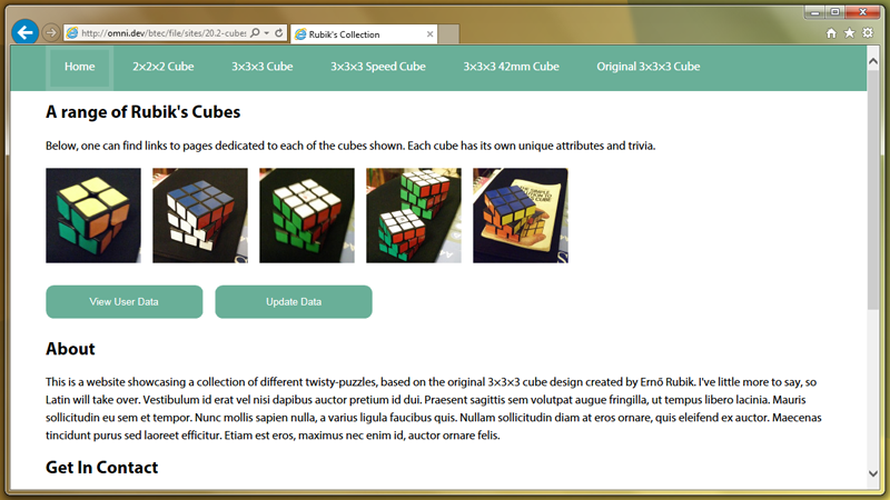 The website displayed as intended when using Internet Explorer 11 and Windows 7.
Internet Explorer running on Windows 7 also showed the website as intended. When viewing the website from a local drive, rather than from an HTTP(S) webserver, the browser would sometimes revert to the older IE 7 rendering engine. Using a slightly different DOCTYPE fixed this issue, but it can also be fixed with the addition of an extra meta tag telling the browser to render in its "Edge" mode.
Google Chrome, Android 5.1 (CyanogenMod 12.1)
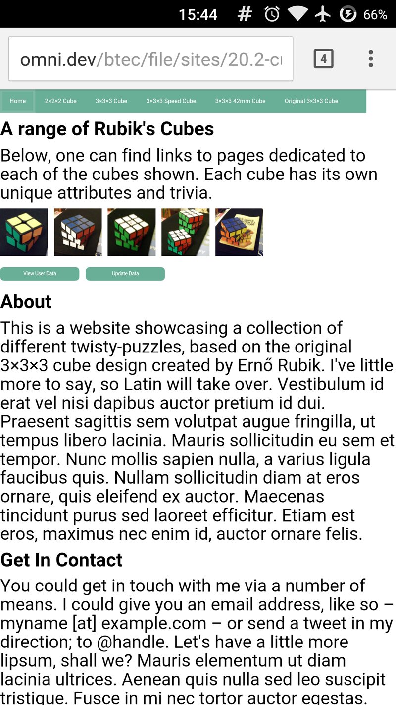 The website did not display well, through no fault of the browser, when using Google Chrome Mobile and CyanogenMod 12.1.
Although there were no issues in the browser's rendering of the website when using Chrome on Android, the website did not display well. Because of the lack of CSS targeting physically smaller screens, the different pieces of text where missized and the website layout did not take full advantage of the digital canvas available. This could be rectified with the addition of more CSS using media queries. JavaScript could also be used to change the styles applied to the document on load, but this adds needless over-head and is less reliable.
Mobile Safari, iOS 4.2.1
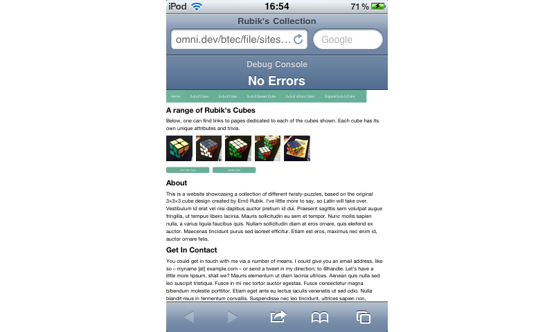 The website did not display well, through no fault of the browser, when using Mobile Safari and iOS 4.2.1.
In similar ways to Chrome and Android, Mobile Safari running on iOS 4.2.1 also did not display well, although not to such a drastic extent. Although the JavaScript on the website executes as it should and the website is still just as functional as when displayed on a full-size monitor, the aesthetics of the page suffers. Just as extra CSS could be written to correct the displaying of the website with Android, extra styles could be written to target the iOS device's screen.